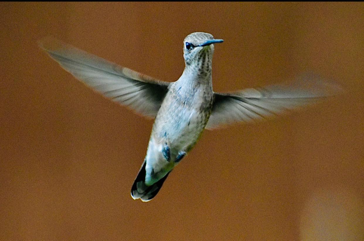
This last year has for most of us sped by in a blur. Coping with a global pandemic has meant endless change, marked by steps backward as often as we seem to be moving forward. My painting has gone much the same way. I set goals, I gather information, I dabble in trials, and often while away many hours contemplating strategies. A main challenge for several months has been to paint a hummingbird wing as it is most often perceived by the human eye, as a blur.
My last post summarized what I learned about the anatomy of the hummer’s wing and the dynamics of its flight. I used up almost an entire roll of practice paper getting familiar with the bird’s shape and its characteristic poses. But capturing the essence of the hummingbird, its quintessential blurry hovering midair eluded me.
When a goal seems out of reach
There are endless ways for an artist to pass time when a painting goal seems unachievable. You can search out new materials (brushes, papers, books), you can tackle new subjects, you can paint old familiar subjects to restore your confidence—all the while of course on a subconscious level, you are considering ways to nail that elusive challenge.
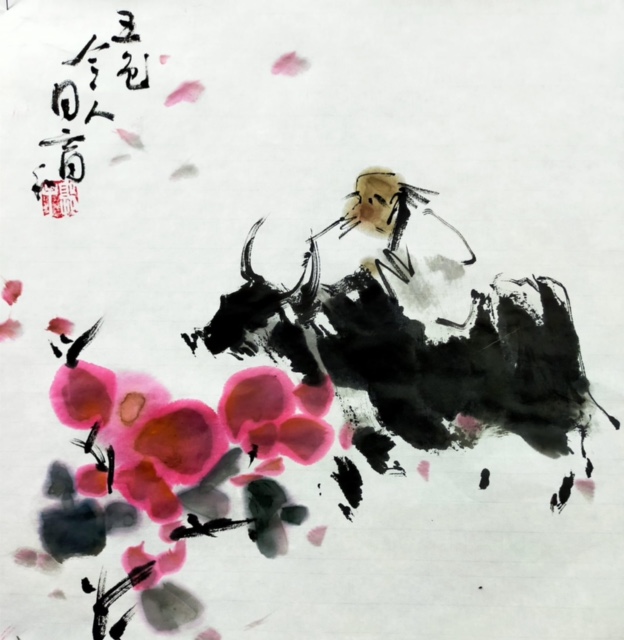
I painted ox (zodiac animal for this year), horses (my fall back familiar subject), and flowers (hoping to set a stage for my hummers once they materialized). Finally, after several rather dry months of contemplation I sat down to try those elusive wings again.
Feeding the inner artist:
Anyone on a creative quest knows ways to fuel or spark the engines.
I acquired a host of good photos of hummers in flight. There are numerous groups on Facebook dedicated to hummingbird lovers and I am grateful to many such friends for their contributions.
A page of bumblebee poses from a new Chinese Brush painting book caught my eye—the wings were all rendered as a blurry swish of grey wash. How to enlarge the effect?
I switched out my usual practice paper for a second favorite, Dragon Cloud. The paper let a swash of color blend into the surrounding paper differently than either side of my usual Moon Palace.
I experimented with brushes other than my favorites. Different sizes and different hairs constrained or assisted in the shaping of the triangular wing emerging from a shoulder of a bird. Ink tones, stroke speed and stroke widths could all be played with.
A painting by an artist friend wherein he dropped color ink splotches into damp paper, let them dry, and then ‘picked out’ flower petals with fine ink lines suggested a way to achieve a flash of color with some essential detail. When you are stopped in the garden by a familiar buzzing sound and you glance around for the source, your eye often catches just that, a flash of green, maybe a dab of ruby red, and some tiny dark markings like the eyes, the feet or the distinctive beak.
Order of painting could influence the outcome. Whereas I customarily tried painting my hummingbird first and then adding a floral setting, one afternoon I reversed the steps—flowers first, bird second. This helped me consider the bird pose in conjunction with its intent to poke into a nectar source, more fitting than simply surrounding a bird with floral attractions.
Closer to the blur:
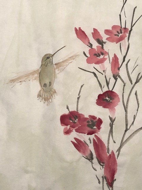
Here are some of my studies. None of these are wet mounted, so the colors could show brighter if I did follow through. I’m not quite ready to call this challenge ‘done and dusted’ yet. I may take a detour into the realm of bright, fluted flowers and perhaps the birds will simply follow. I wish!
This pose keeps coming back to me; I like the composition, the pink glow from the flower on the bird’s chest,, the soft background, and….the wings DO blur more so than “flap”to my eye.
A traditional aspect to Chinese Brush Painting that I truly embrace is the balance between realism and representativeness commonly achieved. One strives to accurately depict such things as associations (bees with certain flowers, dragon flies with others, willows by waterways, etc.) or anatomical correctness (eg. roosters standing flat on their feet not on tippy toes, black feathers emerging from wing tips on cranes not their tails, horses with legs that bend in the right ways) yet exaggerate for dramatic effect the relative size of certain characteristic features (eyes of a predator, talons on an eagle, teeth of a tiger).
Painting a hummingbird hovering mid air has an obvious challenge: do you paint the wings as a camera with a fast aperture speed might capture them (caught mid-flutter) OR do you portray them as the human eye perceives them: blurry. You know the wings are there; you can hear the buzzing. You might even assume their wings are just like other bird wings, only moving faster. Ahh, therein lies a myth, or maybe a few. This spring I set out to learn about the hummingbird wing and try to paint a bird mid hover.
Resources:
I have explored painting hummingbirds before. (See post here.) At the time I found only the one resource in my library of Chinese Brush Painting (CBP) materials that addressed painting hummingbirds. That was a Walter Foster large format book featuring the work of Lucy Wang. Her method was to use brushstrokes loaded with ink tones and colors to depict an Anna’s hummingbird. Six years ago I was satisfied with my end result, a colorful card that featured a recognizable hummingbird.
Lucy Wang’s method of painting an Anna’s Hummingbird
Over the years my drawing and painting skills have developed, I know a whole lot more about this particular family of birds, and I have even watched a pair of Anna’s chicks hatch and fledge. The desire to depict these birds more accurately and skillfully was a natural outcome.
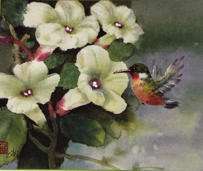
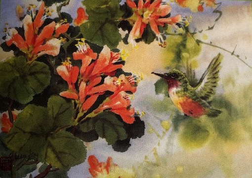
Turning back to my growing collection of CBP books I found two artists worthy of second looks. Both are residents of Vancouver, B.C. (which coincidentally recently named the Anna’s Hummingbird as the city’s official bird). Both artists paint the wings of their birds in detail, as though caught by a high speed camera.
An Exploration of Chinese Watermedia by Eileen Fong (on the right above) includes instructions for depicting an Anna’s Hummingbird (line and ink texturing, color washes and detailing) as well as numerous full compositions with different flowers. Below are some of her illustrations:
2. Johnson Chow’s Paintings is a large format, hard cover collection of the works of Johnson Su Sing Chow with several that include hummingbirds. He is the artist behind a four-volume instructional set on bird painting that every CBP artist should own (shown below).
Here are close-up images taken from two of his larger paintings that feature hummingbirds:
As I searched through my materials I tripped over a very old, rag tag book by American artist/naturalist/conservationist/bird expert Roger Tory Peterson (1908-1996). In a chapter on the Ruby-Throated Hummingbird he included a delightful 1938 color plate in which he captured the blur of the wings. The medium appears to be watercolor. (Do note the image seems to show a trillium and a Bergamont improbably sharing a single stem!)
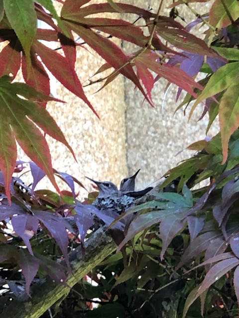
In addition to these three books and other relevant online source, I had the benefit of every artist’s greatest resource: extended, close-up, and personal observation. This spring an Anna’s Hummingbird nested right outside a well-situated window at the back of our house, under a roof overhang. Her timely incubation of two offspring literally under our noses gave me ample opportunity to study their development, their habits, and especially their anatomical features.
What is a hummingbird?
I would guess that most people think of the Ruby-Throated or maybe a Rufous when the bird’s name is mentioned. There are actually more than 300 species in this category. To read more about what is a hummingbird see this site.
Those of us living in the Pacific Northwest tend to be more familiar with the Anna’s because it remains with us year round, not migrating annually to a warmer climate. Much has been written about the Anna’s, from the story concerning its naming for a 19th century Duchess , to its territorial expansion north from Baja, California. Anna, Duchess d’Essling is the lovely lady in pink (far left) depicted in this painting by Franz Xavier Winterhalter.
For an artist, several key physical features of the adult Anna’s are most relevant and need to be remembered:
–long needle-like black bill which is straight
–green crown, back, and tail, any of which may show some minor iridescence.
–chest, throat, and abdomen are pale gray
–a central dark red spot/splotch on the throat which tends to flash in flight
–wings and tail are dark and there are white spots on the outer tail feathers.
–females have a white patch over the eye, though the extent of the white can vary
–bright, large black pupil in the eye with little tufts of eyelash around it; more circular in shape than oval or elliptical.
(In a subsequent blog post I plan to address key aspects to consider when painting young chicks and slightly older juveniles.)
I will also try to use the standard names for body parts of these birds; for more understanding see illustrations by Melissa Mayntz here.
Painting the blur:
In traditional Chinese brush painting there is a concept that reflects that TRUE seeing: object absent, idea present. You do not carefully depict the specifics of the object but nevertheless convey the IDEA that the thing is actually there.
Lucky for me some years ago local CBP artist and friend Nenagh Molson demonstrated a method for blurring the front end of a duck as it dove below the surface of a pond. She carefully painted her duck and while the image was slightly damp she brushed clear water over the front end and smeared in some pale grey lines to leave horizontal strokes suggesting the obfuscation of water. I assumed some experimenting with the method would help me achieve blurred wings of a hummingbird in flight.
The Anna’s wing
As with any painting subject I first needed to know and understand what it was made of, how it looked, how it functioned. I collected images of hummers flying and tried to work through several explanations of just how they did it; in the end the best insight came from a David Attenborough’s Conquest of the Sky Youtube video featuring a University of British Columbia researcher.
Narrative explanations tend not to be clear about what plane they are talking about when they say the wings move in oval shapes or figure eights.Here is a site that relates some of the special physiology of a hummer that contributes to its unique flight patterns, and offers a description.
The physical description makes more sense once I viewed the David Attenborough several times. It also helps to know up front that the hummer flies more like an insect than other birds, and that its shoulder joint is like a ball in a socket, thus allowing the distinctive wing rotation as opposed to simple up-down flapping. Furthermore, the upper arm bone (from shoulder to elbow) is very short in a hummer and the bird has a strong tendon extending from the shoulder to the wrist, effectively turning the wing into a taut, flat sail-like structure.
I made notes of characteristics I thought most relevant to my goal of capturing the blur of a wing, and spread out images of hummers in various flight poses.
The wing emerges from the shoulder of the bird in a triangular shape, formed from ten overlapping primary feathers., and six secondaries (the shorter ones located closer to the body).
The anatomy of individual feathers is described in detail by fellow blogger Kate St. John here; and also well illustrated at Arizona University site here.
On a Facebook Group page I found this helpful image of a hummingbird flying vertically; compare the wing shape to the next image, a graphic from the Attenborough video which illustrates how the unique bone structure of the hummingbird wing dictates the shape.
The wing appears more solid closer to the shoulder because of that second set of feathers (greater, middle and lesser coverts) that overlap the primaries. The bone from shoulder to elbow is relatively shorter than in other animals and there is a strong tendon stretching from the shoulder to the wrist, thus providing shape and strength to the wing.
The primary feathers extend in an overlapping manner; the structure looks much like a pleated skirt.
When the wing is collapsed next to the body those primaries overlap, resulting in a curved shape with the appearance of intermittent bars.
The feather of a hummingbird has a white shaft (rachlis) with flat grey vanes on either side, one being wider than the other in the flight feathers.
Tails have ten feathers (five either side of centre) with overlapping coverts similar to the wings. The tail feathers on an Anna’s are darker toward the tips.
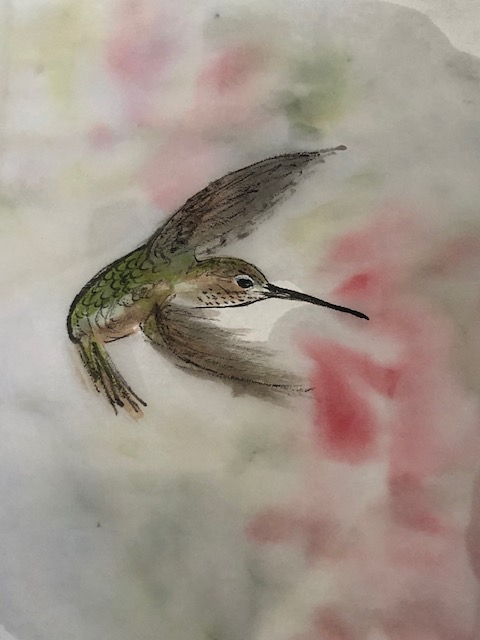
My Hummer Wing Studies:
With my many new insights into the unique structure and functioning of the hummingbird wing I sat down to try and depict a female Anna’s Hummingbird with a blurry wing. Here are my study sheets:
Moving on to simple compositions using hummingbirds in flight, I first tried depicting the wings showing the pleated look:
By the time I had the painting to the ‘half-baked’ stage above I knew the wings appeared too static for my liking, and I didn’t finish detailing. I went back to consider photographic images that captured the blur of the wings such as this one:
And then tried painting the wings with some detail but washing water over the image when damp:
Finally, I thought I was getting closer to my goal! Now I had a method worked out, hundreds of photographic images to work from, and certainly comfort in knowing my subject.
Bird Woman frequently reminds me that it is best to paint from photographs (not other paintings) and that one should never paint a subject in a larger scale than it appears in real life. While working on my ‘blurry wings’ challenge these two principles were reinforced.
While many an artist has painted hummingbird compositions that hold appeal, far too often the anatomy is incorrect: wings with a pronounced wrist bend or curve, plumped out bellies with strong-looking feet, strong throat markings in a named species that has none (unless they were painting a male improbably feeding young!) Working from real life (or a photograph) would help prevent such errors.
I also found as I started to paint a hummer if my initial eye markings bled slightly and I then extended the size of the eye to achieve a neat edge, before long I was struggling to figure out proportions; the process suffered from the pressure to scale everything up. Now I have seen large scale canvasses of wolves, tigers, horses, and even dragonflies that I like. It may be that once I am more confident with hummer painting I could finish one in a larger scale, but I’m not sure it would be pleasing to the eye. For now I will stick with life-size or smaller scale, and continue to ‘chase the blur’.
Now there is a question commonly asked by children as they begin to explore the crayon box. My sisters and I went for the unusual ones: magenta, turquoise, emerald green. One of my grandsons claimed pink for a number of months and was rewarded with pink tee shirts, pink pajamas, and pink socks. My son frequently declares his is chartreuse; we all get to enjoy the reactions of the little people in his life as they make faces at the mere sound of the word.
Most artists I know tend to go through phases, moving up and down the spectrum depending on their current subject matter.
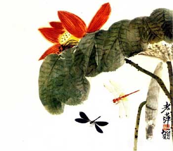
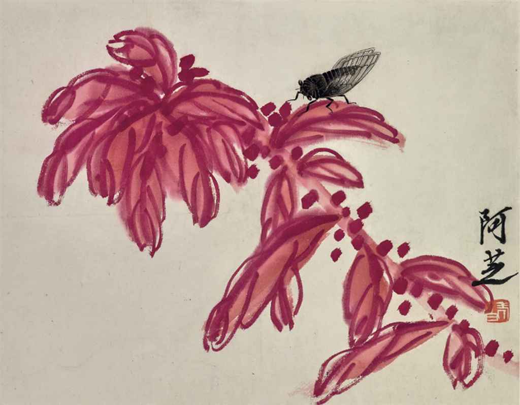
When you examine the body of work of some Chinese brush painting (CBP) masters you can sometimes chart such color explorations. Floral treatments by Qi Baishi are a fine example.
These simple paintings of red flowers are extracted from a number of books of Qi Baishi’s art.
I’ve read that Qi Baishi painted every day of his life except for two stretches of about ten days—one after the death of his mother and the other when he was gravely ill. He found visitors disruptive to his routine and apparently went so far as to post a sign on his home in Beijing asserting ‘Qi Baishi is dead’. The man wanted to paint and people could get in the way.
It leads me to believe that the numerous small floral compositions might have been quick, tourist executions. You know, the kind of thing a master would toss off in a matter of seconds to offer a visitor in order to speed them on their way. Or, more realistically they are remnants of his careful study of color.
To pop or not to pop—the role of red
One of the most interesting reads I’ve ever picked up in my hauntings of used book stores is a volume titled Color, by Victoria Finlay published in 2002. The author travelled the world in search of the origins for the pigments we artists cherish. Her book is thus a compendium of facts and fictions about precious minerals and insect blood, emperors and queens, half mad artists and calculating patrons.
The section devoted to Red focuses on the great English watercolourist Joseph Turner and begs the question “are we seeing today Turner paintings as they were intended?” Her premise is that the formula for red pigment Turner used faded over time, in as little as a few months. Artists devoted to Chinese brush painting (CBP) must ask ourselves that very same question: are we seeing the reds used by masters such as Qi Baishi as they were intended?
I would think that the red pigments used by more ancient masters have indeed faded, to what extent is anyone’s guess. Nevertheless, one safe conclusion to be made would be that often red was used for strong contrast. It was placed as a focal point, to draw the eye to an item of greater interest. We have only to look at some other familiar Qi Baishi compositions to see how this works:
Recently I discovered a contemporary artist (Yitong Lok) using red in powerful ways, primarily in landscapes.
My Red studies:
When it comes to painting red in traditional CBP there are at least four choices for pure values. One can always (and in fact, probably should) alter the pure pigment values with a little ink or perhaps green (red’s opposite on the colour wheel) in order to have a more pleasing composition. I first painted this study sheet illustrating the four pigments as named and number coded by a major CBP art supplier. Personally I consider vermillion to also be choice for a “red”, although many consider it an earth tone or an orange.
Impressed by the manner in which Qi Baishi painted single roses I first tackled red roses. My early experiments proved very unsatisfactory. Now I have not painted a lot of flowers, but as a gardener I am very familiar with the shapes and parts to a host of floral subjects. I have also built up a repertoire of brush strokes and have mastered a degree of moisture control necessary to painting in an oriental manner. After several days of attempts at red rose painting that produced muddy colors, indistinct petal shapes, bland leaves and uninteresting compositions, I realized I was in a slump. I “saw red” indeed.
Ordinarily I have had the benefit of art groups to keep me inspired and moving forward; in these times of Covid restrictions, there are no art group meetings. I had to rely on my own devices to push my paint brush. So I turned to my art books and looked at roses by artists other than Qi Baishi, I reviewed rose-painting instructions, and I painted other subjects that required a dash of red for impact.
While flipping through art books I stumbled on an unusual rose petal treatment: lined petals over painted with a stroke of pale pink. In another book I spied hydrangea painted in a similar manner. So I mixed some soft greens…
I was relieved to be back painting full compositions and out of my slump. The red roses will simply have to wait for another day.
The purpose of my blog has always been to record my journey through the world of Chinese Brush Painting (CBP), to show any progress in technical skill, and to bring together in one convenient spot the resources I collect on each topic. Any learning others take away from following the blog is a bonus; I like to give back.
My exploration of this ancient art form has primarily been self-directed, with occasional lessons and mentoring when the situation arises. Preparing to deliver a workshop or demo has also provided learning moments. While I do structure my studies somewhat—gathering images, consulting instructional books, researching online databases—for the most part I simply follow my heart. I go where the brush takes me.
Blessed with a thriving CBP art community, in normal times I get to join similarly minded artists at least twice a week. Members in those two art groups have a wide range of interests and abilities, and they provide a nurturing environment. There is always someone who can explain or show me a technique, share a resource, or suggests ways to improve a composition.
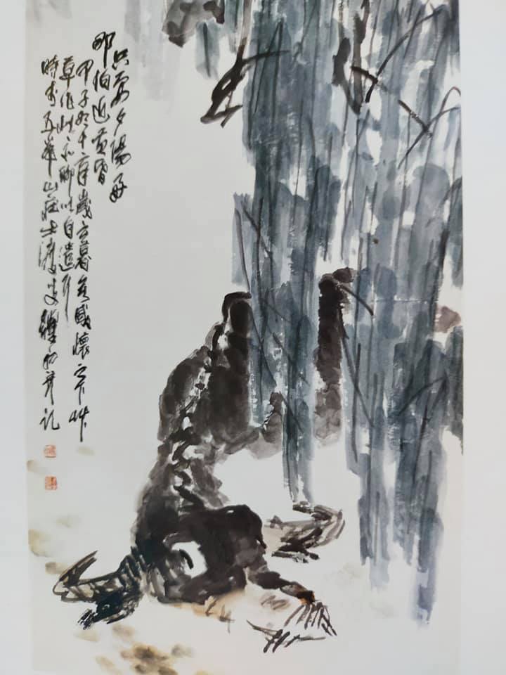
When it came to ox painting to honor our new lunar year, I was well prepared: lots of inspirational images, reasonable command of the required skills, and more time than usual to spend in my art room thanks to a world-wide pandemic. And as I recorded my experience painting 100 different ox vignettes on a single paper scroll (see my last blog post), I realized I was developing some style preferences. I determined it was time to sort through the major influences on my ox-painting and reflect on what aspects had niggled their way into my brushwork.
Key Influencers
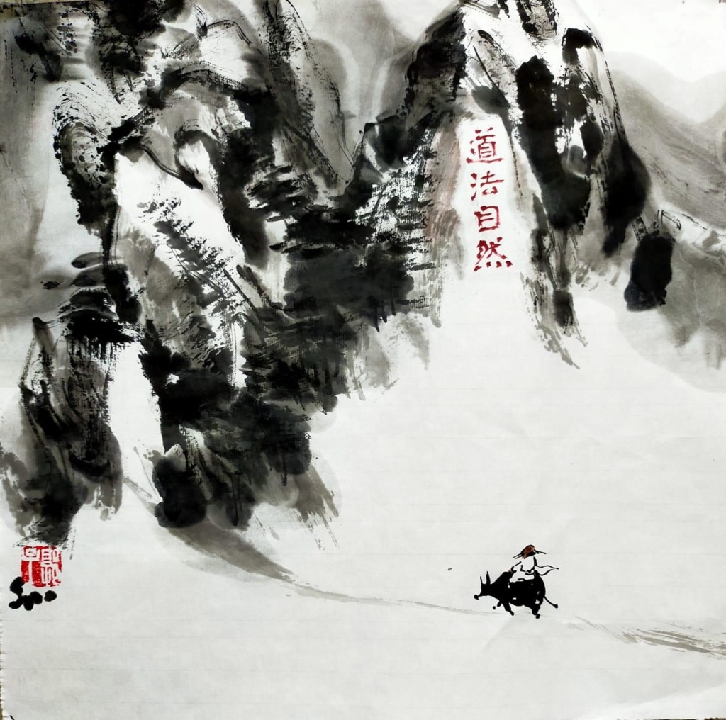
Li Keran (1907-1989) was recognized as a major artist in the latter half of the 20th century. In 2012 one of the seven landscapes he painted inspired by a Mao Zedong poem sold for a record high of $46 million US! His paintings of small herders with water buffalo (“ox”) also earned him wide acclaim. He painted the animals in ink monotones and often shows them interacting with the “cow boys”. Several of his paintings feature trees with red petals tumbling down (kapok trees no doubt) and some show the same grove with a distinctively branching tree in which he placed a boy playing a flute. He may well have had a favorite location in mind. Here are some examples of his compositions:
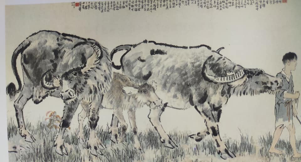
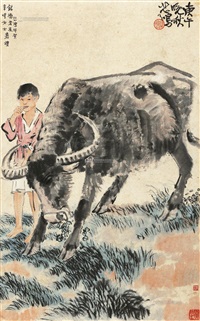
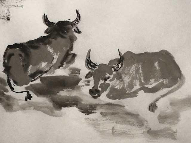
Xu Beihong (1895-1953) was a major artist of the early 20th century and is perhaps best known for his horse paintings. (I own several of his books and browse them often.) He also rendered water buffalo in a manner similar to his horses. He captures the distinctive physical features of the animals and offers a wide range of posturing, with excellent texturing of their hides. Here is a sampling of his oxen:
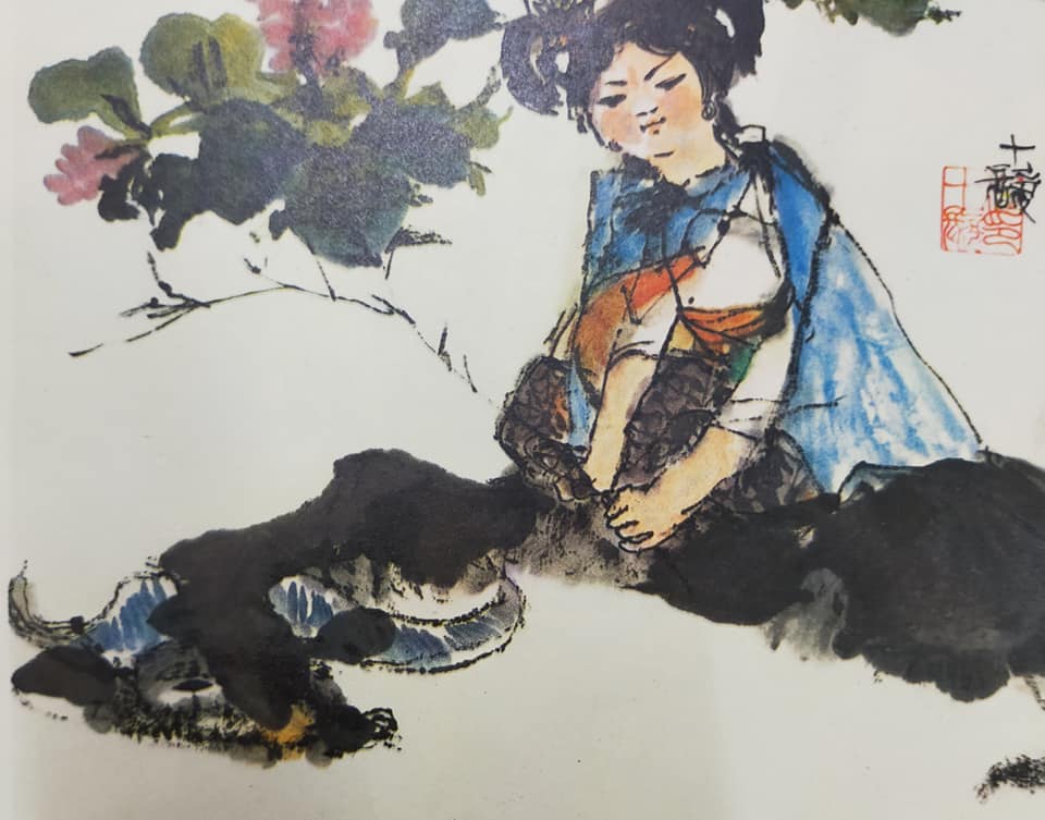
Cheng Shifa (1921-2007) was an artist who developed a unique style of painting young peasants and their animals. I discovered his work while exploring figure painting as well as sheep/goat painting. Only recently did I notice the water buffalo included in his huge volume of work. His beasts are slightly “cartoon-ish’ in style, not being entirely detailed; like his goats they are very recognizable as water buffalo and provide good contrast to the sweet-looking peasant girls. Below are some of his beasts:
Wu Zuoren (1908-1997) is renowned for his camel paintings and it should be no surprise I own one of his books. The same loose spontaneous style that gives immense character to his camels also results in loose, likeable water buffalo. They are distinctively his creations:
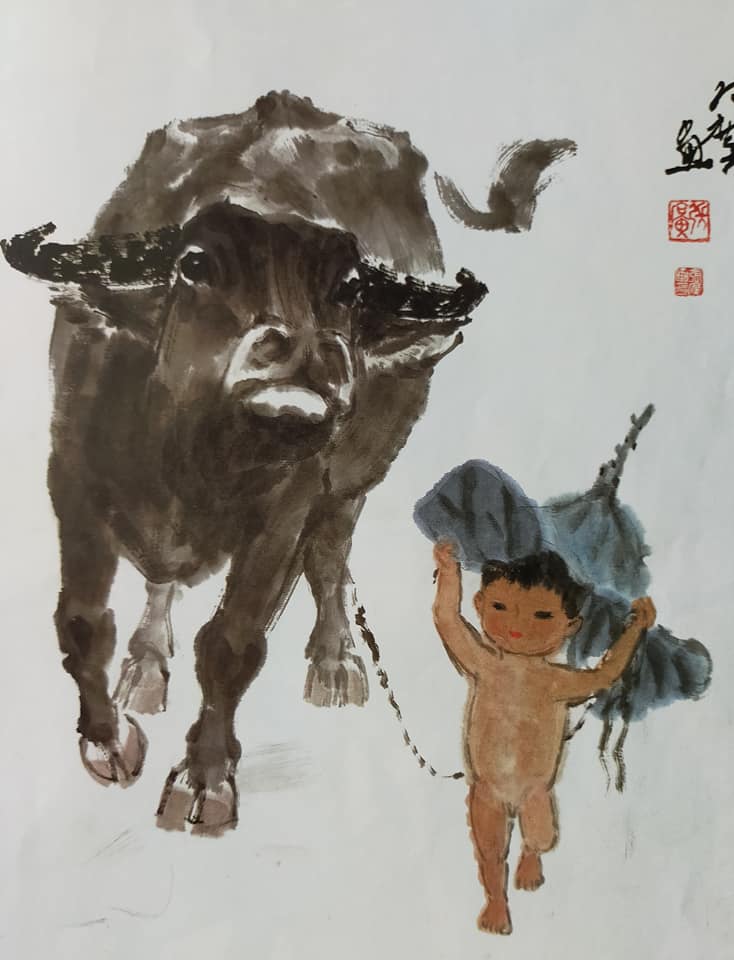
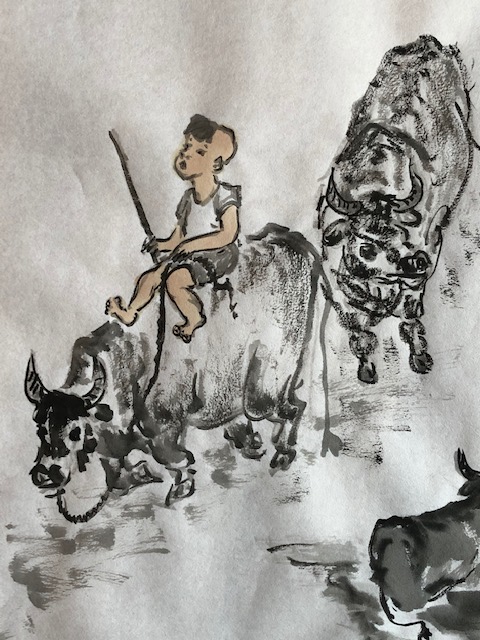
Zhang Guang (1941–) is a contemporary Chinese artist I only discovered recently through a Facebook artist group friend. His water buffalo are usually rendered in grey shades and most often are posed with an uplifted head. Once you’ve seen a few of his compositions it is easy to identify his work. He usually paints them in pairs and often with children accompanying them. Those with the children picking apples are particularly appealing. Here are a several that I tried to emulate as part of my ox scroll.
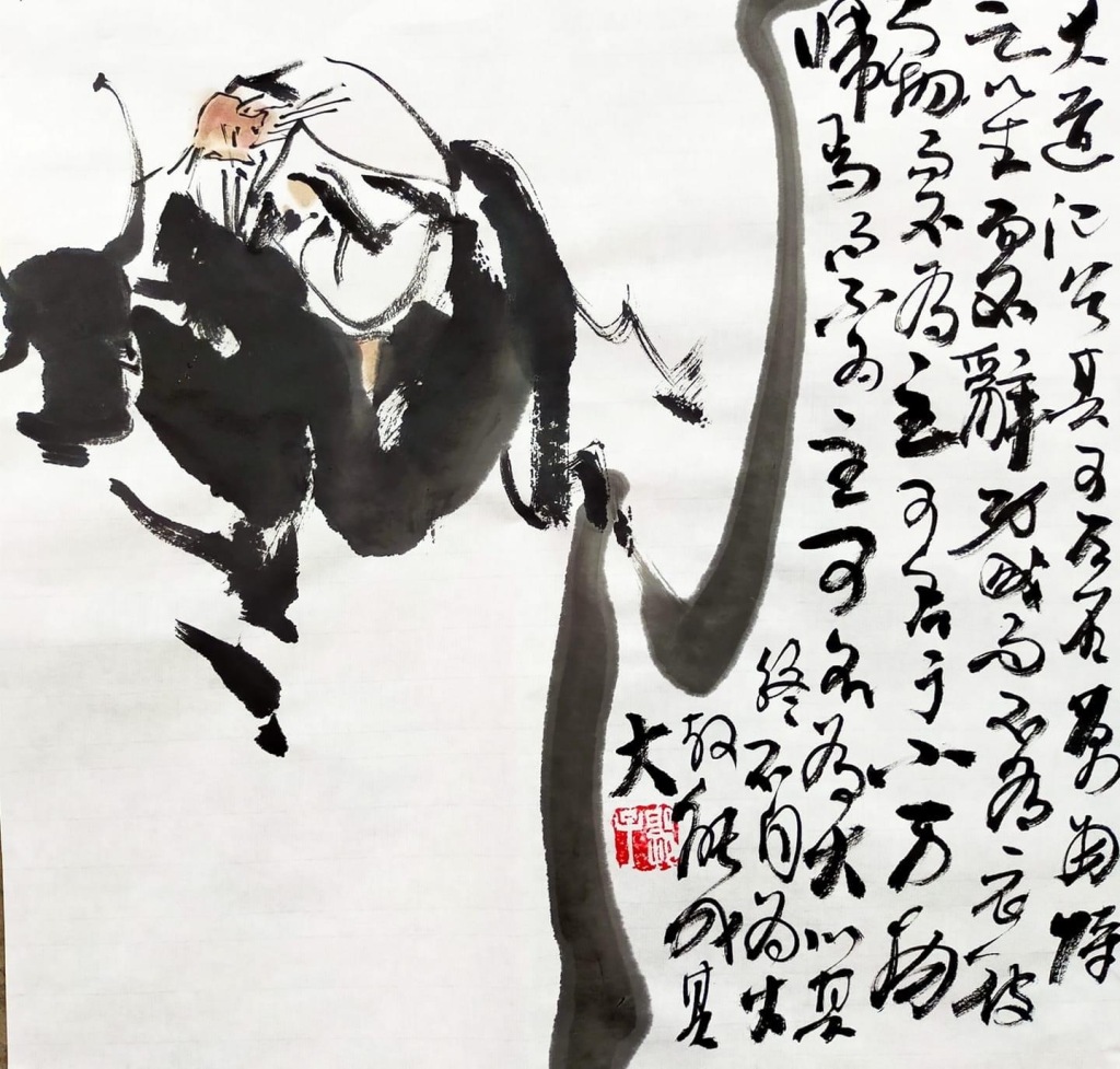
**Guo Wenhe (Kerk Wen Hoo) At last, with the help of artist friend Vickie Chow, I can identify the ox painter I mentioned in my last blog post whose tremendous body of work shared on Facebook (and elsewhere in Chinese media) has so influenced my emerging style. I included a short slideshow there of some of his work to illustrate how clever he is with placement of the calligraphy as part of the actual composition. Here are some recent pictures of Guo Wenhe in his studio working with students on perfecting their ox-painting:
His compositions tend to include one or more water buffalo (“cows”) with a herder. He paints the beast in a spontaneous style in shades of ink; from videos he has shared on his Facebook page I know he paints in a fairly large scale (about 24 by 24 inches or more) using a single large brush for the grand sidestrokes as well as for the more delicate brush tip detailing. He quickly sketches in the body shapes for the herders and lastly washes on skin tones in a very loose manner. Sometimes he adds a bit of color in the background elements such as grass, bamboo, trees, rainbows, fruit, flowers and occasionally a red sun.
My (emerging) ox-painting style
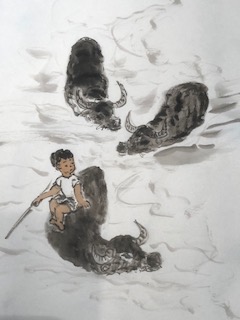
On completion of my 100 oxen project I felt a certain measure of accomplishment. I had set myself a painting challenge and met it. While I knew it would be easy to achieve my daily numbers by simply painting oxen standing or lying around in groups, I was determined to do more than take the easy road. I forced myself to paint calves (which I had not done before) and to consider difficult poses (running, swimming, raising a head to browse leaves, leaning forward to drink). Preferences did emerge:
I like to rough out my animal and herder in light ink before using dark ink to establish the edges/outlines.
I like the look of rough texture on the hides.
Ink shades are more appealing than swaths of color.
Interactions between an animal and a herder are more interesting than animals alone.
Using skin tones on the herder as the only color in a composition is appealing.
Pushing myself to use a single brush for the wide strokes as well as the tip for detail work is advancing my ‘dancing brush’ technique.
Regular practice leads to more confident strokes. The more you do, the more you WANT to do.
My art room has long been a haven, but never so much as during this long year of restrictions on social gatherings. With a passion for painting the Chinese zodiac animals and the recent connection via Facebook with an artist who excels at Ox painting, my circumstances were ripe for a self-imposed challenge to paint 100 oxen on a single paper scroll.
Lang Shining as impetus
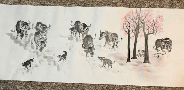
Over 300 years ago an Italian Jesuit priest (Giuseppe Castiglione) was invited to China not to make converts as one might expect, but to share his knowledge of western artistic methods. He endeared himself to three successive emperors and took the painting name Lang Shining. As often happens to teachers, he subsequently learned a lot from his “students” and soon developed a painting style fusing European and Chinese traditions. His crowning achievement was a huge—eight meters long—panoramic scroll painted in 1728 which highlighted 100 horses, many in a “flying gallop” pose he introduced.
Other CBP artists have since repeated the accomplishment of painting 100 animals of various kinds—chickens, dogs, and so on.
I chose as my goal 100 oxen.
Year of the Ox
Our upcoming lunar year (starting Feb. 12, 2021) is the second in the Chinese zodiac cycle after the Rat, and is assigned to honor the Ox. As with the Rat year (which generously includes mice, squirrels, and any similar-looking rodent) the ‘Ox’ designation includes oxen, water buffalo, buffalo, cows—virtually any “bovine” creature. I am told the Chinese symbol for Ox is more accurately translated as simply “cow”. It looks like a fairly easy calligraphy to replicate and I used it in this small painting:
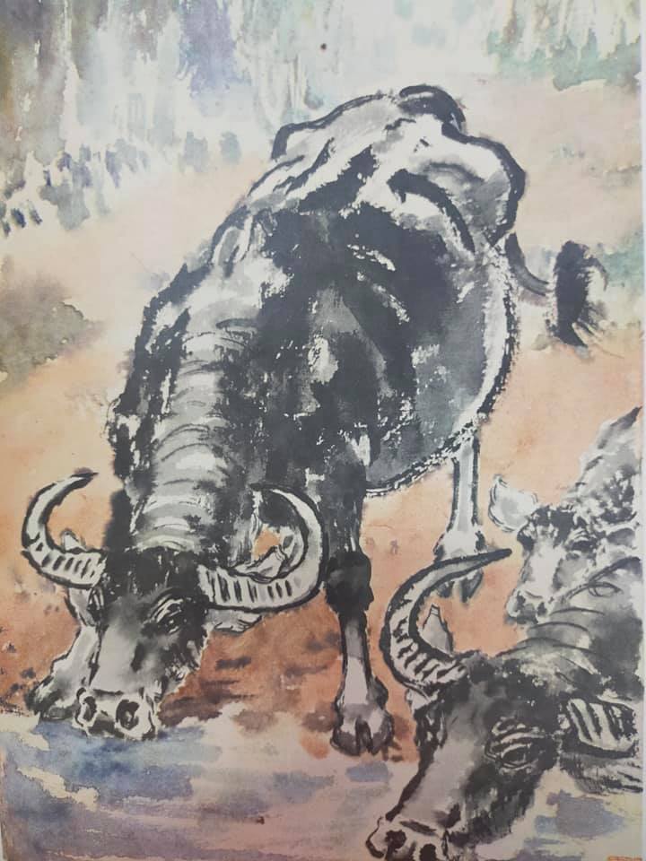
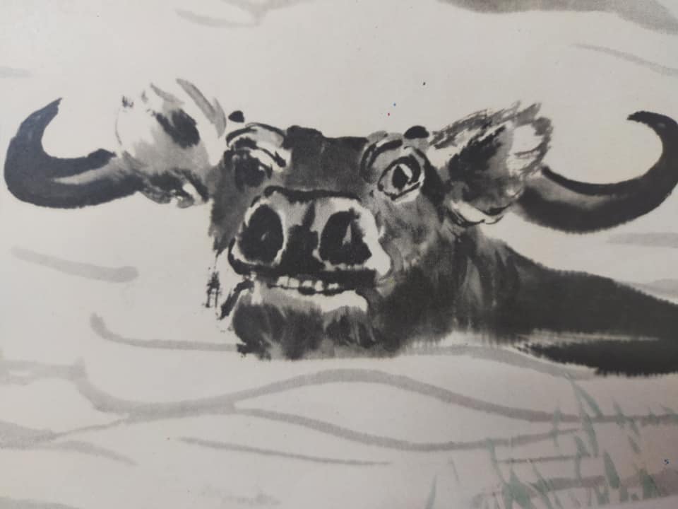
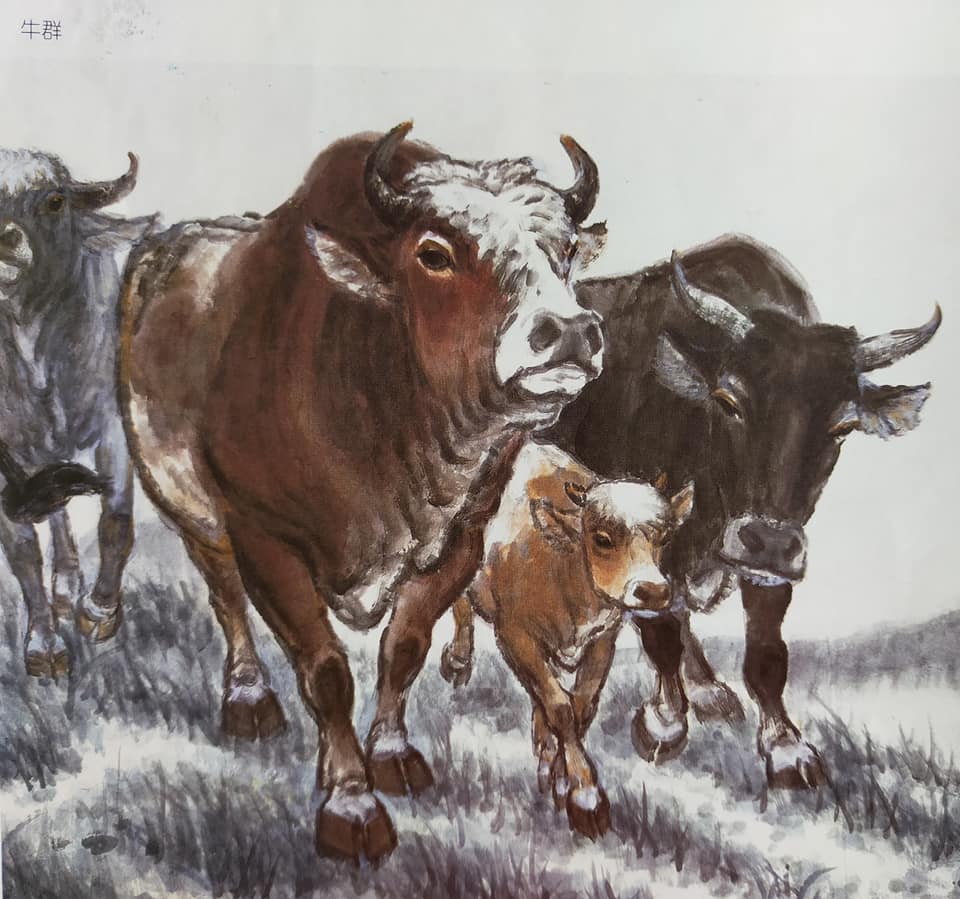
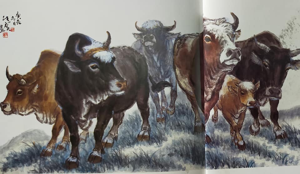
When using CBP compositions as inspiration one must keep this generous interpretation of “Ox” in mind. Most often the anatomy you see is that of the water buffalo, the beast most common throughout China even today. His distinctive features (as discussed in my last blog post) include the paired horns (and they DON”T move up and down like the pointy ears on cats, horses, some dogs!), high shoulder, dish-shaped head, large nostrils, chunky build, short legs, and bulbous eyes.
These are the features you may exaggerate for effect, but you must get them right. The ear has to be a rounded, hanging down kind of flap located just slightly below and behind the horns. Conveying the hide of the water buffalo can be a bit tricky if you work in spontaneous style while painting the animal swimming. I have seen such attempts lead to beasts that resemble hippos or rhinos!
Friends you lean on
The worst part of this nasty pandemic has been the restrictions on social gatherings. One of my art groups was able to adjust facilities and protocols such that we were able to meet well into last fall. But when that ended my regular source for critiques, suggestions and inspiration significantly waned. Luckily I discovered the realm of Facebook CBP art groups and that led to the discovery of an artist in China who excels at Ox painting.
At first when I found him via group connections I could only “follow” him, as he was at the 5000 maximum level for accepted “friends”. Nevertheless I submitted my request. (I also made sure my posts revealed my CBP interests just in case he was looking!) Over time some of his friends lapsed and I guess he reviewed requests.
My ‘Ox-man painter’ (the best I can decipher is his name may be Shao) appears to be a teacher, he has been painting up a storm of oxen to honor the year, and he has posted dozens of them. Close to 200 I would estimate. And it looks like he may have done the same with the rat this time last year!
It took me a while to discern he painted in a fairly large scale. (See those on the wall in the photo above.) His ox vignettes seem to be about 24 inches square if not larger. He typically paints in a loose spontaneous manner: brush loaded with several shades of ink (sometimes color) slathered on a paper such that the sidestrokes appear ‘liquidy’. He uses the brush tip deftly for lines and smaller details. He posted short videos of his ox-painting on his FB page back in November.
His comps are simple, mostly a single beast with a herder. He sometimes adds a bit of something like grass, tree, sun, rainbow, birds, etc. to suggest the environment. One distinctive feature I LOVE but cannot ever hope to replicate is his incorporation of calligraphy INTO the overall design. He scribbles in the “poem” or descriptor along the edge of a cloud, beside a branch, even flying loosely through the air in one where the boy flees on an ox while looking over his shoulder at the characters dispersing behind him. Below is a sampling of his impressive compositions; do watch for the placement of his calligraphy.
My Ox-man painter treats the herders in a similar ‘quick sketch’ style: just the outline, facial features, a tuft of hair on the forehead, scant clothing such as white shirt and black shorts, and swaths of skin tone wash across limbs. The lines are not perfect, not strained, and hugely dynamic.
My project readiness
Years ago I studied figure painting rigorously (practicing local artist Nenagh Molson’s workshop methods for weeks!) and I spent time learning the distinctive features for each of the zodiac animals. Starting with those I knew best (horse, cat/tiger, rabbit, rooster, dog) I moved on to monkey, snake, and the mythical dragon, and eventually could command all twelve animals. (Check my blog topics above right.)
I stayed with using a good practice paper (Moon Palace) and sometimes a fibrous one (Dragon Cloud) in order to truly learn how the paper reacted to ink. I occasionally played with color but mostly worked in ink tones.
I tried all kinds of brushes, settling on a few favorites. I tend to use one large orchid brush for the comps that require large inky strokes, and a small detail one for the finer lines. Recently I discovered a brush called ‘Little Dumpling’ that works well for both effects, as long as my comp is not too large (about 11 x 14 inches). It is handmade and was sold through Sidewinder Studio in the UK. There is also a brush called ‘Medium Flow’ (purchased at OAS and loaned by a friend) that performs well for my needs; alas they are currently out of stock.
While I do admire the spontaneous style of my Ox-man painter, and have practiced following instructional videos by both Henry Li and Professor Ju on painting ox (can be found on Youtube), I have worked out an approach that works for me. It is basically the approach used in painting rocks and mountains: establish the shape of the object with lines, add texture to the surface, wash over with colors or ink tones.
I use either pale indigo or light ink to ‘rough in’ my animal and herder, then I use dark ink with a detail brush (or the tip of the larger one carefully shaped and loaded) to pick out the body lines. I use the larger brush with very dry shades of ink to enhance the texturing of the beast and finally wash in the skin tones on the herder.
Over the weeks from my last art group sessions until the start of my 100 Ox project I had completed about two dozen ox comps, developing many into cards and my yearly bookmark. I was comfortable with posing my beasts as well as my boys in a multitude of poses.
Some preconceptions
Moments before I cracked the cover to a new roll of 15-inch Moon Palace paper I considered project parameters. Lang Shining painted an amazing panoramic scene to present his 100 horses in a SINGLE composition. I decided on restricting my efforts to a series of vignettes, simply continuing with the small ‘beast and boy’ kinds of practice compositions I had painted over the last few weeks. I set a goal of ten per day, knowing they could take about two hours to complete. While I have painted large groups of oxen in order to focus on interactions (have them look at each other) and overlaps (leave white space between them) a scroll of similar groupings would be just practice, and not a true challenge. I determined to have 100 differentposes of my beasts.
Day One January 30 (1-10)
Perhaps the scariest thing about trying to paint 100 of anything on a single sheet of paper is that if you screw things up on one, there’s no cutting or whiting it out. So I started with scenarios I knew, both in my head and in my brush. I focused on the planned vignette at hand and gave no worry to the other 99. Each day I considered only how the ten for that day could be executed, and constantly flipped through the hundreds of oxen images in my ‘idea book’ to refresh my thinking. Here are the ten for Day One:
Day Two January 31 (11-20)
I made sure to try different poses of the beasts: facing left, facing right, walking, lying down, and advancing head on. I included a calf.
Day 3 February 1 (21-30)
My project was unfolding as it should. I had different poses, groupings, and as yet no major disappointments. Usually when figure painting I like to leave white highlights on skin and add rosy cheeks but the technique takes time, so I accepted that simple washes of skin color would suffice.
Towards the end of my morning’s work I stopped to record the steps I take in painting these vignettes:
At this stage while I was ‘seeking stimulus’ a Facebook friend posted numerous oxen compositions as painted by master painter Zhang Guang, another posted oxen by Cheng Shifa. Guang’s animals I had never seen before (his technique is for ‘all-over ink shading’) and they offered some new poses (mostly head lifts) that I opted to try with my next ten (31-40). Shifa is an artist whose works are largely pastoral scenes with goats and sheepherders (mostly men and girls) and I had amassed many images of his ‘goats and girls’. My FB friend’s post was a reminder to review his other farm animals, specifically the ox.
Day 4 February 2 (31-40)
This day’s efforts reflect the influence of comps by Zhang Guang. In my final grouping of six beasts I tried his coloring technique. I also noticed my day’s paintings were larger in scale than previous paintings; I made a mental note to scale back if I could as I wouldn’t want the entire scroll to look too piecemeal. I liked the scenarios with more context, the apple pickers and flute players provided more color. Here’s the first five of the morning, followed by some close-ups, then the total scroll so far.
Day 5 February 3 (41-50)
I consciously went back to my own ‘tried and true’ method for painting the beasts (maybe another time Zhang Guang) and focused on getting my daily ten different vignettes of boy with beast on to the paper…four beasts swimming (don’t have to figure out the feet!), one caught in rain, one big behind, two standing aside while the herder draws/reads, and one fighting to disengage his lead. Good day I think, and hurrah for getting to ‘half way’.
Day 6 February 4 (51-60)
From many years of ‘project management’ I am fully aware that if my project is going to be derailed it is likely here in the ‘just past halfway’ mark. I flip through my idea book and reconsider comps by the ox-painting master Li Keran. I re-examine instructional guides. I reflect on what challenges I’ve not yet fully explored (calves, beasts at a waterhole). The day’s quota is put to paper: first a scene in the manner of Li Keran, then a grouping with two calves in it, and finally another grouping which lacked a focal point until I inserted a farm dog. (Yes, oriental scrolls are created and read right to left.)
Day 7 February 5 (61-70)
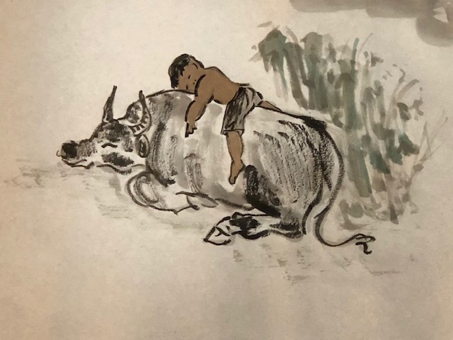
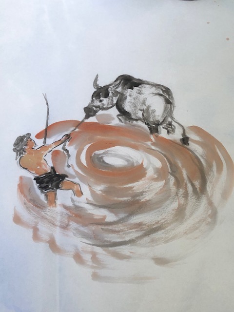
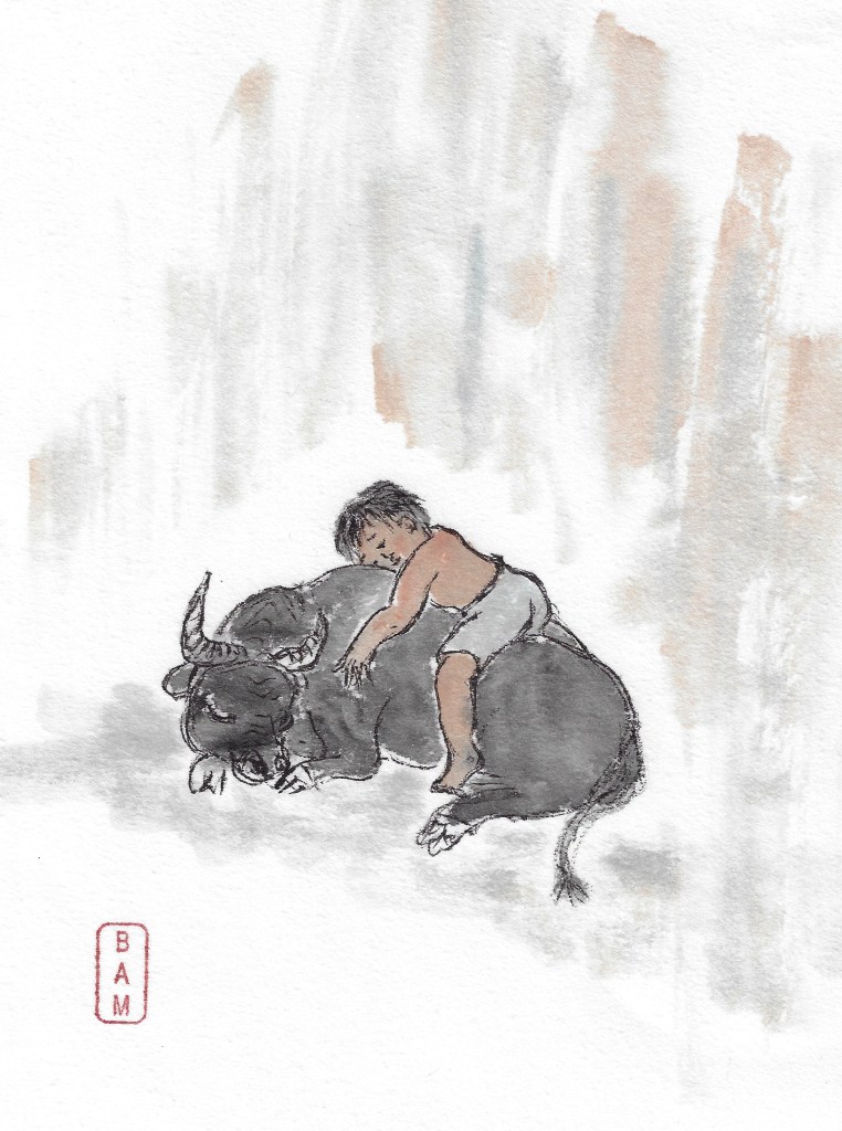
I focus on familiar vignettes and then try some totally new ones. The ‘new’ ones result in facial features going wonky (68 and 69 on the upper right below) but I return to a much-loved pose with 70 (boy asleep on beast’s back). The brush has a mind of its own and mistakenly my rough sketching yields an oxen body too long out back…not to worry, in goes some contextual grass/weeds and the boo-boo is painted over. Ta da.
I now know painting 100 oxen is doable. I am on the home stretch!
Day 8 February 6 (71-80)
Buoyed by the previous day’s recovery on the elongated behind, a self-reminder that the wonky faces don’t really matter in the overall scheme of things, and some influence from my idea book, I start the day incorporating Zhang Guang’s head lifts on a pair of oxen. I try a do-over of a herd in the marsh inspired by my online FB ox-man painter; I painted this grouping a few weeks ago in green tones but chose morning light/vermilion tones for today’s efforts.
The art card shown at the top was made from an earlier painting of this herd using green tones: today I gave the scene some burnt sienna for a different look.
My ox-man painter had presented all adult beasts but I sneaked in a calf in both my efforts. To make up for the huge gain on numbers achieved with the herd, I tell myself to up the ante and try two totally new poses for herder and best with the last vignettes of the day (79 and 80). The thick-and-thin lines to the boys’ limbs go quickly, the lines in the oxen feet do so as well, and I am pleased with the ease of rendering my vignettes. Alas, the facial features end up a tad wonky again. I manage to blot up a spillover of skin tone on 79 with water and paper towel; when dry the would-be boo-boo hardly shows. Good save.
Here’s all ten for Day 8
Day 9 February 7 (81-90)
Overnight I dreamed about my final days and ponder what challenges I might still tackle. I discovered an ide for the big finale at 100 and am tempted to ‘paint a herd of ten sleeping’ and advance to the home stretch. Nope, I reign in the temptation and tell myself to consider some more swimmers and working beasts. 85 is a girl facing backwards on a beast and her wayward limbs require another ‘fix’. (She has flying hair and a hat on her back to cover up a misplaced shoulder. Look for it.) 86 is a working scene involving an adult (not the same proportions as children, so always a challenge when you have just been painting children for the last few days. Adjust your eye.) This comp (and some in the last ten) is based on one in a small instructional book purchased from Oriental Art Supply (OAS) in California. They stock a series of such small books and are great value for the money; I bought at $8.00 US and now they charge a bit more, but are still good value.
Day 10 February 8 (91-100)
The last day of my project has come. Again my dreams were filled with ideas for these final scenarios. My idea for 100 has stirred up concerns: there’s only ONE chance at what the brush lays down on the paper and my idea entails facial features on a much larger scale than I have been working for the last ten days. I have to put that final vignette out of mind while I get 91-99 painted. This takes some mental disciplining. My intensity results in 91 and 92 appearing in larger scale than intended. The first is painted after another of the instructional ones in the little OAS book: beast and boy at waterside cooling off. I love the thick-and-thin lines in the beast’s backside. I decide his front feet should be showing but can’t work them out to satisfaction, so cover them up with the grass. While I tend to paint a full head of black hair on my little ‘cow herders’, my online FB ox-man painter usually paints the traditional forehead tuft of hair. In my 91 the tuft seems to work better with the pose, so tufting it is. In 92 the tufting helps separate the boy’s head from the surroundings. I paint some of my favorite untried poses for 93 through 98, and then aim for a beast running swiftly to my finish line. Oops 99 worked out to be smaller in scale…and his face is wonky. Not to worry, this whole scroll was to be challenging AND fun. It has been. On to the final.
100 emerges somewhat as planned. I start with the ox (eyes first, horns, ear, head, nostrils and chin) and dab in positions for the eyes of my child. Eyebrows, forehead and cheek line, nose, mouth and chin follow. I quickly sketch the torso with shirt and limbs, then start filling in the hair. I realize I am forgetting to breathe. Not good. (The voice of an old friend and mentor reminds me, this is it: the last image. SO DON’T SCREW IT UP NOW!) I texture the ox, wash skin tone on the child, and drop color where it’s not planned so scuff in more color around the duo to make it appear planned. Add the date and sign it. Done. Let it dry. Clean my brushes…
Reflections:
If you want to paint a large project, start with what you know, think in increments, and go for it.
Gather lots of resource material to maintain the flow of inspiration.
Be confident with your abilities; apply the fixes you’ve learned from others and have done again and again.
Keep moving. If facial features go wonky, finish the vignette and start another. Who cares. Turn off that left-brain critic and calmly clean your brush for the next load.
Avoid the easy outs and face the challenges you wanted to face; you’ll be happier for it and maybe advance your skill.
Favoring animal painting over the ‘bird and flower’ conventions of Chinese Brush Painting (CBP), means I have studied ox painting before. (See previous blog post here.)
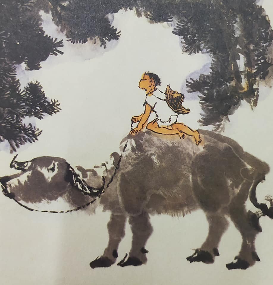
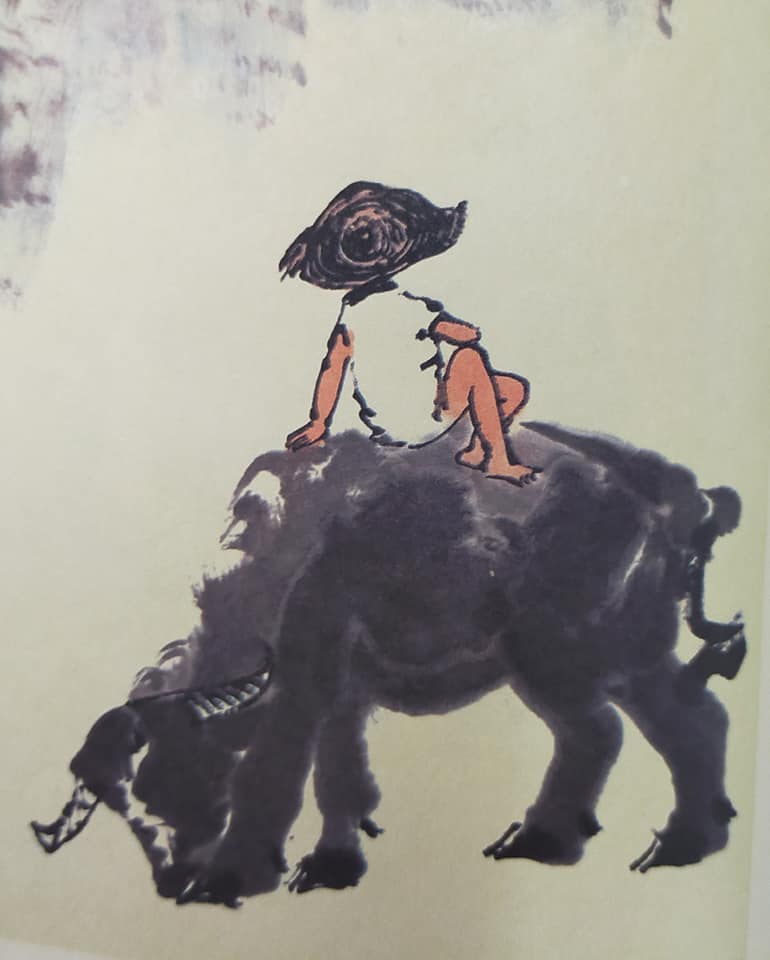
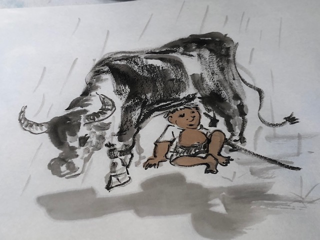
With the approaching ‘year of the ox’ (Feb. 12, 2021) I decided to spend some time building on my repertoire of ‘figure painting’, specifically the little boys that customarily accompany the water buffalo to and from their worksites, usually the rice fields.
While young boys typically are tasked with tending the beasts, and thus can be commonly found wherever the animals may roam, their presence in an ox/water buffalo composition serves an additional purpose: contrast. The relative small size of the boys next to huge, lumbering beasts with pointy, curved horns and sharp hooves satisfies that oriental appreciation for opposites (ying and yang). In reality, water buffalo are very docile, gentle animals, easily manipulated even by the smallest of tenders or cowherds.
When translators mistakenly call them “cowboys” I have to chuckle; these little boys with soft hands and chubby cheeks are a far cry from our true western cowboy, those rugged, leather-skinned, spur-jangling men in high-heeled boots and dusty hats.
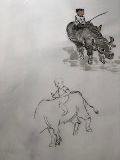
From my files featuring cowherds with water buffalo I have identified ten categories of typical activities they engage in. For each category I set a goal to sketch a minimum of three poses I could later use in compositions.
Figure painting basics:
Cowherds in Asia wear simple clothing—white shirts and black shorts—or a simple white loincloth and no shirt. Occasionally you see them with a hat. I prefer to give my little boys a full head of dark hair, although many artists show them with only a tuft of hair at the forehead.
The basic approach is to lightly sketch the shape of the boy using a detail brush and pale indigo paint. I start with the eyes/face, build the head around that, add neck, trunk, arms, lower body, and legs. Once satisfied with the general sketch I pat it dry and carefully pick out (outline) the boy’s shape with a fine brush and ink. When the outline sketch is dry I add skin-tone color (mixed from yellow, vermilion and a touch of ink) and color in the shorts. I prefer the look of a loose, quick sketch to one where the lines are exactingly placed and carefully connected. These little boys tend to be active and alert, so quick sketches portray some of their energy.
I have observed that some artists work from broad strokes in skin tone color, then add outlines for the face, limbs and body. i have tried that method and find that it makes you consider the posture of the boy very, very carefully before you begin. My method allows me to devote full attention to each additional element in turn, once those eyes are in place. If it works, no need to change…but until you try it you don’t know if there is a better way than the one you use!
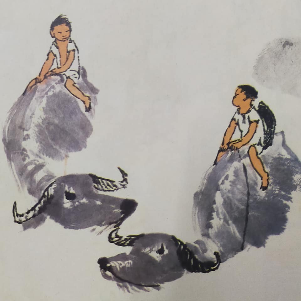
With this list in mind I completed numerous studies; here are my study sheets for riding, leading, and making music:
I selected a few postures I liked and completed small compositions:
I found that after painting water buffalo in different poses I had greater confidence in painting individual beasts; my familiarity with their body parts (and how to alter them for a different view) increased with practice. You may even have spied a bit of calligraphy on the ‘head-on’ lone ox painting in my second grouping above–the Chinese symbol for this member of the Chinese zodiac is a rather simple character involving two strokes. I have been entertaining the idea of attempting a ‘One Hundred Water Buffalo’ scroll painting to mark the Year of the Ox. The challenge of composing different vignettes with my water buffalo and their cowherds that flow meaningfully across a scroll is intriguing. Giuseppe Castiglione set the standard with his scroll of One Hundred Horses back in 1728. Others have tackled roosters. With several more months of imposed ‘house arrest’ due to a world pandemic, and no art groups to provide structure/direction to my art, a 100 animal painting may fill the need.
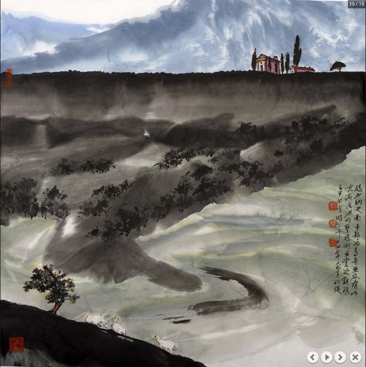
My father’s legacy includes a few wise sayings that are often repeated at family gatherings. One was: don’t worry about the rain that might be coming over the mountain, deal with what’s happening on the farm right now. It made a lot of sense when we were actually living on a farm in the mountains.
When painting a subject that you want to present in a rainy atmosphere—bamboo perhaps, a lotus pond, ducklings, people carrying umbrellas, etc.—you do have to consider how to convey the effect before you even start the composition. You’ve got to know what’s ‘coming over the mountain’.
With ‘bamboo in rain’ the ancients have figured it out for us and good examples of bamboo leaves hanging down in rain are often included in bamboo instruction manuals. Johnson Su-Sing Chow in his Book of The Bamboo devotes several pages to discussion and illustration of painting bamboo in rain. You don’t need any slanted lines of rain bashing at the plants to know it is raining; the nuance of the leaves says it all.
Chow paints each leaf with a downward bend to suggest the weight of raindrops.
Tips from Chow:
At the time of the rain or shortly after, branches are weighted down; short branches bend slightly, whereas longer ones have more obvious bends.
All leaves should point downward, weighted by the raindrops. Leaves often curl up in the rain, twisting at the base or just at the leaf tip.
Thinner canes will bend more than heavier canes.
Paint bamboo in rain in the usual order: canes first, then branches, then leaves in front and finally leaves behind those in lighter shades. Paint leaves on one cane at a time so as to consider their clustering and placements.
For subjects other than bamboo, one has to consider how they are affected by the rain and provide details such as crouching, hurrying, or holding up a deflector of some sort. All plants will droop and solid objects might show spatter or puddles.
Some time ago while pulling lessons from the great Hokusai’s instruction manuals (See site here.) I collected several examples of people and landscapes in rain. (Those from his lesson books are shown in a slideshow below, and thus have composite strokes shown in the margins.)
Hokusai’s deft touch in conveying a rainy scene primarily relies on slanted lines: close together and obliterating parts of the forest in a landscape, and further apart when dripping down on a pedestrian. He provides umbrellas to his pedestrians (most of the time) and bends their limbs as they strain against the stormy elements. (I truly don’t know what is meant to be happening with the pedestrian encountering a giant snail in that one little scenario!)
My interest in conveying rain in a painting arose this last month when building on my repertoire of water buffalo and the young herders that are often accompanying them. They are typically out in rice fields or wandering their way homeward in compositions. Here is the scenario I painted that suggested the animal and his herder were caught in a downpour.
While some elements of the composition suggest rain is falling, I considered how else such misty weather could be conveyed. I recalled having saved an unusual pose of a kingfisher with rain drops bouncing off his beak. Clearly rain streaks were painted with white paint over a dried painting. I tried that with my herder hiding under the lotus leaf:
And then tried to emulate the kingfisher comp. Bird Woman often reminds me of the old convention that one should never paint a creature larger than it appears in real life. The ‘larger than life’ kingfisher did come across a little creepy; I considered that had he been painted with more backdrop that ‘creepy’ effect could be diminished.
Rain versus snow?
Winters where I live offer more rainy days than snowy, so I have lots of inspiration for compositions that call for rain. The trick in conveying rain is to paint in white streaks on a DRY composition; painting snow falling involves dropping wet white paint on to a WET composition.
Stopped at a red light last spring I snapped this composition that calls for painting: umbrellas, tulips, puddles, grey skies and fresh green grass all speak to a rainy day. I just have to replace the raindrops caught on my camera lens with white paint streaks.
P.D. James famously described perfect autumnal days as occurring more frequently in memory than in life. That is how I think of snowy days when folks around me start rhapsodizing about their love of winter and that fluffy white stuff. But when it comes to painting a card to convey Christmas greetings to family and friends, snow comes first to mind.
I have experimented over the years with painting snowy scenes and the process is quite straightforward: you paint a suitable scene—landscape, a creature outdoors, or bird on a branch—then throw a wash over the sky, and while it is still damp, splat in opaque white paint.
The white paint splatter lands in droplets, which diffuse (slightly) into the sky. Your sky can be a warm-colored burnt sienna wash or blue-ish, or any shade you think enhances your scene. I favor indigo tints. You can also touch up the snowflakes in the sky using a brush loaded with white paint (diluted or not); this takes practice and patience to get a natural distribution and a variety of round-shaped dots.
One of my first attempts at a snow scene was this one of a cat outside in falling snow: hindsight says the snowflakes were a tad overdone.
Another painting from about the same timeframe (2010) is this scene of a favorite building (Goward House), which I made into a card. Note that the scale of the snowflakes relative to the building would imply these flakes were about four inches in diameter!
Below is a close-up of the sky; note the variety in size and distribution of snowflakes.
A few years later I painted several rural scenes featuring snowy weather and one I made into a card.
Pandas are another subject that can be given a snowy setting as I did with this next one.
December snow jobs
My most recent snowy scenes were again largely attempted because of the approaching Christmas season. A monochrome painting of Asian deer found online inspired the composition below. I admired the positioning of the deer and liked the challenge of the variety of poses.
After painting in the pine, and the addition of snow on branches, I realized that the front quarters of the second from left animal were twisted unrealistically. I decided to use the painting to attempt a “fix” that would involve careful layering of white paint solutions over a dampened surface to both cover the offending front leg, and also blend seamlessly (without a watermark edge) into the indigo tinted background. This is the kind of thing you want to be able to execute with confidence when trying to salvage an otherwise really good composition. (A different kind of “snow job” you might say.)
I ended up with what seemed to me a glaring white area next to my deer; it can be difficult to judge such “corrections” because once you know it is there, you tend to think it is obvious to all viewers. Once I had the painting glued and drying on a board I attempted a further “fix” by moistening the area slightly with a damp brush and then applying a light indigo wash to tone down the glaring white. The dampness was required to help avoid a watermark. I think it worked.
The second snowy scene to provide challenges this month involved posing horses in a different way. I have painted a team of horses in profiles as well as viewed from the sleigh or wagon driver before, but not as viewed head-on. The foreshortening required is tricky enough given the four legs, but then there’s the need to suggest (if not actually show) quite a bit of harnessing materials—those numerous parts needed to hitch your team to the wagon or sleigh. The most prominent is the breast collar circling the horse’s chest and the hitch extending from the wagon between the two horses. Then there are all kinds of leather lines and sometimes decorative trappings like bells and brass plates.
With the aid of a few photos I worked through most of those details, but then took on placing my sleigh and team emerging from a grove of sugaring maples. Thanks to numerous visits to sugar-bush sites (in Ontario) that have offered horse-drawn sleigh rides I had photos.
Here is my composition ready for the final step of misting and splatting with droplets of white paint.
And here is the composition once I made snow.
Tips for snowing on your paintings:
Splatter wet paint on to a damp surface. This could be your just-finished painting OR lightly mist and blot water over a dry composition.
Practice with the tools (brushes and tapping tool such as a ruler or another brush) and paint solution before moving to your good painting.
Strive for a variety of droplets and distribute. You don’t want the subject to look like Swiss Dot fabric.
Prepare to blot with a damp towel to remove white globs of paint; most paper is quite tough and can withstand some scrubbing.
You can always touch up the snowflakes (one flake at a time!) with a pointy brush while your snowy composition is on the drying board should you notice glaring irregularities in your snowy scene after final gluing.
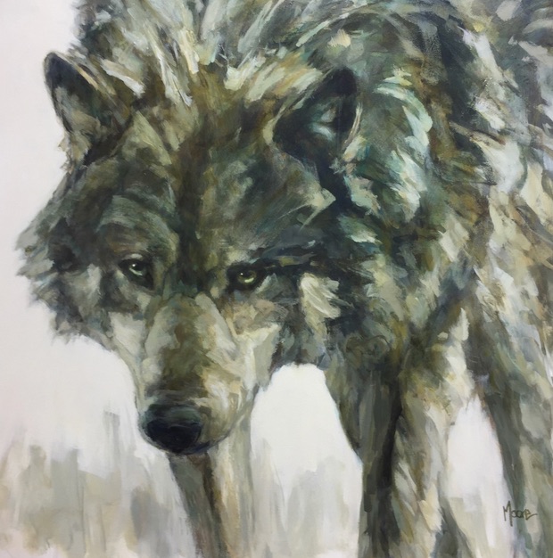
Inspired by the acrylic wolf paintings of artist Andrea Moore, and determined to paint wolves in moku style (because it can be more expressive than linear style Chinese brush painting for some subjects) I scoured my library and online sources in search of direction.
I also brought to mind two very real wolves that had captured my imagination in recent months. One was Takaya, the lone sea wolf who lived mostly on Discovery Island, just off shore from my home town of Victoria BC for the better part of nine years.
Taqeya the wolf, he swims between the islands within sight of Victoria, feeding mostly on seals and occasionally keeping vigil on the rocks, to the delight of people on passing boats. Residents of the B.C. capital say they sometimes hear him howling in the night. (Cheryl Alexander/www.wildawake.com)
The second was Number 8, a runt in a litter relocated to Yellowstone National Park in the mid 1990s from Canada as part of a hugely successful restoration project that not only restored wolves to the wilderness they once populated, but also re-invigorated the entire ecosystem of the park. See this video.
In my research on wolf drawing I also discovered a very helpful blog post from fellow blogger Monika Zagrobelna. She provides excellent illustrations for her insights, including visuals showing fur direction and common wolf coloring.
I thought I was well prepared to sit down and figure out how to paint wolf in moku style. But before I could advance to that intended goal I found I was sidelined yet again. This time the tangential creations all had to do with foxes.
My side trip to fox painting is understandable when you consider how closely related are foxes, wolves, coyotes and of course dogs. Add in the fact our creative processes often involve “relational” thinking: X is similar to Y in this way, X is different from Z in these ways… The part of me I directed to consider wolf painting bogged down with how painting wolf differed or was similar to painting foxes. I have painted foxes in moku style before.
Although I had not blogged about the experience, I had indeed spent many hours exploring brushwork to convey the ‘essence of fox’ on rice paper. Here is one successful painting, in the manner of Cheng Yang.
I had also pulled together several resources from my CBP library.
Resources for fox painting in CBP:
1. Cheng Yang in Traditional and Contemporary Chinese Brush Painting using water soluble media
2. Rebecca Yuein Techniques for Painting Animals
3. SadamiYamada in Complete Sumi-e Techiques
4. Fang Chuxiong in Painting Cute Animals.
Foxy Features:
I suspect another compelling reason my brushes defined foxes and not wolves when I launched into my most recent studies is that I was more familiar with foxes. The pointier nose or snout, the rich reddish fur, and delicate “foxy” face features were already inside my head. Wolves are a reclusive animals, and my sightings were mostly of creatures loping across highways or meadows. Foxes I have seen up close and personal.
My Fox Studies:
Here are several fox compositions I painted one recent afternoon.
The one up front is the strongest example of moku painting. Only a few ink lines were added to the body after brushing in colored strokes to depict body parts. This little image was painted in the manner of an old Japanese painting showing a silly fox dancing with a lotus leaf on his head. If I painted a wolf in this manner it would quickly resemble the Disney versions of mythical evil wolves and NOT capture the essence of wild wolves as I would like.
Back to the (moku) wolf challenge:
As I pondered the brushwork for depicting a fox and considered how to adapt my color, strokes, and shaping to depict a wolf I realized there were significant differences in their bodies and fur that exacerbated the problem.
When painting in moku style you depict animal heads, trunks, abdomens, limbs and tails with single strokes wherever possible; you use circles, arches, lines and other blobby shapes to convey the distinctive anatomy of the subject. You overlap strokes and leave selective areas white. This works well for a fox because it has a distinctive pointed snout with white around the eyes and a triangular head. The ears are pointy, the front and hind legs are slender, its coloring is quite evenly reddish brown, and its body can be depicted with relatively smooth strokes. Capturing the essence of fox in moku style is relatively straightforward.
But when you take on painting wolf in moku style there are immediate challenges, the most problematic being the fur. Very young wolves might be easier because their fur at a young age is simply fluffy. But a mature wolf has fur with a dense under hair as well as an outer hair, and all that hair is directional on the body. (See Monika’s blog for greater understanding of the importance of that.) The fur is BEST shown with some texturing, hence is better conveyed with texturing or broken brushwork, hallmarks of the outline style of CBP.
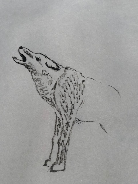
I tried to capture the distinctive thick mantle or cape over a wolf’s shoulders, the muscular legs, the lowered head and fuller nose of a wolf using strokes of grey tones, and then light brownish tones. Here are two quick studies of wolves crossing snowy terrain.
I then tried a head-on pose, striving to get the yellow eyes and muzzle screaming “wolf” and progressed to the furry body. Again, conveying fur without underlying texturing simply didn’t seem to work. I finished this painting of a wolf looking out from birches and am pleased with the overall appearance. But the depiction is NOT traditional moku painting.
The fur of this wolf is depicted with side strokes but i still had to use ink for the facial features; I liked the effect enough to brighten up the birches, glue the painting and put it into a frame.
Back to the resources:
In months past I have played with the texturing techniques of Fang Chuxiong in painting foxes, kittens, squirrels, goats, apes and monkeys. He demonstrates two approaches—1. Ink in texture and overlay color washes and 2. Stroke appropriate shapes for animal parts and then overlay with darker colored texturing.
I have also played with the techniques Rebecca Yue illustrates in her animal painting book. She calls the method “broken brush” painting and uses it effectively for a wide range of animals, sadly (for me) no wolves. BUT, I just discovered she elaborates on her method with SIX different ways of “breaking her brush”. That warrants further study.
We grew up in fear of the “wolf at the door”. It took me a while to determine my parents and grandmother were speaking figuratively (life altering abject poverty) and not literally (the wild beasts occasionally spotted in our wilderness home environment). We did, after all, have moose, cougar and bear all stroll into the yard at various times, and the bull moose did clamber up the front steps for a quick peek in the window.
I also had difficulty associating the exaggerated slavering snouts and scrawny body parts of the illustrations in our fairy tale books with the reality of the magnificent furry beasts loping across our fields or highways. Even as a child I understood they were an integral part of the great balance of nature.
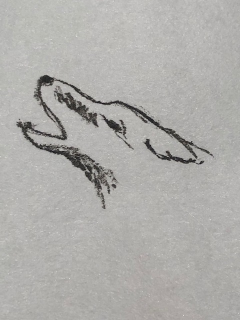
A few weeks ago as I puttered at my art table trying to paint the mountain slopes of my childhood, a long ago imagined pair of wolves I conjured in order to match the eerie howling we heard in the valley came to mind. I could clearly “see” two furry beasts howling from a mid-mountain ledge. Sketching them in seemed only fitting.
Resources:
It is best to work with good photographs of animals you are not familiar with; wolves are a favorite subject of nature photographers and images can easily be found online.
In my Chinese Brush Painting (CBP) studies I have focused on dogs before, mostly concentrating on small breeds. And out of tradition I studied the Pekingese, that quintessential Asian lap dog. See Links here and here.
For the wolves in my painting I needed only to understand the details that would make them appear distinctly “wolfish”. None of my CBP books address wolf-painting per se, but I quickly found several good photographs at some of the national park websites.
Dogs vs. Wolf
For anyone who wants to dwell on what makes a wolf a wolf, there’s plenty of well-illustrated material online. Here’s just two such links I found helpful: the first compares wolves, coyotes and foxes, the second zeroes in on wolf characteristics.
This one notes differences largely in behavior and temperament. Differences in number of teeth, nature of scat, breeding, maturation rates and footprints are discussed, but likely do not affect a painting.
The breeds of dog most closely resembling a wolf are the German Shepherd and the Husky: fur coloring and relative sizes are very similar. However key differences do commonly present and they can be important in a painting. Some of these come to mind:
The tail of a dog may curl upwards, a wolf’s does not.
A dog may stand with its head held upright at a ninety degree angle or even “pushed back”, i.e “aloft”; a wolf tends to stand hunching its head with shoulders slightly raised. Yes, it looks more menacing, which is part of its nature. You want to be sure to show thick muscled shoulders or “ruff”. Forget the scrawny, wasted caricatures of old fairy tale books—they do no justice to the spirit of a wolf. Of course posing a wolf with its head pointing at an upward angle with mouth open clearly conveys “howling wolf”. The prominent teeth should be visible and its snout slightly shorter and fuller than for a coyote.
The wolf’s eyes tend to be smaller and more slanted downwards at the centre than in a dog, important if you are painting a full frontal view. The eyes will be yellowish if you are painting in color.
The chests on dogs tend to be broader and the feet solidly under the body; they rarely splay. The chests on wolves are narrower and the feet often splay outwards rather than appear directly below the body.
If you want to depict a specific kind of wolf you may want to check out details concerning fur color, tail size and color, and so on. There are 38 subspecies under the category of Canis lupus and some are now deemed extinct. I was surprised to learn there are several reddish or cinnamon colored subspecies. See this link.
Wolf packs are social groups and when you depict a group you will want to show accurate positioning relative to others; using photographs for reference instead of another painting is therefor most important when painting this creature.
Whistler B.C. is home to artist Andrea Moore who paints large scale wolves in acrylics. In the examples of her work below you can see she knows what she is doing! Look at those slanted yellow eyes, the hunched shoulders, and (in the twosome) the slight splaying of the legs.
Painting a Wolf with a Chinese brush:
As usual when painting animals in the CBP manner your first decision is whether to fully line the creature in ink and wash with color or ink tones, OR to depict it in “boneless” manner, using colored/toned brush strokes to define the shapes and body details.
In both cases I would start with the eyes and facial features. As my first “need” for a wolf in a composition was to depict one or more in moonlight in winter I opted to try several poses with simple inky washes over outline “sketches”. (Painting in the “boneless” style would result in images more like Ms. Moore’s above.)
Below is the procedure I followed once I had found a few photographs of wolf pairs and groups. A lone wolf howling at the moon is a classic wolf image; wolves hunting are another
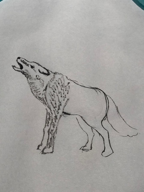
My studies:
I started with a simple pose of a single wolf in profile.
I can see that I will have to work on texturing to define the rounded shapes of limbs, darker where the body part would be shaded behind or under another body part and lighter on the parts that struck by light.
Here’s my second small study:
Putting together my mountain slope techniques with the wolf poses I completed the painting as envisioned and here it is on my drying board.