Spitting image, the Bactrian Camel


The camel and I have something in common: we’ve both been called ‘refractory’. The camel in a memorable poem by T.S.Eliot titled The Journey of the Magi, and I by my paternal grandmother on more than one occasion. (She knew using ‘big words’ would get my full attention, more so than a whack or a holler.) There the similarity ends.

I could fade into the sea of grey-haired grannies in my city with ease, but a camel sauntering down the street would attract a crowd. They are such clownish-looking mammals with many features to excite a paintbrush or sketch pen. The camel was a favorite subject of one of China’s late, great painters, Wu Zuoren 1908-1997), renowned supposedly for his ‘depictions of natural scenery’. Most of us who study Chinese Brush Painting (CBP) think of him as the ‘camel guy’.


I’ve looked at Wu Zuoren’s work before, admiring his pine and crabs. I saw examples of his camels, but never truly LOOKED at them. That all changed when a FB friend posted a video of Wu rendering a pair of his favored mammals. I was struck by two things: he started with body strokes (not the eyes and head) and he manipulated the ‘halo’ effects of overlapping grey washes to define muscle groups in an amazing manner. He also had a lot of fun defining comical facial expressions with those distinctive eyelashes, nostrils, and lips. Why hadn’t I noticed before?


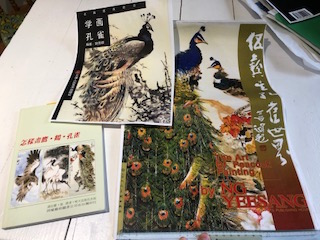
Now I wish I could ‘share’ a link to that video but unfortunately it was posted to a Chinese website I can’t navigate (See blue screen above). Wu’s method is enlightening to watch, and I was able to see his ‘process’.

Resources:

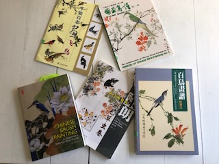
Once I was attracted to painting a camel, I had to research what the critter was all about. I knew they were affectionately dubbed “ships of the desert” and were once believed to store water in their humps. (It is fat they stock in reserve in those humps—one for the dromedary and two for the Arabian or Bactrian—and they can go for long periods of time without consuming water, and then they will slurp up gallons at one go.) I found a couple of books on camel painting in the CBP manner, and pulled out all my Wu Zuoren references.

  1. Selected Paintings of Wu Zuoren and Xiao Shufeng
  2. Mix Painting Camel (Chinese ed.) by Li Heng Cai

Camel Books

Distinctive features:

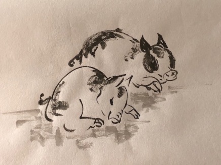
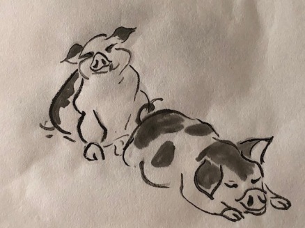
The Bactrian camel has numerous features that lend themselves to the nuances of Chinese brush painting. The long, upward-curving neck holds the head at a funny angle, contrary to the smooth neck of a horse, donkey, or even water buffalo. The head itself has those big flaring nostrils (that can be closed to keep out sand) and marvelous eyelashes. The animal also has numerous sets of eyelids to protect the eyes, including one set that wipes sideways like windshield wipers. The head topknot and small rounded ears also contribute to a haughty, disdaining demeanor. Add the fact they spit regurgitated stomach contents when in a bad mood—who wouldn’t be in a Zoo or after long trek over the desert—and you’ve got a most arrogant beast.

The following illustrations are from Li Heng Cai’s book; even without command of the Chinese language I can discern significant anatomical features and their relationship to other body parts.

Camel LiHengCai

Camel LiHengCai 1


As for the rest of the body, Wu  zeroed in on the hairy clumps atop the humps, the head, the chest, shoulders, knees and toes for great brushwork. He depicts many rear-end views of camels likely because of the ying-yang effects of slim tail contrasting the rounded butts. He also captures the gangly stride (camels walk with the two legs on each side in concert, unlike horses; this result in that distinctive swinging motion some say is the reason for the ‘ship of the desert’ metaphor.) The leg bones are shorter than in horses, and the feet appear flatter (two-toed and heavily padded for efficient walking in sand).

My camel studies:

I first had to spend time with my sketchbook, working out the proportions and relationships among all the distinctive camel facial features. The only real life camels I’ve examined were zoo residents who kept their distance and spit if they came close. I had to find photographs as well, as one should never trust another artist’s sketches to be anatomically correct, especially a CBP artist (exaggerating certain features to enhance the spirit of an animal is par for the game.)  Here are some sample pages from Li HengCai’s book that offered lots of fodder for my camel sketching:

This slideshow requires JavaScript.

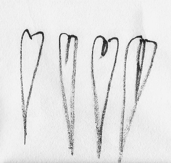
Then I discovered command of ‘halo-painting’ had slipped my mind. So, playing with overlapping grey washes was in order.

Finally I moved on to trying whole camels. I started with the eyes and head, as the approach was more comfortable for me. I cannot see why Wu starts with the body anymore than I can grasp why the great horse-painter Xu Beihong starts with the body and neck, not the eyes or head. My only surmise is they like to establish the ‘rounded’ belly/trunk first in order to position the animal, kind of like squaring off in a wrestling or boxing match.  My first camel paintings:

I want to work on ‘halo painting’ more and using various ink tones for effect.  The comical expressions on camel faces intrigue me. And I discovered I have instructions for painting camels using brown colors in a Rebecca Yue book, should I want to go beyond these monochrome studies.


Posted in Chinese Brush Painting, painting camel | 2 Comments

Red Bamboo says “boo”

As with so many of the traditional subjects in Chinese Brush Painting (CBP), bamboo has a host of conventions associated with it. Several of them have to do with what colors you use and how.

Diana Kan in The How and Why of Chinese Brush Painting notes that a painting of red bamboo can be placed in your home to ward off an evil spirit. That would only seem to work if you used Vermilion (and not crimson) as your “red”, as per the convention.

To obtain the right shade of “purple” in order to paint purple (aka black) bamboo—the canes are indeed purple but the leaves are green—you mix equal portions of ink with crimson red. Purple bamboo is a variety used for making flutes.

Depicting red or purple bamboo in compositions is another subject relegated to the back pages of bamboo instruction books or the last minutes of a workshop/demo. Likewise, until now, such paintings have only received my ‘last minute’ attention.  The subject somehow seemed fitting for a last minute post for the year 2018.

With Christmas in the air, and lots of red decorations about, I sat down to paint with shades of red on my mind. Some time ago I had ordered the four-color sampler package of red chips from an online CBP supply house. The four colors in the sampler are:

  1. CC04 Red
  2. CC08 Dark Red
  3. CC06 Crimson
  4. CC10 Rouge

I have had Vermilion (CC05) chips in my stash for years, using it mostly for flesh tones. (CAUTION: not all color chips will be exactly the SAME; the widest variation in tones shows up in my Burnt Sienna chips. Thankfully one can mix in red or blue tones to achieve the desired shades.)

My ‘last minute’ colored bamboo studies:

The red bamboo leaves on the left sheet were painted with crimson (the last row is thinned out and mixed with a bit of ink). Those on the right sheet were painted with Vermilion, the conventional shade for any Red Bamboo composition.

In a recent workshop artist Nenagh Molson showed us some color variations for bamboo painting that are occasionally used.  I tried a ‘freestyle purple stalk with freestyle green leaves’, and then ‘freestyle with ink outline for a purple and black combination.

With holiday celebrations cutting into my painting time, and new books providing new inspirations, the colored bamboo didn’t progress to full compositions.  I am still working on satisfactory clustering of leaves in outline style from earlier this month–much more challenging than traditional freestyle in monochrome ink studies.  Bamboo studies could indeed fill a lifetime!

Posted in Chinese Brush Painting, painting bamboo | 6 Comments

Most Ancient Bamboo style (outline/contour)

As I push deeper into the mysteries of painting bamboo I discover even more painting subtleties that can contribute to the overall effect of any CBP composition. The latest insights pertain to a style of rendering bamboo that some call “outline”, others “elaborate” or “detail” style. Yet another refers to it as “contour” style. Such paintings are sometimes included in the back pages of a book dedicated to bamboo, but very little instruction is given.

Basically the method entails “drawing/sketching” or “outlining” bamboo leaves, stems and stalks with a fine brush and then coloring in the shapes. When the coloring is done in layers of shades with drying in between, it is an approach I’ve previously learned to call “gongbi”.

Resources:

I have filed away numerous examples of bamboo painted in the outline manner, but so far have found only one manual that offers some direction: Johnson Su-sing Chow’s vol. 2 Book of Bamboo. He tells us there are TWO types of “outline” or “white sketch method”—Tan Kou or single outline and Shuan Kou or double outline.

outlineBambooBooks

I bought the book on the left for its crane compositions but soon discovered the artist Liu Shujun used OUTLINE style bamboo (similar to the treatment of narcissus grass on the cover) in several of his paintings.  The book on the right (by Johnson Su-Sing Chow) is the only one I’ve found that  addresses HOW to paint bamboo in outline style.

Chow’s accompanying illustrations and notes all pertain to what he refers to as Shuan Kou, or simply “white sketch” method.  Alas, he does not mention the Tan Kou method again, or explain the single vs. double line distinction. As my online researching was limited to English-only sources, I could find nothing more on the subject.

In workshop notes from local artist Nenagh Molson, the ‘single outline’ method is illustrated as outlining the outer edge of leaves; the ‘double outline’ method is shown with a second pairing of lines to suggest the central vein of each leaf , emerging from the base of a leaf.

SgleOutineBamboo

This is bamboo in ‘single outline’ or Tan Kou ready to be colorized. Note the few leaves that end slightly twisted; one has to plan to color those differently–usually darker–to indicate the underside of leaves.

DblOutlineBamboo

This is an example of bamboo sketched in the “double line” sketch method or Shan Kou. There seems to be some leeway in rendering the second (central vein) line: here the line is a single long stroke, some of my examples have a short little vee stroke, others a two-stroke shape that mimics the outer edge lines.

Earlier this year I purchased a book featuring crane paintings by artist Liu Shujun, and soon realized not only did he render the birds in pleasing postures and interactions, BUT he also used unusual treatments for many of the setting elements, his pine and bamboo in particular. On second look, I determined his bamboo in several compositions was done in OUTLINE style! The leaves in two comps appear done with mineral paints (one is green, one is blue) and that would imply they were painted green/blue first, as mineral paints must be applied OVER a color. A third comp shows bamboo in a soft blend of greens and indigo.

GreenTanKou

Liu Shujun’s bamboo above features a short vee stroke in the centre of each leaf for the central vein.

BlueTanKou

Here his double outline bamboo leaves are colored blue, with the central vee not quite as dominating.

IspyBamboo

The ‘second’ strokes are more prominent in his multi-colored Shan Kou bamboo.

I did manage to find an image of an old bamboo painting online, attributed to a Li Kan allegedly in the Sheong Gu style. (another spelling for Shan Ku?)

LiKanoutlineBamboo

I also found a book of animals by an artist named Xu Gu of the late nineteenth century (Qing dynasty),  that featured some loosely painted ‘outline style’ bamboo.

XuGuSquIrrel

Further research led to a web site for The Mozhai Foundation, a non-profit organization dedicated to furthering appreciation for Chinese art, where Xu Gu’s paintings were discussed.  Squirrels were among his favored subjects; the notes accompanying the above painting at the Mozhai Foundation site provided some insight into painting Shuan Kou style bamboo:

Stalks of bamboo enter the painting from the upper left. In contrast to the “boneless” brush used in Green Bamboo (cat. no. 3), Xugu employs the “ double-outline” method and fills in the forms with color. But unlike a traditional double outline, which relies on long, smooth, flowing lines, the artist employs a thirsty brush with scorched ink in combination with zhan 顫 (quivering), duan 斷 (broken), and nishixing 逆勢行 (reverse-momentum) strokes to outline the bamboo leaves. The resulting linework—rough, broken, and dry— captures the worn appearance of stele engravings and conjures resonance and rhythm that is simultaneously archaic and fresh.”

I then realized I already had some other XuGu paintings in my electronic files, stashed under squirrels:


At first I found  the squirrels rather cartoon-ish, but loved the bamboo; in time, the quirkiness of the squirrels grew on me.  His use of “contrast” as a design principle (arching tails vs. straight canes, line work for the leaves vs. fluffiness of body fur) and the choice of blue (not green) as a dominant color are obvious deliberate decisions contributing to the overall effect.  Outline style bamboo is “growing on me”!

Principles of painting bamboo in White Sketch (ShuanKou/Sheong Gu) or “double outline” method

According to Su-Sing Chow the tan kou and shuan kou are the MOST ancient methods of rendering bamboo. Incised drawings on ancient artifacts of bone, jade, bronze and stone are all predecessors to painting bamboo on silk or paper in this manner.

The lines should be “straight, clear, and accurate and all details must be shown with meticulous care” says Su-Sing Chow. “To learn this more difficult style of painting start by practicing the small branches or a leaf and do them over and over many times. Then try several leaves in a row until you can do them easily.

Leaf lines must be very fine and not appear like steel threads, according to Chow.  You want to render a leaf edge in a ‘thick and thin’ manner (varying the width of the line) and have the ends meet (not overlap/cross and not leave a gap). You want the end points of stems, on the other hand to be OPEN, not meeting or overlapping. (He would obviously be discussing the traditional double line method, not the Xu Gu variations.)

This is a principle that pertains to painting all trees and shrubs as well, but is often neglected by novice painters. To practice outlining leaves and stems so that you can meet your leaf tips, and leave thin stem ends open, all the while maintaining a thin line of ink that shows no hint of hesitancy or re-directing…..I can see why the method is deemed the MOST difficult.

Another tip regarding painting bamboo in this method is to REVERSE the usual order of steps in a composition.   Whereas in ‘freestyle’ (moku) one starts with canes, adds nodes then branching and finally leaves, in ‘outline’ style it is recommended you start with the leaf clusters, add the branches, and lastly the canes. Such an approach will allow you to better envision distribution of leaves in front of and behind branches and canes, according to Su-Sing Chow. He also urges practicing such compositions in ink only before attempting to add color.

Another principle I tripped over, and is evident in the bamboo in the crane comps of Liu Shujun, is to paint canes with joints, but not with the darker node lines. Small point, but with CBP, the ‘devil is often in the details’ so I will strive to heed the advice.

My studies of ink only, outline style bamboo:

Initially drawn to Liu Shujun’s crane comps I had played with his ‘double outline bamboo’ style before launching into a more in-depth study of it. Oddly enough I discovered on my own that it was easier to START with the leaves  before sketching in the canes! (See principles above.)

DbleOutvariations

There seem to be some variations to depicting the central vein when painting in the ‘double outline’ manner.


Once I acquired Chow’s directions for rendering the single and double outline methods I produced these:

I found the double outlines easier to execute than the single ones, and that control of coloring the leaves was tricky. (Using a specialty brush designed for depicting thin vine tendrils was also helpful.) Then I tried to emulate Xu Gu more closely:

MyXuGi

At this point in my studies Delightful Lotus pointed me to some pages in Diana Kan’s The How and Why of Chinese Brush Painting, wherein she addresses a method she called “contour style“.  Aha! Yet again instructions were minimal,  BUT the artist did add to my understanding of the outline methods for painting bamboo.  She provided several excellent examples of single outline leaf clusters AND repeated the direction to render the canes without node demarcations. She also suggested a short VERTICAL LINE above and below a node to further enhance the look of the cane (see below lower right). My Xu Gu study above would benefit from those vertical markings; the canes are rather plain without them.

Traditional ways to color in the outlined bamboo leaves and stalks seem to have emerged (light green undercoat followed by indigo highlighting), as well as some interesting combinations of elements of the “freestyle” and “outline” methods. White leaf veining (in single or multiple lines) over freestyle leaves is one, ink outlining over purple colored stalks is another. Those combinations also seem to be ‘back page’ methods seldom described. And in one inside cover of a book I found this splendid example of outline style bamboo using gold paint:

Gold Bamboo1 copy

Always practice bamboo, they say.  With SO MANY ways to portray it and variations on the coloring of outline style, I see more studies in the near future.

Posted in Chinese Brush Painting, outline style bamboo, painting bamboo, white sketch method bamboo | Leave a comment

Snow falling on bamboo

One of the most stunning ways to present bamboo in a painting has got to be with a generous dusting of snow on the foliage. As with all things bamboo-related, depicting such a vignette is no easy feat. I’ve played with this subject material many a time with not much satisfaction. Given my recent successes with bamboo clusters, I thought I’d give snow another chance.

There would appear to be at least three ways in which one can convey the presence of snow on bamboo leaves, branches and stalks. The oldest and most traditional manner is to simply ‘paint around’ imagined white lumps, depicting parts of leaves/branches that stick out of the snow. This method can also be improved with shading some of the snowy lumps with pale indigo or ink.

A second method involves ‘painting’ in the snow over top of a bamboo composition, using some form of white paint. Instruction manuals usually suggest ‘white tempura’ but there are a number of excellent white paints to have in your art bag. I use a brand called Doc. Martin, which is also useful for painting white highlights in eyes.  A small jar can last you a long time!  (You do have to take care not to sully it with ink.)

A third general approach is to compose your bamboo around areas portrayed as snow that are ‘masked out’ with a substance such as a manufactured masking agent, glue, or even milk. One could also ‘shield’ an area with paper and paint over top.

Resources:

I have numerous books on bamboo painting but most do not go beyond a basic introduction. Two that do address ways to depict snow on bamboo are:

  1. Leslie Tseng-tseng Yu in Chinese Painting in Four Seasons
  2. Johnson Su-sing Chow in Vol. 2 Book of the Bamboo from his four-volume set on the Four Gentlemen

I have also collected examples of snowy bamboo from other books addressing such things as pandas and monkeys.  And then there’s a wonderful video by Nan Rae on Youtube that shows how to render snowy bamboo in front of a moon. See this link.

My Studies:

I first tried using white paint over inky bamboo. I did prepare a medium wash of white paint,  thinking snow should appear lighter in some areas, but quickly found it disappeared.

SnowyBoo1

YusnowyBamboo

Yu’s illustration seems to have a slightly grey background which was probably washed on from the back of the painting.

I have used milk as a masking agent in the past with great success. This procedure takes some preplanning as the ink goes OVER the area covered with milk (and allowed to air dry or facilitated with a hair dryer). As the milk can be hard to SEE on white paper, this process requires some trust and imagination. But the benefits can be surprises that work better than you intended.

SnowyBoo2

the milkfirst

Milk on white paper is not easy to SEE! here it is still damp.

Johnson Su-sing Chow’s guidance for depicting snow by leaving select areas white was detailed, but his illustrations did not look too promising to me. Nevertheless, my third exercise was to try and envision how bamboo clusters would appear under snowy clumps. As expected, this exercise offered the challenge of painting PARTS of leaves.

SnowyBoo3

JSSCsnowyBamboo

This technique requires not only imagination to envision the ‘snow’ but also skill in portraying parts of leaves. What a challenge!

4. For the next exercise I ripped up bits of paper into rounded shapes and positioned them on my art paper. When the small papers refused to stay put I gave them a bit of spit and re-positioned them. Then I painted clusters as usual right over top of the ‘shielded’ areas. Some ink soaked right through the paper shields, but did so in a random fashion.

SnowyBoo4

spit happens

Spit happened! That seemed a good way to keep the bits of paper in place while I painted my clusters OVER the leaves. I grabbed tweezers to lift the shield afterward to avoid smudges.

INSIGHTS:

Reflecting on my exercises I concluded using white paint gave me more control over both the leaves and the snow mounds; the masking methods and the negative painting method (leaving snowy areas white) took more preplanning in terms of the leaf clusters and composition as a whole.  I have yet to play with the sky washes from behind to suggest white snow mounds on leaves and branches.

Here is an example of bamboo in snow done in the traditional manner of leaving white for the snow. You’ll note the background is given a wash that doesn’t touch the leaves and branches; I would want to cover the white areas under leaves and branches where snow would not have mounded for a more realistic portrayal.


SnowyBoo5

Here are two examples in my files of snow-covered pine.   I find pine needles easier to imagine and position sticking out of snow than bamboo leaves. Getting a brush to cut off the bamboo leaf that is under the snow is challenging.


Perhaps several more practice sessions are in order; I hope to be able to complete more than a single bamboo leaf cluster with snow on it.

SnowBirdbamboo

At my next art group morning I painted this snowy scene; I set out a few simple leaf clusters, all similarly hanging down as if wet and cold.


Posted in Chinese Brush Painting, painting bamboo, the four gentlemen | 1 Comment

Tips on (bamboo) tips

Always practice bamboo.

That’s one of the mantras often repeated in Chinese brush painting instruction books. It’s the sage advice of many an instructor. And it is advice I’m starting to realize I cannot ignore.

There is the one obvious reason: when you don’t practice, you get ‘out of practice’, meaning you lose your confidence in executing a simple leaf formation needed to finish a composition. Worst of all, if you’ve just spent hours on a complex painting you certainly don’t want to ruin it with a carelessly considered leaf that is too sloppy, too wide, too wet, too parallel to a nearby one, and so on.

Another reason for ‘always painting bamboo’ has to do with its versatility. You may have heard that learning bamboo is fundamental to all Chinese brush painting. If you practice (and study) the several elements of bamboo painting—stalks, nodes, stems, buds, roots, and the myriad shapes to leaves and clusters—you are more likely to discover something new that can be applied in other circumstances.

The last time I attended a workshop on bamboo painting given by friend and mentor Nenagh Molson her explanation of “tipping off” a bamboo stalk led to several insights about finishing paintings, particularly bamboo compositions. And it all started with her showing us the Chinese character for “bamboo” and drawing our attention to the hidden secrets in the calligraphic strokes.

bambooZHU

“Writing” bamboo

The calligraphic character involves four different strokes, two of which are repeated. The horizontal one should be recognizable to most CBP artists as the ‘bone stroke’. This time out Nenagh drew our attention to the very last stroke, that little upward stroke at the end of the character—kind of like the end of a J. It is also in the character ‘yong’ I blogged about here.

The stroke is called “gou” aka “yo” for those who want to know. Here’a a Youtube video showing how the character is written and you can also hear the pronunciation of each stroke.

Nenagh then showed us two ways to finish the tip of a growing bamboo stalk, and of course there was that little upwards hook stroke (see 2 below). The second way (number 1 below) was a variation, twisting the brush slightly differently.

IMG_1969

From there, we got to talking about numerous ways to define the growing tip of bamboo branches, and different painters seem to have their favourites.  In the following image of a well executed bamboo composition I digitally isolated the growing tips on numerous branches to show their similar completion. This artist has used mostly a slightly curved single leaf (a few are ‘broken’ or ‘split’) and the result is a consistent look to his plant. The weather conditions are probably sunny–not windy or rainy.

BambooTipMarked

I knew from last summer’s studies of Professor I-Hsiung Ju’s Book of Bamboo—the effort that gave me much confidence with defining clusters and even groves—that my own repertoire probably included three:

  1. the slender “new moon”
  2. a single straight stroke in any direction
  3. a long leaf extended and ‘broken’ in the wind
IMG_1973

I’ve recently added the upward ‘broken’ leaf treatment to my repertoire for bamboo leaves on branches. It is quite elegant placed next to a smaller slim leaf at the very tip. Do note how leaves emerge from opposite sides of the branch, NOT in opposing positions such as on ash trees.


My repertoire was thus up to five. After Nenagh’s workshop I went back to my books and files, and gained some new insights from various sources.

Insights

The Mustard Seed Garden Manual has numerous images showing ways to finish bamboo branches. I was pleased to see they did NOT advocate leaving a tip (even for new fresh growth, in the sun, facing upwards) that held two opposing leaves in a VEE formation.

When I see that in a composition the strong VEES look like bird tracks, and distract from the overall look of the plant. As a gardener, I know that maybe one or two branch tips may have lost their end growth but not all at one time (unless a severe pruning has just been done!).

In the MSGM the artist shows slim little end branch tips, or slim leaves (new moons abound) or long slender split ones. Should there be two opposing leaves at the end of a branch, they angle other than a vee, and they have a tiny bit of stem between them, if not a sheath around a growth tip.

IMG_1970

I went on to discover different clusters I had not tried before.

As often happens, the process of filing away workshop notes and flipping through files for specific treatments (bamboo branch tips) led to some new inspirations. I’m trying to get a better grasp of painting bamboo in outline or sketch method, and depicting it in snow. Those studies look promising…and I am trying to get in a habit of ‘always practicing bamboo’.


Posted in Chinese Brush Painting, painting bamboo | Leave a comment

Crested Mynha, essential bird

The first few times I noticed a crow-like bird sporting a distinctive tuft where beak meets brow in oriental art I thought it was an artistic expression. Perhaps it was a popular exaggeration of some bird’s spirit that had ‘gone viral’. I soon recognized the attractiveness of a bird that is mostly black and has features that can be rendered with some flair—the eyes, the beak, the yellow legs and feet.

MynhasMashup

Ling Mao Caochong Juan provides several pages of various crested mynha bird poses for inspiration. His book is in the middle of the bottom row in the next image.

I soon discovered the Crested Mynah is not indigenous to North America, although the species was introduced to Vancouver BC about 100 years ago and thrived for decades. It is classified as a starling (family Sturnidae) and thus not related to the crow (Corvidae) as closely as I guessed. It does measure in the nine-eleven inches size range similar to crows, sports mostly black feathers with some white markings, and then has that distinctive tuft emerging from the top of its beak. It is an easy creature to add to a brush painter’s repertoire.

Resources:

My shelves include numerous general bird-painting manuals, and several address the crested mynah. I favor the presentations of these five:

  1. Johnson Su-sing Chow, Vol. 2 in his bird-painting manual series.
  2. Yang O-Shi, 100 Birds
  3. Ling Mao Caochong Juan (Chinese Brush painting)
  4. Hao Bang Yi (Bird Painting basics, yellow cover series)
  5. Mei Ruo, Chinese Brush Painting, a beginner’s step by step guide.

MynahBooks

All five approach crested mynahs in much the same way and offer oodles of helpful poses. Oddly enough Yang O-shi starts her bird with the shoulders, and then adds the head and beak. The others all proceed in the traditional manner of beak, eyes, head, shoulders, body, wings, tail, and legs.

Bird-painting Tip:

Many CBP artists prefer the beak-first approach to painting birds, saying that if you get the beak ‘right’ then all else follows. Mei Ruo goes a step further and presents an image showing FIVE LINES one needs to envision as you lay down the inky strokes to a bird’s head: brow line, eye line, face line, cheek line and chin line.

BirdLInes

Painting Steps:

  1. With a fine detail brush and black ink define the beak; just behind and above the line that heads toward the bird’s throat from the upper bill define the eye (oval shape with dark pupil)
  2. Using black ink paint in the distinctive tuft above the beak and fill in the head. Note that this bird has a flattened oval head.
  3. Continue to define the bird’s shoulders using stabbing dry brush strokes with medium/light ink.
  4. Brush in the body, wings, tail feathers. The mynah has some white markings on its wings.
  5. Using an orange-yellow outline legs, then dab on scales in dark ink when dry.
  6. Paint the environment.

Here’s my crested mynah bird study sheet showing the steps; in the last panel I tried a few different poses.

In two of my early mynah bird comps I encountered mishaps–in one the legs went down too wet and started ‘blooming’ on the page.  I quickly blotted them and scuffed up the color with clear water.  I then dried the paper with a hair dryer and re-did the legs, taking greater care in moisture control.  This is a ‘hail Mary’ effort one should practice so that when you have to save a really complex comp you can do it with confidence. Look closely at this bird’s right leg to see if you can spot where the yellow was lifted from the paper.

IMG_1784

In another, moisture control again caused some grief in the final stages (see upper left corner leaf), but the result could not be saved:

IMG_1786

And then I painted a successful grouping of crested mynah birds (which realistically should have had yellow legs, but artistically have crows’ feet). These glued well and have now been chopped and framed.

IMG_1785

The simple markings of the crested mynha, as well as the potential for playing with the eyes, beak and tuft, hold considerable appeal.  This is one bird I may paint often.

Posted in Chinese Brush Painting, crested mynah, how to paint birds | 2 Comments

Ink, one of the Four Treasures

The weakest ink is mightier than the strongest memory.   (Chinese proverb)

Brushes and paper are the two treasures most often considered by those of us obsessed by Chinese Brush Painting (CBP). Ink stones and ink, the remaining two, seldom garner much attention, at least not on the same scale as brushes and paper.

StickStonebottle

Do I grind or pour, that is the question…

We spend time and money tracking down paper: we hunt for it in foreign markets while traveling, we purchase much more than we would ever use in order to have some for exchange with other like-minded scavengers, and we hoard it in our cupboards once we have a stash.

As for brushes, in reality we could manage with two or three—a large soft orchid brush, a fine detail brush, and a hake for applying washes efficiently. But the truth of the matter is that we succumb to the allure of just about every kind of painting instrument we see. Our brush pots, drying racks, and woven fiber rolls hold countless varieties—goat, sheep, wolf, badger, horse tail, squirrel, rat whisker, even some fashioned of human hairs. Then there are those of mixed hairs, some we have hacked up deliberately to create a ‘scruffy’, and even some we’ve used so long only thin wisps remain. All have their place in our hearts as ‘treasures’.

But ink? Other than choosing to use purchased bottled ink or grind our own from an ink stick, most CBP enthusiasts give ink little thought. I find bottled ink gets me to task sooner than taking time to grind. I know that the more traditional grinding serves a purpose: you clear your mind and properly ‘prepare’ for the painting session ahead. And if you select ink sticks with some discretion you can prepare a ‘stickier’, DARKER ink than you’ll get from a bottle. (Well, except when you pour bottled ink on a hot day and considerable liquid evaporates before the end of your session; that un-intended action can also lead to ‘sticky’ ink in the dish.)

THE book on Ink has been written!

There are times when a good work of non-fiction can outweigh the intrigue of fiction. The Social Life of Ink, culture, wonder, and our relationship with the written word by Canadian English professor Ted Bishop passes that bar and then some. His 2014 opus has been described as ‘part travel narrative, part hidden history, part cultural exploration’ and ‘fascinating, with writing as tactile and fluid as ink rolling across rice paper’.

inkbook

As a retired wordsmith, I indeed found every single chapter compelling and entertaining. As an enthusiast of CBP, I could hardly put the book down once I got into Part II The Art of Ink. Bishop outdid himself in researching the history of ink-making in China. He visited factories, travelled to the famed Yellow Mountain region where the best inks have been made for centuries, and even tried learning to ‘write’ a few Chinese characters.

Much to absorb

The best parts of the chapter on ink for me, aside from details of his factory visits, were the insights into ink additives and all the old secret recipes and the poems. One excerpt:

“Traditionally, credit for the invention of ink goes to the third-century calligrapher Wei Ten. In his recipe, after you’ve strained your soot and dissolved your glue in the juice of the chin tree, you add five egg whites, one ounce of crushed pearl, and the same amount of must, after they’ve been separately treated and well strained.”

Bishop’s research uncovered a range of ink additives to improve color, consistency and aroma, such as peony rind, pig or carp galls, pearls, pomegranate, and sandalwood. He notes over 1100 possible ingredients!!! I will never sit at my art table with quite the same non-reverent attitude again.

And then there were Bishop’s poetic discoveries. Beginning with Xue Tao, a Tang dynasty poetess (c. 770-832) the author cites relevant verse (translations) to enhance his cultural and social history.

‘Old pine burned forming light charcoal flowers,

The exquisite ink-making skills of brother Li

How describe the deep, cool shining color?

Darker than the fair lady’s hair, a crow flying in winter.’


And another, this from a poet called Chang Yu:


‘Burning orchid-lamps, we invited the moon to join us;

drinking wine, we plucked the strings of our lute.

Who would have thought that for another evening of joy

we would have to wait for thousands of years!

Now your wandering spirit is far away in darkness,

and only cold words are left, in your own hand.

The dusty ink still gives off a light fragrance,

the paper is torn, but still has its lustre.


And from Li Po (aka Li Bai), China’s equivalent of our William Shakespeare, part of one of his poetic tributes to ink:


Soot made of Shang-tang Mountain green pine,

Mixed with cinnabar powder of I-ching,

And orchid oil and musk, a precious ink is made,

Its glaze shines so luxuriously that one is afraid to use.


The servant boy with two coiffures brought it in,

Wrapped in a brocade sack, carefully on his arm;

With this gift from you I am going at once to the Orchid Pavilion.

When inspiration comes upon me, I shall write happily with my brush and your ink.’

Aftermath

I must find this book for my shelf of favorite bedside reading.

I should really put aside the bottle and grind my own ink, now that I am aware of just some of its reasons for being so treasured.

I will sew a brocade sack for my stick and my stone, to carry them as they should be carried.


Posted in Chinese Brush Painting, ink | 1 Comment

Spreading peace, love and joy: painting peacock

If you’ve been following my blog, you’ll know I like stories that illuminate the spirit of the creatures I study. The older and more legendary the story, the more appealing it is for me.  Several gorgeous peacocks greeted us at a local lavender farm recently and  prompted me to consult my art books.


This slideshow requires JavaScript.

The peacock, is probably the most striking and the most fabled bird of all time. Most legends concern its association with pride, its distinctive so-called “tail feathers” or its prowess at killing snakes. I found one blogger has already collected a host of such tales,  which made for delightful reading. My favorite story is one that explains how the peacock acquired its distinctive train feathers. See this link.

The tale ends by asserting the gift of a peacock feather spreads peace, love and joy. My CBP books claim it represents beauty, dignity, and high rank; it is also believed to ward off evil. That said, who wouldn’t want a peacock painting on their wall!

Primer on peacock:

Before delving into painting techniques I had to check out the bird’s anatomy. My first insight had to do with the peacock’s distinctive fan of brilliantly colored feathers: it’s NOT comprised of tail feathers, but is an appendage on his back that he allegedly uses in courting the ladies. Such a feathery construct would suggest to me the peacock is related to the Mandarin duck, which also has an unusual back appendage called a ‘sail’. I found no such proof or discussion.

peacock

This photo of a peacock posted in an art group forum on Facebook clearly shows the wing feathers with the collapsed ‘train’ lying along the bird’s back.

I learned there are primarily two species of peafowl in the genera Pavo. They both hail from Asia—the blue-headed or Indian peafowl (pavo cristatus) is originally from India and is designated the national bird; the green-headed peafowl (pavo muticus) is from southern Asia.

Oddly, both males and females of the green peafowl have brightly colored heads and feathers, whereas in the blue-headed variety, only the males sport the colors, with females presenting in drab brown-grey feathers. There is a third African species only found in the Congo Basin and aptly called the Congo peafowl, but it is not as widely known as the main two.

The exotic bird enthusiast who owned the lavender farm we visited had several peacocks strutting majestically through his meadows. He told us the white peacock is NOT an albino, but another species entirely. That recognition has only recently been made among ornithologists.

IMG_0828

Both males and females of the green-headed one sport colored heads and the distinctive feathered train.

The function of the elaborate train on peacocks has generated much debate; Charles Darwin launched the ‘sexual attraction’ theory. Others have expounded on significance of the size, coloring, and number of ‘eyes’ in the fan. If only peacocks could talk!

What an artist needs to know:

Now knowing there are basically blue-headed (male only) and green-headed (both genders) peafowl, I’m not as confounded by different head or body colorings depicted in paintings. I suspect the authors of at least two of my books on painting peacocks were not fully up to speed on these facts, as one shows blue-headed birds with and without trains (hence falsely depicting the female as blue-headed) and the other shows pairs of green-headed ones, with the supposed female lacking a train. (Oh boy, do let me keep the coloring sorted out properly!)

The bird’s head is triangular-shaped with a short, pokey beak and eye markings. The head sports a tassel. The train that can be raised into a fan-like structure extends off its back; wings are often speckled with wispy bits trailing from the coverts. The peafowl’s feet are scaly-looking like most bird feet, with long toes showing toenails on the tips (three forward, one back).

I am glad to have lots of photos from our recent farm visit to help guide my studies.

Resources and methods:

Painting peacock is addressed in many general CBP books that include birds, likely because of the bird’s popularity. Jane Dwight includes it in The Chinese Brush Painting  Bible and so does Yang O-Shi in her Flowers and  Birds: a perspective. Birds depicted in both those books have muted tones which I find less appealing than colors used in some specialty books I found. (See below)

Artist Ng Yeesang is featured in The Art of Peacock Painting (the large format one on the right) and it was his birds I chose to emulate.

peacockBooks

As one might guess, the peacock will consume large amounts of bright colors. It also takes careful consideration to choose an appropriate setting. Traditionally in CBP the bird is paired with peonies or placed on a tree limb, such that the bird’s spectacular train is displayed.

feathers

These close-up photos of real peacock feathers reveal train feather details.

As with any bird, starting with the beak and eye helps establish the bird’s nuance. Building the head and then neck and chest after that, works well. Sketching the body shape and array of feathers lightly is next. Then comes detailing of the head, chest and wings. The exotic feathers take several stages, starting with shading and definition of the ‘eyes’.

  1. Rough sketch outlines for your bird/s using very pale indigo/ink.
  2. Build up the sketch with a fine brush loaded with dark ink to show main head features such as eyes, tassels, markings; drop in details for body feathers (overlapping scallops), the main wing feathers that extend in arches, and horseshoe shapes for the eyes in the train.
  3. Continue to define the body feathers and the long feathers of the train. Each ‘eye’ on the train needs a dark ink ‘pupil’ with three concentric lop-sided ovals.
  4. Only when your inky under-painting is fully defined and you have shaded areas that will appear denser/darker, do you bring out the colors.
  5. Paint the (male) head first, a deep cobalt blue; consider using mineral paint on top. You can blend sky blue and indigo with the cobalt in your brush to suggest sheen to the short, bright feathers. Then treat each ‘eye’ to turquoise, yellow and orange markings. When the eye colors have dried, go over the whole train with shades of yellow-green, darker towards the feather ends. Any breast and wing feathers in sight should be shades of brown, orange, and grey.
  6. For a female bird, your sketch will NOT show a train. Her body should be slightly smaller than for a male, if you paint a pair. Her feathers are brown, grey, and orangey.

My first peafowl studies:


Wanting to define some of the fine details of the long train feathers with fine ink lines I played with using a horsehair brush on my Dragon Cloud paper.  I wasn’t too pleased with the subdued colors, but decided to try a full comp on that paper, hoping to bump up the intensity of the colors.  Here’s how my first few steps looked:

stepOnecomp

The female’s feathers need some tweaking as does the edge of the male’s train. I’m not happy with his wing treatment, but the foundation comp is worth finishing.

FinalPeacocks

As I sat back to consider the end result (did the rock need more color? should I employ a background wash? etc.) I realized I had painted the female’s head blue, as it appeared in the Ng Yeesang book; I’m not certain that is totally realistic! Wasn’t it the green-headed peafowl that presented with colored heads on both genders and the blue-headed variety only had color on the male’s head?  My armchair critics raised no objections, so maybe I will glue it after all. (I’ll get it right on the next one!)

Posted in Chinese Brush Painting, how to paint birds, peacock | Leave a comment

Boys and Girls together, figure painting

Any parent who has held a newborn knows the soft curves and tiny features that go into the beauty of human babies. Any artist attempting to capture childish glee knows the anatomy differs from that of adults in more than just size. You can’t simply outline a smaller version of an adult, add dimples and call it done. Nope, there’s much re-inventing to achieve, if painting children is your goal.

Among Chinese brush painters, there are some who do it best. The work of Zhou Sicong (1939-1996) comes to mind. I’ve yet to acquire a book of her work, but luckily a member of one of my Facebook art groups posted examples, and I now know a name for my watch list.


This slideshow requires JavaScript.


Resources:

To paint children, there are some basic anatomical insights an artist must have. You can likely find a few books in any art section of a library that detail such differences for people painting in any medium.

Here are a few from my art bookshelf:

PEOPLEBOOKS

Among the tips to know:

–Children generally have larger foreheads than adults; a child’s eyebrows should present at the (vertical) halfway mark on a facial oval, whereas an adult’s eyes will fall at that line.

–Youngster’s eyes are usually rounder and larger than those of an adult

–Adult bodies are realistically about 7 ½ x heads tall, but for centuries artists have drawn them closer to ‘eight heads tall’ to enhance the appearance. (And we thought airbrushing was a new phenomenon!)

My recent studies:

Armed with a new paintbrush-pen and several printouts of the Zhou Sicong compositions I first filled several pages of a sketchbook getting familiar with the cherubic facial features:


Then I tried a few with ink and colors:

IMG_1660cookingKids

IMG_1658

fishingKid

These were all done with a concentrated effort to get the head proportions ‘right’, so much so that I merely ‘roughed in’ the setting details.  Now is the time to go back and complete one with full attention to all aspects…but I just tripped over some wrapping paper from a dollar store that is calling my name.  Looks like Hokusai sketches.  The children may have to wait.


Posted in children, Chinese Brush Painting, painting figures | 2 Comments

To art room, to art room… to paint a fat pig

You may have noticed that not too many general CBP instruction books offer direction on painting the pig—this, despite the pig (or boar) being one of the 12 Chinese zodiac animals. Several of my books offer directions for “popular” zodiac animals, but exclude the domestic pig (Sus domesticus) and cousin wild boar (Sus scrofa).

The good news is that once you’ve mastered some line-drawing skills using brush and ink, and maybe painting wet-in-wet for body markings (or dry brush if you want that look) you can indeed paint pigs. You just have to learn some of the anatomical requirements: large head on an elongated body, snout, four-toed hooves, floppy triangular ears.

With a pig year fast approaching—2019—I’ve been considering porcine compositions.

pigcards

My stock of zodiac-inspired cards is down to just these three. The one in the middle was inspired by artist Cheng Shifa who painted a lot of domestic farm animals.


The one book in my CBP library that does address pig painting in some detail (The Beginner’s Guide to Chinese Painting Farm Animals and Pets by Mei Ruo) also introduced me to an all new breed of pig, the Panda Pig or Liang Tou Wu.

I guessed this species unique to China was named because it has body markings similar to the panda. Sure enough, Mei Ruo explains it commonly has black hair on the neck and on the rear, hence its name Liang Tou Wu, which means “two ends are black”.

Mei Ruo offers numerous tips for rendering attractive piggy paintings:

–strive to capture its unique body features—short stubby legs, rounded body, floppy ears—with thick-thin outlining and contrasting shades of ink.

exaggerate the mouth and eyes to suggest more of a grin, thus enhancing the facial features.

–pigs, oxen and goats are all cloven-hooved; the pig has four pointy toes on each foot with the two front ones touching the ground and the back ones lift up slightly.

consider angles when defining body parts: the ears are triangular, the side-view of the head is a large isosceles triangle, and the head viewed head-on appears more hexagon-like than rounded.

–in keeping with the principle that ‘foreground objects are painted with dark ink and background objects with lighter ink’ Mei suggests defining the front end of the pig in dark ink and lightening the ink towards the rear end in order to establish depth within the painting.

–because the pig symbolizes good luck, it should be painted with a smile.

He offers detailed directions for painting the panda pig in freehand style, explaining positioning and shaping of body parts. This old farm girl needed little help with the anatomy, but I did appreciate the reminder to use my thick-thin outlining more effectively.

Here are some of my studies from this afternoon:


pandapigssleep

I’ve tried to put in the ‘panda’ markings with dry brush.

Twopandapigs

Here I used wet-in-wet brushwork to define the ‘two-ends-black’ markings on fat pigs.

piggirl

I considered a comp showing pigs herded by a young child, based on an online photo; I simplified photo elements but didn’t get the pigs fat enough to resemble panda pigs. These look more like wild pigs and the child is not oriental-looking.

These two sketches held more promise as new piggy cards:

From three years ago I remembered this fun composition of three piglets in a basket which I’d left unfinished; it was painted based on Mei’s directions:

PigBasketBM

Pushing the two boy/herder sketches ahead with coloring I produced these:

I like both comps, but may have ruined the one on the left with the grounding. (It is too dark.)  His pigs are a little too ‘sketchy’ as well.  The one on the right looks more promising for a card.

Just after I finished these pig studies, a chance discovery of a terracotta pig in a local thrift store sent me back to the art room.  Surely this lovely critter will lead to some worthy pig paintings!  I’ve put out a request to the grandkids for a suitable name.


Posted in Chinese Brush Painting, painting pig | 2 Comments