My first mum festival

Life is what happens while you’re planning other things—such I learned a long time ago, but every so often seem to need a reminder!

Now I was planning to leave behind my studies of painting chrysanthemum, I was intending to move on to other painting subjects, I was seriously considering never painting a mum again. And then an owl came to visit us, a great-horned owl with large luminous eyes. She showed up one morning outside our living room window, hunting vermin and agitating other feathered creatures with her mere presence. I managed to snap a dozen or more photos.


So of course that sent me back to an old favorite artistic mentor, Huang Yonguy, the painter known for his socially critical ‘winking owls’.


This slideshow requires JavaScript.

This time as I flipped through my two lovely volumes of his work, however, it was not his owls or even his blue herons that caught my attention; it was a lady lying drunkenly in a field of large yellow chrysanthemums!

As I looked more closely I spied a second kind of mum in her reclining garden, a spidery one with deep indigo petals. I noticed her eyes were closed and she held an empty wineglass. Surely she was a devotee of the September Mum Festival, allegedly observed on the ninth day of the ninth month throughout China with garden tours and sipping of chrysanthemum wine.

My lady may have tippled a bit much, or perhaps was overwhelmed by the abundant floral splendor in her garden. I love figure painting and could see myself inking in those large sprawling heads of golden and blue mums quite easily…yellow is such a cheerful color, the greens and blues so soothing. Before long I had a loose sketch and was on my way to more mum painting than intended.

mumladysketch

The subject and treatment meant no need for great precision. Mixing the right skin tone went well and the yellow mums soon trailed across my page.

mymadymum prelim

Then I had to figure out a different kind of mum for some blue ones. Consulting Delightful Lotus, I had expert advice on ‘when to stop’ and ‘where to add’—one great advantage to art group membership! When I dismayed that my lady appeared greatly ‘influenced by the wine’ yet still held a full glass, Lotus came to the rescue with an explanation, and title! (A Full Life) :

It is a lovely day and the field of mums calls to me and I must lie among the blossoms….I must become part of them. The sun is warm and golden and I must feel that warmth. ….And here the glass of rich merlot fits comfortably within my slender reach…and I….one sip….and then….I rest.

FullLife

My painting after a first background wash; after it dries I will assess values and perhaps bump up the foreground.

FulllifeDetail

detail from ‘A full life’

Between painting sessions, while I pondered flower placements and treatments, what type of butterfly might be in my garden, and other such concerns I found delight in other figure paintings by Huang Yonguy. Then I painted this inspired group of dancers; I doubt anyone has ever made a ‘daisy chain’ from large mums, but the dancers seemed to need a chain of some sorts.

sunnyways

I think I’ll call this ‘sunny ways’.

I may not paint another mum intentionally, but I certainly will be looking at more of Huang Yonguy’s figures. They are such fun to paint! And yes, his owls are still captivating.


Posted in Chinese Brush Painting, painting chrysanthemum, painting figures | Leave a comment

Painting the fourth gentleman (part 3) chrysanthemum leaves

I am bewildered; despite learning lots of things about painting flowers in general and the chrysanthemum in particular, I’m finding I have to push myself through these current studies. C’mon, inner painter, get over it! Disliking the mum in the garden should have little bearing on learning to paint it.

I’ve flipped through my books endlessly, reflected on the features of certain painting styles I like, considered what much-loved animals I can paint with the mum, narrowed my challenge to just two methods for representing them in ink, played with colors and petal formations…and yet, my desire to paint them is still rather low key. But this is a ‘must-do’ as far as Chinese brush painting goes; I’ve got to trust that there are benefits to be gained from plumbing the knowledge base for painting this fourth gentleman. With familiarity surely will come greater appreciation?

Resources:

As for the chrysanthemum flower, I have oodles of instructional material for painting the leaves. There are many ways to represent them, not many of which I am enticed into trying. For example, I know I am not destined to become a gongbi/meticulous brush painter, so that style is off the table. I can admire that someone would actually attempt painting the mum leaves in a ‘negative’ manner (i.e. visualizing the veins as white space AND then painting the leaves in ink AROUND the white veins!) and occasionally am surprised to see white veining on green leaves that hold some attraction. Those two treatments are not speaking to me.

After a brief chat with Bird Woman about our ‘druthers’ when it comes to mum leaves, I realized that the common black ink veins over shades of green don’t appeal to me either. Paint those veins in indigo and I am interested….

The instructional material for mum-painting from my library that I once again turned to were these:

–Nenagh’s workshop notes

–Johnson Su Sing-Chow’s volume on the mum from his four-volume set on the Four Gentlemen.

–Wang Hai Tao’s book dedicated to the mum

–Leslie Teng-tseng Yu’s Chinese Watercolor Painting in Four Seasons

–Prof Ju’s book on the mum

–four pages from Yang O-Shi’s Flowers & Birds, A Perspective

Mum leaf characteristics to consider:

–strive for a variety of greens (or ink tones) in a composition. Keep the fresher, light greens for the newer leaves nearer to the top of a stalk; render darker and browned leaves toward the stalk bottom.

–learn to create a variety of leaf shapes—turned ones require lighter undersides and straight edges where bent.

–think of the leaf formations as either all three-lobed or five-lobed on a single plant.

–note that auxilliary veins emerge from opposing sides of the main vein as you progress from leaf base to tip; they do NOT fork to both sides from a common point.

–veins must be painted into slightly damp leaves

–be sure the side veins emerge from the main ones ‘naturally’ as in run along the main vein slightly before angling out (do not skew at a right angle or plant them loosely and disconnected; of course that is a rule folks like Qi Baishi broke for effect)

–consider the curving of a leaf as you render the veins; work quickly to achieve a rhythmic brush

–‘dance’ and don’t worry about extending from the leaf surface.

–I like leaf veins done with indigo paint

–use side strokes for shaded tones to the leaves, curve slightly

plan leaf placement to block the view of a stalk or stem by leaving gaps as you drop in flower stalks once the flowers are created


Here are my study sheets:

mumleafTable

I even tried monochrome leaves with dark ink veins:

IMG_1070

I was far from satisfied with my leaves, finding results very inconsistent.  I reminded myself these were ‘studies’, I WAS trying different loads of color, different shapes for leaves, different veining….the sheets were bound to have a ‘dog’s breakfast’ look to them!

The next afternoon I decided to paint a few full compositions, focusing on making the leaves ‘work’ as they should to fill out a scenario. I figured if I stuck to a FEW leaf shapes (KIS) rather than trying to paint in a variety, I might have greater success.  So I started with a simple layout of red mums with inky leaves, painting the flowers in first:

Redmumtable

Redmum1

Then I added simple leaf shapes, and while they were still damp I added simple ink veining:

Redmum3

The result lifted my spirits a bit as I could see several good things going on in this one–flowers of different sizes and maturity, leaves of varied sizes placed effectively,  consistent style veins that contrasted on the leaf surfaces.  So I selected a traditional basket of mums as a second full composition:

I found the earthenware jug in the background of the original detracted from the basket, so I ignored it and added a bee.  I got varied shades of green working in this one, but used the traditional ink veining.  I realized I was basically employing a similar leaf shape, but hey, can’t one develop a ‘stock piece’ and make it work for you?

The two white mums cried for a little outlining with pale green in order to enhance their white appearance.  The basketry looked a little muddy, but that might change when the piece is glued. Oddly enough, there are FOUR mums in this composition, a number traditional Chinese avoid as it signifies death. But the arrangement is pleasing, perhaps due to the tilt of the basket, the placement of leaves and the arch of the handle.  I like it.

I bravely attempted a third comp for the day; it has more flowers, more complex leaf arrangements, and a bird.  Out of practice with birds, I messed up the beak, and of course that destines the whole bird, to the scrap pile.  But not the whole composition!

Birdmum

I liked the looseness and coloring of my mums (and leaves!) so I played with possible croppings:

And in the spirit of play, I ended my session with some old friends:

Catplay

And I do have to admit that with greater familiarity with the brushwork, color-mixing and veining techniques, I have more confidence in painting the chrysanthemum. While the knowledge is fresh in my hand and mind,  I should really try a spider mum comp, maybe with one of those felines above.

Posted in Chinese Brush Painting, leaf painting, painting chrysanthemum, the four gentlemen | 2 Comments

Painting the fourth gentleman, chrysanthemum (part 2)

Strength lies in compactness of shape and structure.

Gem-like petals fall into a flowering constellation.

The chrysanthemum is a surging sweep of sunny radiance

These are a few of the lead-ins by Leslie Tseng-Tseng Yu to her chapters on painting mums. Usually I find her headers quite inspiring; such has been my dislike of mums in the garden that I have difficulty in staying ‘on course’ with my intended painting study of this all-important flower. One HAS to appreciate the spirit of the subject in order to understand it, and thus to capture its essence on paper. I’m working backwards, trying to gain appreciation through learning to paint its spirit.

I’ve taken the time to LOOK closely at the parts of a chrysanthemum, and even photographed this one received as a gift last fall.

To date, I have attempted dozens of mum compositions, all with little satisfaction. I’ve even tried diverting myself by painting cats and roosters (two of my favorite subjects) as the host subjects, and then sneaking in the mums as the guests or contextual elements. Another common accompaniment for the mum is a crab, but after my first two attempted diversions failed, I didn’t bother with a crab.

Examining the mum paintings I admired (Qi Baishi’s and those Nenagh Molson demonstrated), I considered the qualities I wished to emulate:

  1. QB painted large blowsy heads, using dark colored outline strokes (not ink) and overlaid lesser tone of the same color.
  2. QB indicated the centre of his blooms with a few very loose, overlapping strokes (no black dots).
  3. QB arranged mums, usually of two colors (orange and red) so that the blooms dominated his scenarios, even when the other elements were two large roosters. Balance seemed to be the operating principle.
  4. NM added dark ink outlines in a third step, after outlining in light ink and dropping in color. Her lines were quick and dark, adding vibrancy to the blooms. The lines often missed the intended petal edges, resulting in a ‘lively’ appearance.
  5. NM didn’t strive to evenly color the petals; she allowed white to remain and add sparkle, as well as contribute to that vibrancy achieved by the confident ink outlining.
  6. NM aimed for lots of variety in leaf tones.

Knowing that the only way to move forward, is to keep moving, I decided to take a look at the other traditional method for rendering mum blossoms—moku or boneless.

Whereas painting mum flowers in outline style has two or three steps to each petal and uses primarily upright brushstrokes, the moku method entails loading a brush and using it mostly in slanted or press-lift strokes to render the desired forms. The moku method is particularly useful in depicting the large, spidery mums that are often painted on tea-stained or grey paper. I like that treatment.

Moku painting relies on letting colors MIX right in the brush and the surprise of each petal as you place it can occupy the brain enough that the actual painting becomes less restrained, more joyful. This is like ‘playing’ on a musical instrument as opposed to concentrating on the technique in a study piece. Moku painting may be just what I need to get my mum liking up a notch or two.

Resources for Painting chrysanthemum by the moku method:

Because of its status as one of the FOUR gentlemen, those subjects fundamental to ALL Chinese brush painting, the mum is addressed in pretty well any general instruction book as well as numerous dedicated books. My library has lots of reference material. Ms. Yu’s Chinese Watercolor Painting, The Four Seasons which I quoted above is an excellent resource; so too is an instructional video by Ning Yeh from OAS. Prof. I-Hsieng Ju’s excellent books on the four gentlemen are also high on my list of recommendations for study sources.

MumbooksHor

Notes: Following the Yu method is the easiest path to painting a mum in moku (boneless). Ning Yeh’s is more complex and takes more time to work through, BUT there are many pluses to having done so. He breaks the challenge into sections with different strategies for each, AND he explains how you can adapt each of those strategies depending on the outcome of each application. So yes, his moku method takes more time to internalize, but you end up with a much greater understanding of what is expected for each round of petals.

Prof. Ju’s book on the mum is absolutely jam-packed with information, and I’ll reserve documenting how it has helped my mum painting for another time in order to do it justice. His instructions can be absorbed in bits, they are helpful to beginner painters, but for me the true value of his work is as ‘grad studies’. Having previously wrestled with depicting mums from my own knowledge of the flower parts, some general instructions and some basic CBP techniques, I have many ‘aha’ moments as I work through Ju’s books. His work may be overwhelming for a beginner, unless one is good at self-directed studies.

Yu’s approach: She provides a good starting plan. Using tones of one color (yellow) she introduces a procedure for painting an in-curved mum. Simple expansion of the last rounds of petals using an S-curve stroke (she shows five variations) can yield a bloom with longer, thinner petals, as ‘spidery’ as you care to make it.

MumStudyTTYu

For the truly novice flower painter she notes:

–at the centre you should paint shorter, tightly curled petals in darker tones than those further out

–try to think of the blossom in three dimensions, having numerous petals arranged in layers.

  1. paint three successive curved petals left of centre; add a tiny one to counterpoint those three, then dab in three on the right
  2. fill in the flower centre at the far back, the petals of that first round that are furthest away from you. Keep them small, curved, varied. Leave white space at the very heart of the centre.
  3. Practice this ‘centre’ layer until you are satisfied with the dimensional look.
  4. Create a second layer in much the same manner, with strokes that are slightly lighter in tone, slightly larger/longer; add a third layer in the same manner.
  5. You now have a central clump with two outer layers; you can drop in little dabs with a lighter shade of yellow to ‘fill’ the blossom. Keep in mind that dark tones come forward and light ones recede into the blossom.
  6. For the next layer of petals you want to splay the petals, having them drop down in a variety of curves. Yu illustrates five variations on petals for this last round. These petals should be thinner at their base, and end with a slight curl back in the direction from which it came.
  7. Lastly, draw in centre stamens with light or dark ink as desired.


MumStudyTTYu2

I tried to emulate one of Leslie Tseng-tseng Yu’s white mum compositions using her method.

Ning Yeh’s approach:

One of the few mums that does appeal to me is the spider mum, especially a white one painted on a colored background. Each head resembles an exploding firework, or a messy assemblage of ‘spider legs’ spilling out from the perimeter of a more typical, bulb-like structure of tighter, shorter petals.   The ‘legs’ are long, tubular petals that contribute most to their splashy appeal. Sorting out some ‘plan’ to their appearance can be challenging (Fibonacci sequencing?) but fortunately others have already done that!

A relatively structured approach to rendering a spider mum has been illustrated by Ning Yeh in a teaching video and shown in some of his books. What follows is my attempt to learn from his method. (I have not covered the materials he recommends, the color mixing he advises, or the brush loading he demonstrates—these are all integral to achieving results more similar to his. He also includes many delightful ‘stories’ in his teaching video that enhance the experience.) My study discussion is limited to trying to grasp his key steps in painting a spider mum blossom. There are many LAYERS or tiers of petals in a mum head and Ning Yeh explains ways to best depict each layer.

‘Fish seeking food’ is the over-riding metaphor he uses to describe how the mum’s petals ALL emanate from a central point, or POINT TO IT. One has to consider this imaginary centre in three-dimensions of course; holding a tennis ball or other round object in your hand can help with this visualization. Better yet, get a real spider mum from your grocer or florist! The closest I could come to was this large white mum with in-curved petals:

This slideshow requires JavaScript.

(Use a small flow brush for steps 1-3; load the brush with a white-green mix tipped in red throughout.)

Step 1. NY Layer One and Two—create pumpkin. Ning Yeh begins his mum by rendering what is actually the second inner round (tier) of tightly curled petals, and then drops in an inner first tier/layer of even tighter (and darker colored) petals. He suggests you consider the shape of a PUMPKIN as you construct this first section (rounded, three-dimensional and hence fore-shortened in the ‘back’, ribbed, wider at the sides, longer on one side than the other if you want the head to tilt slightly). He describes the basic stroke as lowering the boom’, i.e. you load the brush and simply place the tip on the paper, pulling it into a slight curve. He also advises planning your strokes in segments—visually divide up the disc-like shape you are ‘filling’ and for each segment place one stroke in the middle with one/two to either side of that first sectional stroke.

(He’s right: if you simply lay strokes down one after another sequentially, they tend to appear ‘lined up’ or ‘piled up’ like little soldiers. When you paint in the recommended order the strokes tend to show more of a relationship to one another–they curve slightly, leaning towards the partners. This reminds me of my grandmother’s baking lessons when dividing dough for bread/buns—you in essence are dividing up a whole rather than building one.)

Do note that there should still be some ‘white space’ showing among those innermost curled petals. Your goal is to ‘close the space’ as NY says, but not to cram it full of color.

step1all

step1Tier1.2

Step 2  NY Layer Three—go bananas. In fleshing out the next tier of petals NY uses two visual concepts to help illustrate the nature of the placement of petal strokes. He reminds us of banana clusters (where we have strokes curving around a stalk, somewhat ‘spooning’ one another) and also describes the relationship between paired strokes as ‘kissing up’ (one slightly smaller one tucks in beside another to fill the gap). One has to again visualize dividing the space to be filled into five/six spaces and then aim to place a banana cluster into each of those segments. Segments will not all look alike; those to the left or right will appear longer than those in your ‘foreground’ or ‘behind’ the flower’s centre. While there is a plan to petal placements, one does have to be ready to adapt the plan to each stroke outcome—that’s where the ‘kissing-up’ idea comes in: be alert to the visual effect after adding each banana cluster and consider how/where to tuck in an extra little stroke or two that unites the whole more pleasingly.

step2Tier3

Step 3 NY Layers Four and Five—bow to boss. These two layers/tiers of petals are executed simultaneously and in fact differentiation between layers may be difficult to actually discern. (If like me, as a child you pulled petals off dandelions and observed the pockmarked surface of the calyx you know there is indeed a concentric circle pattern inside a mum head.)

Ning Yeh’s uses a visual metaphor that reflects his cultural background: peon and boss greeting each other, where the boss bows slightly but the person of lower class bows more fully. In placing paired petal strokes you can think of one longer one in relation to another shorter, more curved stroke. He reminds us to keep those bowed pairs aiming to the flower centre, considering always where in the three-dimensional object we aim to depict the petals are located. Some will be longer, others shorter, and the spidery ‘legs’ can curve elegantly in all directions.

He shows how to ‘seal off’ resulting gaps with tinier, darker strokes, and describes the paired petal placement thusly: paint one longer one, then ‘go downstairs’ ie. place the second in the pair at the foot of the former one. He completes the ‘circling’ of the flower head for these two tiers 4 & 5 with tick strokes across the front of the flower head.

Steps3

Step 4. (Switch to a larger orchid/bamboo brush) Layers Six and Seven—ribbon dancing. For these next tiers of petals Ning Yeh suggests a ribbon-dancer metaphor: you ‘throw out’ one longish petal stroke’ and plan to add one stroke on each side; if your first long stroke doesn’t quite go the distance you ‘bring the petal home’ (or hand it off as in a relay) with a second overlapping petal. He explains this new strategy (ribbon dancing) with a larger brush is necessary to help you fill the larger areas you are now facing at the outer rim to the flower head. And again the strategy for petal placement has to be adaptive.

FinalStepMum

Tick strokes across the front and the ribbon-dancers extending from the pairs of ‘long-short’ should result in a seven-tiered spider mum.

At this stage in the training video he stresses the desired outcome is to have your flower painting look SPONTANEOUS, GRACEFUL AND DYNAMIC. As he applies this strategy of ‘throwing a ribbon’ and then ‘finishing’ the throw AS NEEDED with an overlapping petal, then placing strokes to either side of the ‘ribbon’ AS NEEDED based on the outcome of the first throw, one can truly grasp how necessary is a FLEXIBLE strategy.

Ning Yeh completes his flower by commenting on the touch-ups made to fill spaces or connect petals. He goes on to paint a second flower and finishes the composition with stems and leaves.  After working through his four-step procedure a few times and practicing each stage,  I felt ready to work more on each brush load, the color control, petal placement and  manipulating those ribbon-dancers for greater effect. Armed with insights into the purpose for each tier and how to use the brush to blend colors, I felt some sense of accomplishment after days spent deciphering the steps to this lesson. Perhaps a full spider mum composition is not infeasible.  I’ve got my ‘recipe’ down to four meaningful steps:

NYstepsSumUp

Leaves will have to wait for another week…


Posted in Chinese Brush Painting, flowers, painting chrysanthemum | 2 Comments

Painting the fourth gentleman: chrysanthemum (part 1)

If you would be happy, grow chrysanthemum.  (old Chinese proverb)

As a gardener, I’m not fond of the chrysanthemum: the plants are too similar, the flowers all roundish pom-poms, the color range is largely earth tones and strong yellows (I like creams, blues, roses, mauves), they give off an unpleasant fragrance… As an artist then, I’ve had little reason to want to try and capture its spirit on paper.

Because the plant is one of The Four Gentlemen, those all-powerful, all encompassing subjects to thoroughly learn when you take up Chinese Brush Painting (CBP), I’ve had to reconsider the mum. You’ll notice I’ve left it until last among my self-directed, intensive studies of the four fundamental subjects, the ones you learn in order to have a complete foundation for tackling any other subject under the sun and beyond (dragons be not of this earth but are a favorite CBP subject.)

Now that I’ve taken some time to get to know this ‘gentleman’, I feel a little foolish that I didn’t tackle it more thoroughly, much sooner; there is much to learn about painting from this ancient and enigmatic darling of the orient. My studies have expanded over several weeks and have focused on numerous aspects; they are certainly not comprehensive as that could take a lifetime or two!

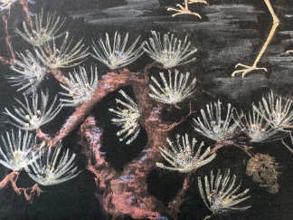
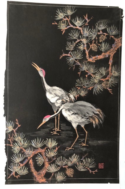
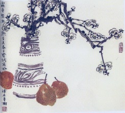
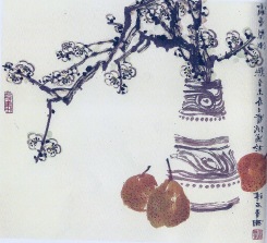
The master painter Qi Baishi identified particularly with the chrysanthemum and painted it often; his mum-painting ‘style’ is very minimalist and quite recognizable. Here are a few examples of his wonderful mum paintings.


This slideshow requires JavaScript.

What is the ‘mum’?

Some online sources report that mums are the biggest sellers worldwide, outstripping roses. I can see the appeal in cheap, colorful, and availability, but I also know many a mother and grandmother who would prefer gifts in corked bottles to those in dirt-filled pots.

I knew that chrysanthemums (family Asteraceae) originated in Asia where they were cultivated as far back as 2500 years. In North America and Europe they’ve had our green-thumb attention for only about 200 years.

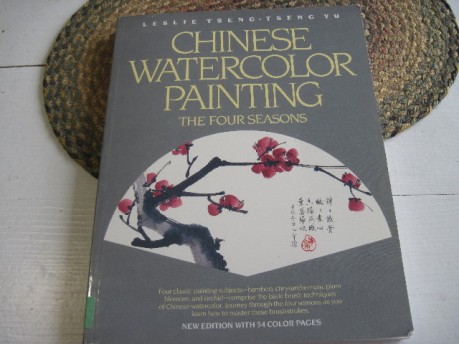
Heaven Full of Stars, Goose-feathers Tube, Carrot-threads, Dragon’s Beard, Jade Saucer Gold Cup. Drunk With Wine Made From Peaches of the Immortals—these are but a few of the exotic-sounding names given to varieties known in China, according to Leslie Tseng-Tseng Yu, author and illustrator of Chinese Watercolor Painting the Four Seasons. Only recently I discovered a chapter in a 1926 book by Francis Ayscough titled The Chinese Idea of a Garden in which she too offers such exotic-sounding names for many different varieties of mums. In the very beginning—some 3000 years ago—there allegedly were only four colors: white, yellow, blue and red.

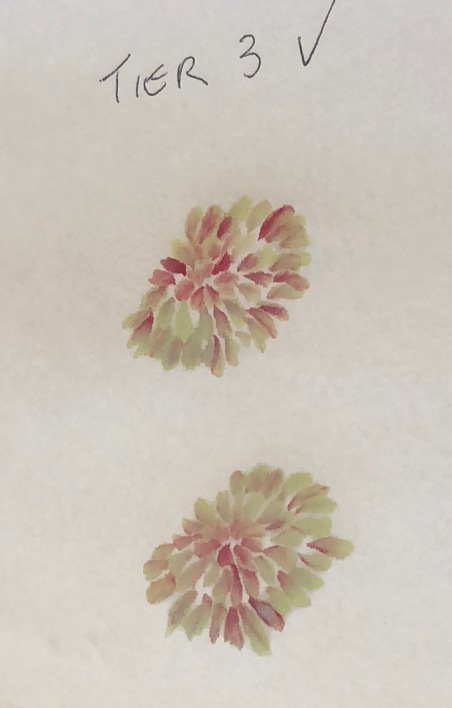
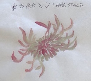
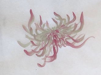
The National Chrysanthemum Society USA separates the varieties of chrysanthemum into 13 different classes based on floral characteristics: irregular incurve, reflex, regular incurve, decorative, intermediate incurve, pompon, single and semi-double, anemone, spoon, quill, spider, brush or thistle, and unclassified or exotic.

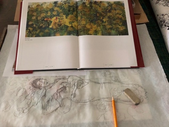
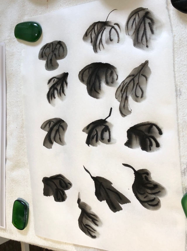
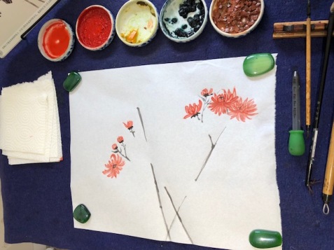
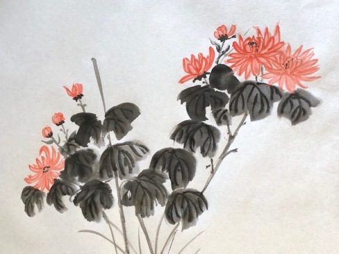
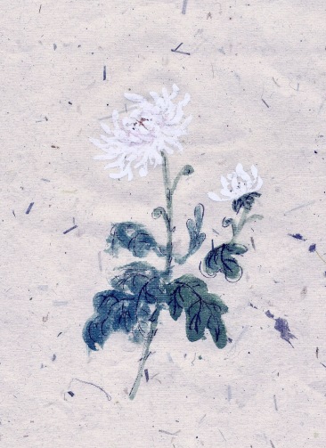
Within these classifications, there are about 40 generally recognized species and thousands of varieties.   The Society also offers a detailed history of the ‘mum’.  For artists who have been gardeners, mum painting mastery is really more about being selective than thorough. With so many nuances to the flower, one could spend a lifetime exploring its variety. My preferences are for the very simple daisy-like form and the graceful sprawl of the spidery heads. For this reason I started my mum studies examining only TWO painting approaches—1. Outline style flowers with added color, 2. Boneless (moku) flowers in ink and color. For both floral treatments I painted the leaves in boneless style with ink veins.
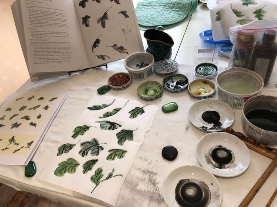
Major resources:

Because of its significance in learning CBP, the mum has garnered a lot of attention; this is reflected in the literature. You’ll find instructions for painting the mum (in at least one style, maybe two) in any general CBP book, as well as in more than a few dedicated to the flower. Most often, it is the last of the four gentlemen (after bamboo, orchid and plum) that one learns during introductory lessons to CBP.

Many CBP artists consider it the ‘gateway flower’ to learning techniques for painting ALL flowers. From my early years in studying this art form I collected numerous books addressing all four gentlemen, and I have also found a few dedicated to painting chrysanthemum. The MOST complete in terms of explaining and illustrating technique is at the top of my list below; the others named are those I rely on the most often.

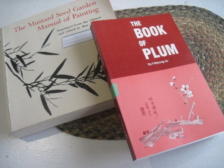
  1. The Book of The Chrysanthemum by I-Hsiung Ju
  2. Book of the Chrysanthemum, Vol. 4 of The Fundamentals of Chinese Floral Painting by Johnson Su-sing Chow.
  3. Learning Drawing Chrysanthemum in a moment (Chinese Edition) by Wang Hui Tao
  4. The Why and How of Chinese Painting by Diana Kan
  5. The Way of Chinese Painting, Its Ideas and Techniques with selections from the Seventeenth Century Mustard Seed Garden Manual of Painting by Mai-mai Sze (handy purse-size paperback)
  6. Chinese Water Color Painting The Four Seasons by Leslie Tseng-Tseng Yu
  7. 100 Flowers, Chinese Techniques for Painting Flowers by Yang Oshi.

**. Workshops by Nenagh Molson

MumbooksHor

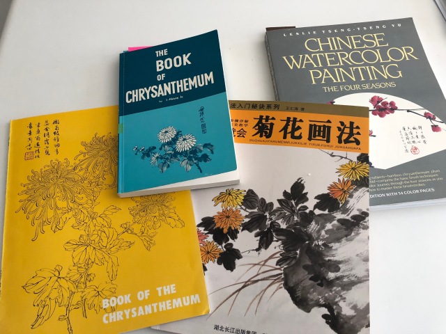
Some of my resources for painting mum; my fav is that little blue book by Prof. I-Hsiung Ju. I also have a handy pocketbook version of the Mustard Seed Garden Manual that is easy to tuck in a bag when traveling or hanging out at a hockey arena.

There are several good videos on Youtube showing mum painting techniques.  I recommend five sequential ones each about 3 minutes long starting with this one. (You may have to re-search in order to get 4/5 to come up in sequence.)   Note: just the paint application is shown, not the loading of the brush in between bursts of painting!

Parts of the mum

As a painter the ‘need to know’ about mums can be boiled down to just a few major parts: 1. buds, 2. flower heads comprised of petals (each one is a complete ‘flower’ in that it has a colorful section surrounding a stamen leading down the throat to a pistil; in maturity the ‘petal’ produces a single seed at its base.) 3. calyx 4. stem and offshoots 5. leaves.

Each part to the chrysanthemum has particular characteristics to be aware of, so that you can capture its true essence. As in all CBP, conventions have emerged and some of the mum’s distinctive qualities do indeed get emphasized and others are downplayed.

 Symbolism:

I don’t think I have ever encountered a flower with so many symbolic meanings: cheerfulness in the face of adversity, defiant of frost and triumphant in autumn, intellectual accomplishments, cleansing qualities, joviality and longevity of life. 

Buddhists use this flower as offerings on altars because they symbolize powerful Yang energy. This flower attracts good luck in the home. It is good to give old people chrysanthemum flowers because they symbolize strong life. Because of their popularity among gardeners, and the fact so many retirees turn to gardening, the plant has come to represent retirement.

Chrysanthemum is a Chinese word, derived from “Chu hua” meaning “October flower”. It is also the emblem of the Old Chinese Army and, in China, the chrysanthemum has long been considered a very noble plant along with the orchid, bamboo and the plum. It was so well thought of that only the noble were allowed to grow the chrysanthemum in their gardens – lower classes were strictly forbidden from doing so. It quickly became so revered it has a festival unto itself—the Ninth day of the Ninth Moon—as well as many legends.

It is said that Buddhist monks first brought the Chrysanthemum to Japan around 400AD. The Japanese Emperors were so impressed and thought so highly of the little flower that they often sat on thrones of chrysanthemums – there is even a book named the “Chrysanthemum Throne”. To this day, the Japanese believe that the chrysanthemum is a symbol of the sun, and that the way in which the flower opens its petals denotes perfection. Japan also holds a “chrysanthemum festival” known as the Festival of Happiness.

As with many flowers, the Greek language comes into play with the naming of the Chrysanthemum. The name is believed to derive from “chrysos” meaning gold, and “anthos” meaning flower.

In some European countries, the chrysanthemum symbolizes bereavement – most notably in Italy, France, Belgium and Austria. Chrysanthemums are only ever sent in these countries at a time of sadness, death specifically. In the UK however, the chrysanthemum holds a much more positive sentiment, used widely in all lines of floristry. Florists, customers and recipients alike often cannot fail to love the vibrant colors and wild shapes of this most versatile flower.

Composition in paintings:

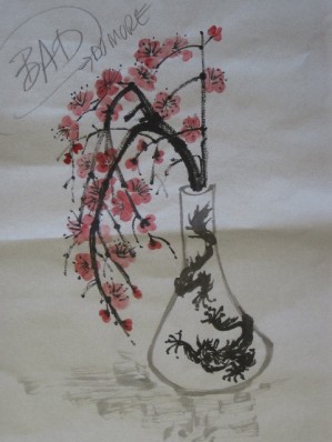
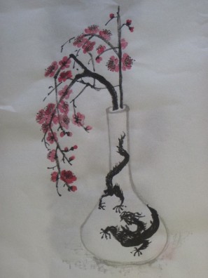
Traditional portrayals of mums in CBP generally fall into two categories: 1. a few select stems on the paper alone or in a vase/basket, or 2. the plant ‘in situ’ as it once was in ancient China, growing beside a rock or next to a bamboo fence.

LSmumsbasket

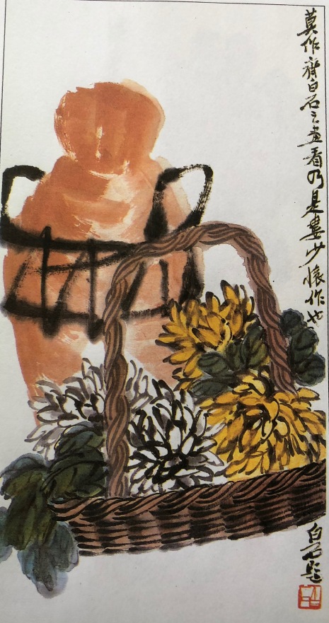
Lou Shibai’s painting of several chrysanthemum heads in a basket is a classic way to show the flower. I’m impressed by the even basketry weaving.

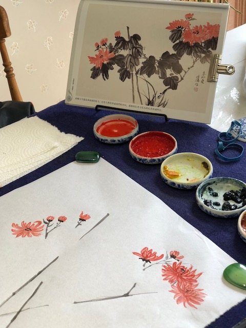
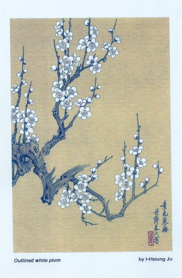
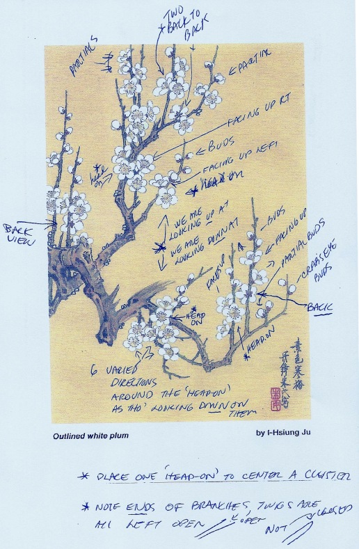
Painting the Mum in Outline style with added color:

My studies started with attention to floral heads, but once I acquired Professor Ju’s marvelous books on painting the four gentlemen, I realized there was much to learn about the basic petal stroke (kou-le) before attempting to portray full flowers!

Ju offers many insights into the etymology of the term ‘kou’le’ and sums up thusly: “kou” is a line made by a tip stroke with a hesitation at the beginning, a ‘tsang-feng’, then followed by a straight stroke, a ‘chung-feng’, and ended with a reverse movement, a ‘huei-feng’, so that the pointed ending of the whole stroke is returning like a hook. “Le” is a line with the same quality as ‘kou’, but placed horizontally, either in convexity or concavity.

He explains that all chrysanthemums painted by the ‘kou-le’ method will therefore have every petal closed, surrounded, or even limited by either kou strokes or le strokes.
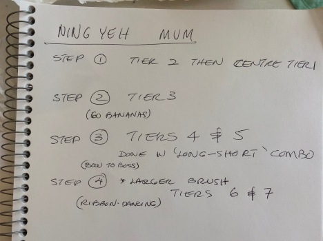
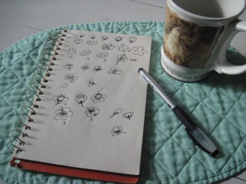
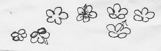
Study sheet 1:

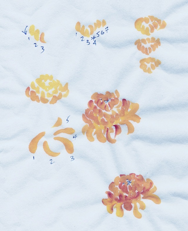
I started with trying the ‘kou’ strokes as used by Yang O-shi to portray a simple flower in THREE steps. She painted her centre stamen dots first and then pulled the petals in toward the centre.

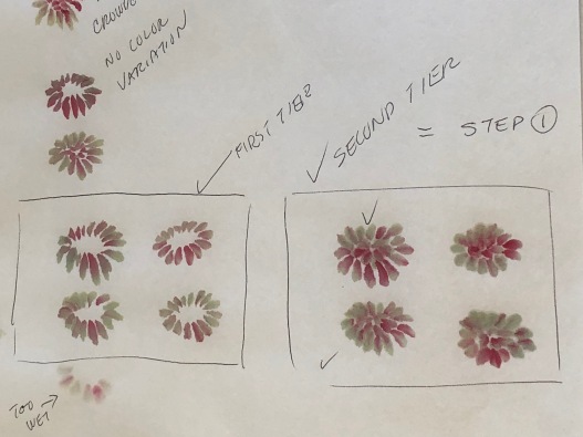
In a recent workshop Nenagh Molson explained that the ideal centre dots are added once you have outlined the petals around a centre space, they should all be dark and round and NOT touching one another.  Her  method involves FOUR steps: outline petals lightly, add dark centre dots, apply variegated color using a brush loaded with water and tipped in color by touch-pressing each petal, then when dry go over the petal outline in dark ink.

MumStudies1

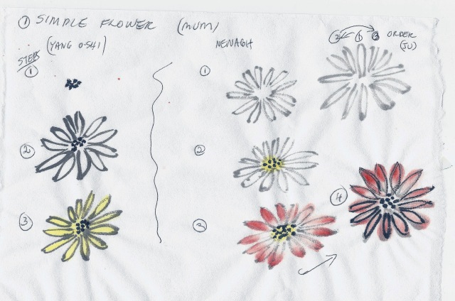
Prof. Ju (and others on my list of resources) explains how to foreshorten petals and curve them as you position them in a spiral in order to convey depth (and roundness) to a flower. He uses umbrella shapes to help illustrate the visual concept. Most of them also specify an order to the placement of the petals so that you evenly distribute the petals. Once you’ve mastered a simple flower, they walk you up to layering petals in composite heads, and varying petal length, curl, width, etc.

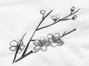
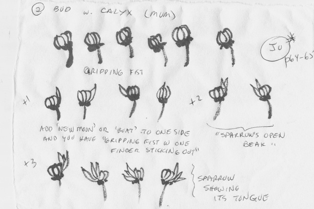
Study Sheet 2 and 3 (a bud and the calyx)

Prof. Ju gives us lots of ideas for portraying a bud. His method for the calyx yields a crisp looking platform for the bud to sit on.  Nenagh explained the traditional manner she learned for portraying the caylx; it requires a brush loaded with dark ink used in side strokes.

MumStudies2

MumStudies3

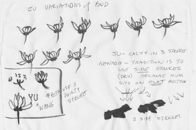
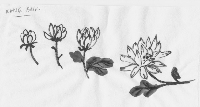
Study Sheet 4 (based on the Wang book method)

MumStudies4

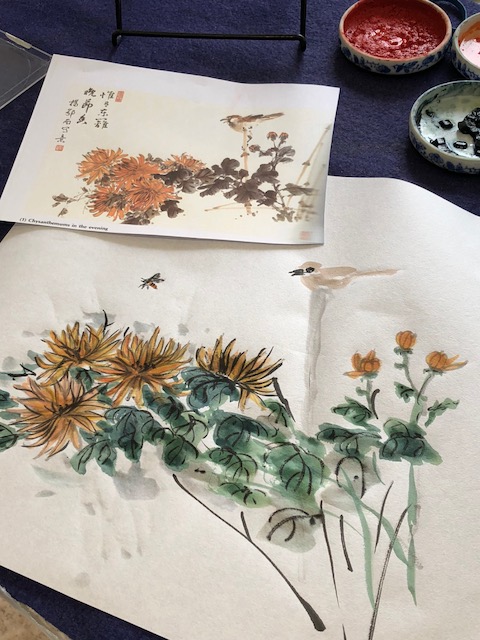
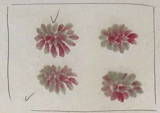
More complex heads are a logical next step for my studies, and I sooooo want to get a better handle on Nenagh’s coloring technique. Here’s some inspiration from her last workshop:


More studies to come, then leaves.

Posted in Chinese Brush Painting, painting chrysanthemum | Leave a comment

Another dark encounter: Pine on Black

Despite sharing my Black Licorice double xuan paper with artist friends, I had several widths left, and that large gold bamboo frame beckoning from the art room. The simplicity of two cranes in a setting holds considerable appeal, and I had a working technique developed for painting them. So I set the challenge of painting pine around two cranes for the larger frame.  Below is my first (successful) experiment with painting on black paper; I called it “In Praise of Plum”.

IMG_0723

The traditional method for painting pine clusters is to ink in the needles, then go over each needle with a dark green, and finally lay in a green-blue wash over each cluster (softening edges with water). You can either ink in branches, limbs and twigs with outlining and texturing, or depict them freestyle with color. Obviously ink outlining was not going to work on black paper, nor would the use of white paint for the needles. I had some experimenting to do.

First off, I searched online to see if any other CBP artist has gone down this discovery path and posted anything. All I found was one Youtube video demonstrating painting on black cardstock using acrylics. The subject (lotus) and method is CBP but the paper handling is not. The result is stunning, but too intense for my vision for pine.

I sat down to try a few different methods and ended up with one that seemed to work. (Lucky for me I had several highly skilled CBP artists to consult in my two art groups; their input is always helpful in ‘developmental’ work.)

The Plan

I intended to paint two cranes slightly off centre, looking to the left, and dominating the scenario. I aimed for pine that would fill the upper right and part of the lower left. I intended to ‘ground’ the cranes with a light wash around their feet, and lastly drop in my chop in the lower right.

The Cranes

I would render these fellows in the same manner as for my “In Praise of Plum” composition: outline in white paint, paint the eye in black over white paint, fluff in body and wing feathers with white tones, paint red over top of white for the head marking, paint the beak and legs with gold and add some black ink scale marks to the legs, and finally, add black ink and gold paint to suggest the wing tip feathers (those that look like tail feathers because of their placement).

 The Pine

I had experimented with different ways to depict pine on the black paper surface. I found that I could lay down pine limbs and smaller branches, using several rust and rose shades from my pearlescent paint box with a large orchid/bamboo brush. For the needles I used a detail brush loaded with green paint and then dipped in the blue and sometimes the green from the pearlescent box. I placed moss dots on the needle clusters with gold paint and also dotted the needle cluster centres. I even managed to suggest cones among the pine clusters using the pearlescent brown.

The execution:

I completed the composition pretty well as planned, brushing some very light green pearly paint at the feet of the birds to ground them, adding inky swirls to the pine boughs, and bringing the pine behind the birds at the right in order to add to the depth within in the scene. I discovered that the addition of moss dots in deep blue enhanced the coloring of needles and pine bark.

IMG_0637

I sprayed the painting several times with fixative, letting it dry between applications.

In preparation for gluing I made sure my painting was large enough to fit the frame (just barely) and sprayed the composition with fixative. I added my chop in the same manner as with the plum painting. Having lost much of the pearly and gold paint from my previous painting on black paper (In Praise of Plum) in the gluing process I double-dosed my pine painting. I also sprayed lots of water on the back of the painting as I stretched it with the gluing brush to avoid leaving a milky glue haze to dry.

IMG_0642

Telltale signs of paint left on the gluing board; touch-ups will again be needed!

As soon as I flipped the painting to the drying board I could see that despite the copious spraying of fixative I had yet again lost about 25% of the metallic and pearly paints in the procedure. Once the painting was dry (and still stretched on the board) I had to touch up the entire composition. The cranes were the least affected this time, so maybe the extra spraying had helped the white painted areas.

IMG_0638

Before gluing

IMG_0645

After Gluing


Once the composition had dried, I cut it to size and popped it in the frame.

PineCranesToCut

I now had TWO paintings on black paper that were show-ready, and three days left before the show hanging.

IMG_0722

In Praise of Pine

My paper stash yet includes a few sheets of the black licorice paper; with a workshop on painting chrysanthemum coming up, perhaps I’ll tackle that fourth gentleman before my ‘black paper days’ end.


Posted in black paper, Chinese Brush Painting, painting crane, painting pine, using gold paint, using metallic paint | Leave a comment

Exploring the dark side: painting on black

While experimenting with gold metallic paint and aiming to fill a large gold bamboo frame, I made some pleasant discoveries about painting on black paper. With my first few bamboo/cat paintings I had learned that even after careful spraying with fixative before gluing, my art lost much of the metallic paint and required touch-ups while still stretched on the board. That was easy to work around. Other insights required more thought and effort.

BooGoldCat2NotFixt

Remember this fellow? His sad eyes still beckon.

1. Pre-planning. Working with two cranes and a branch of plum blossom as my subject, I planned a large composition. On a large sheet of medical paper (the kind used for patient protection in doctor’s examining rooms can be purchased in medical supply stores; Nenagh says it is great for bamboo painting) I sketched two cranes and roughed in a branch for plum blossoms. KIS is a credo for Chinese brush painters at any time, but more so when you’re trying something new; the less you are fussing with the better! Hindsight (in the form of a trusted art critic after the fact) told me I should have made sure the plum branch would enter the picture above or below the halfway mark of my frame. And I had to do some fancy brushwork to try and hide two strong branches that came out looking very parallel in growth pattern. The eye can be distracted by such ‘railroad tracks’, yet such growth is common in plum trees.

Cranes are basically big white birds with some black and red markings, plus golden beaks and legs. The gold paint would thus go on the beak and legs, with some enhancements on the black wing tip feathers (those that LOOK like they are tail feathers). The whole bird will thus have to be outlined with white paint. The plum branch could be laid down with the gold paint directly, and flowers done with some of my pearlescent paints for the petals and white for the stamens

2. Transfer of sketch. When painting on white paper any pre-planned composition layout is easily slipped UNDER paper to enable me to quickly rough in the major compositional lines with pale indigo ink. With black paper as the foundation for a painting I had to rethink this process.

First I tried cutting out my crane shapes and tracing around them with white chalk on the black paper. Alas, as I moved to outlining the birds with white paint and LIFTING errant chalk marks with brush and water, I made holes in the black paper. It is clearly softer than other painting papers I’ve used. My trusty art buddy suggested I forget the preliminary sketch and simply outline the bird freehand. (She was right: I CAN draft bird bodies. I outlined cranes on a new sheet of black paper…freehand.)

Later on, after more insights about the pearlescent and gold metallic paint had been gained, I transferred another preplanned comp by carefully tracing over the major lines with a dull pencil. This leaves a slightly indented outline in the soft black paper, which can easily be seen while over-painting in pale white. It disappears with the gluing process.

3. White paint. I found I had to under-paint the head tops with white before adding the distinctive red marking on the crane heads, or the red wouldn’t show on the black. Using my large bamboo/orchid brush with diluted white paint I scuffed in bird bodies that looked ‘feathered’ and three-dimensional. (This was easier than with ink tones on light paper.) The crane eyes took some re-thinking to maintain their shapes. I found I could paint white over ink, then ink over the white again and again until I was satisfied with the result. Once I had inked in the black marking on the crane’s neck I realized the thin white outline of the bird had to be retained or my bird disappeared into the black paper. I learned I could ‘lift’ erring white paint with brush and water, dabbing with paper towel, fairly easily.


IMG_0599

Here you can see the little white hole above the neck curve caused by too aggressive ‘paint lifting’.

IMG_0600

The hole is masked by black ink, the gold branch is enhanced and the blossoms brightened.

4. Metallic paint. I tried mixing the paint with water-based glue to see if I could get it to stick more firmly and not lift during the gluing process. Didn’t work. Best option remained to touch up after gluing while the painting was still on the board. I added a few swipes of gold brushwork in the wing tip feathers that were mostly black. I also discovered I could paint in black marks over the legs once they were rendered in gold paint to yield a scaly effect. A gold highlight in the eye simply looked spooky, so I reverted back to black and white eyes. I had to seriously touch up the plum branches, sepals and fine branching of the plum after the painting was glued. While I had considered moss dots of another color (green was suggested by fellow artists) in the end I added them in gold AFTER the painting had dried on the board.

liftedMetal

Just look at all the metallic residue from the plum branch that adhered to my gluing board after I glued the painting, despite spraying with fixative.

5. Pearlescent paint. I used these colors for the plum flowers and buds, striving for variations in tone (darker for the buds). The sheen and some of the tone ‘lifted’ in the gluing process so I tried touching up after gluing; this was tricky as my white stamens overlapped petals for the most part.

6. Brushes. I used a detail brush for outlining, a small soft brush for applying the gold paint, and my large orchid/bamboo brush for the plum branch, petals, and bird bodies. The large brush worked really well with shades of white paint in rendering the crane’s feathered body and wings.

7. Gluing. I used fresh glue and sprayed extra water on the painting as I glued it, brushing carefully to avoid leaving a glue residue. Previously in gluing black paper, I found the process left a white haze in patches so this time I took extra care with the glue application. I backed the paper using Moon Palace practice paper. With my last trial painting I inadvertently made a small hole while lifting errant white lines, and while the painting was yet on the board applied black ink to mask the hole. It vanished!!

8. Touch-ups. When painting with white paint, metallic paint, and pearlescent colors one has to be ready to do a lot more ‘touch-up’ work after gluing (and dry on the board). Even using fixative did little to alleviate this problem. As noted above, I also swished on some ink washes to hide the white backing showing through a hole, and over some areas where lifting errant white lines had left a white haze.

IMG_0592

The main branch of the plum needed metallic paint added while on the drying board.

9. Composition. ‘Less is more’ definitely applies to planning a painting where you intend to incorporate white, metallic or pearlescent paints. If your foundation paper is to be black, then you’ll want to be absolutely minimalist in composing a painting. Cranes proved a good subject (shades of white worked very well in rendering their feathered bodies and wing; the gold on their beaks and legs did too.) Any furred or glossy-skinned animal (cat? monkey? horse?) or feathered creature (owl? night heron?) that by nature is active in the dark would be a good subject for a painting on black paper. I prefer the results of portraying bamboo and plum in gold paint to how mums and orchids looked when executed in gold, a consideration for contextual elements in a comp intended for black paper.

10. The chop. A final concern for painting on black paper pertained to ‘signing’ the painting: how could I stamp my chop? I tried applying pearlescent paint (the color used for the plum blossoms) to the chop and stamping it on a scrap of the bonded black paper. Wouldn’t you know it, my first trial on a scrap worked rather well, but when I moved on to chopping my actual painting, the result was not so good. I easily lifted the pearlescent paint and re-applied the chop. Again parts of the signature did not adhere well. I tried touching up with paint and black ink. This pearly paint was showing TOO shiny next to the plum blossoms (remember they had been softened in the gluing process) so I tried to water the paint more. Fearing another dreaded paper hole, I stopped fussing without any satisfaction over the look of the chop. There comes a time in many a project when you simply have to go with what you’ve got; this was it for my cranes and plum on black paper.

FinalPlumCranesonBlk

Now to return to a larger sheet of the black paper, larger birds, and more thought to how to apply a better chop; I’ve still got the large golden bamboo frame to fill. I wonder if I could do pine for the setting instead of the plum…. the box of pearly paints does include greens and blues.

Posted in Chinese Brush Painting, Gluing, painting crane, painting on black paper, painting plum blossom, using metallic paint, using pearlescent paint | Leave a comment

The Midas touch, painting with gold ink

From time to time members in my art groups amaze me with their curiosity and creativity. After a few weeks away from painting, hosting a houseful of guests, or just a bout of the blahs many of us need some new subject, a new paint brush or art book to reinvigorate our painting.

Lotus tends to flip through books until she spies a new way of treating a subject, Bird Woman gets her brush inspired by different papers, and TOB (the other Barb) has so many grandchildren and great-grandchildren she checks her ‘special requests’ and starts on an untried subject. I sit down with a cup of tea and consider what’s new around me. I absolutely love it when two or three ‘inspirations’ come together and proclaim an experimental session of some sort.

This last month I had a new book featuring cranes in bamboo settings, an order from OAS with an enclosed bonus lesson on painting with gold and white paints, and a roll of black paper that was getting squished in the bottom of my art bag synchronize their appeal to me. I simply had to try painting with gold paint on the black paper with some of the interesting bamboo clusters from my new crane book.

MidasTouch1

The gold paint pan on the right was donated to the library at one of my art groups. With a gift lesson on painting in gold ink arriving with a purchase from OAS and some black paper in my stash I was all set to play at my art table.

Subject Considerations:

The Ning Yeh lesson demonstrated painting with gold and white paint on black paper in four simple compositions showing each of the four gentlemen: bamboo, plum, orchid and mum. Simple elements do indeed seem appropriate to painting in gold.  I tried the bamboo and plum exercise Ning Yeh set out in his gift lesson:


Bird Woman had already taken a piece of my black paper for a ‘test dance’ with her brushes, AND one of her favorite subjects: bugs. She advised that one had to think negatively when composing for painting on black paper. Dramatic effects could be achieved if you gave careful thought to the ‘outline’ and the most ‘forward’ parts of the subject material.

WhiteCatOnBlack

When Bird Woman and I first tested the black paper she painted bugs, and I tried this cat. We found the paper glued beautifully but one had to dilute the white paint carefully–too much water and it would disappear as it dried.

Local CBP artist and teacher Barb Elford entered two stunning compositions of bamboo painted with WHITE paint on black composition board (with gold bamboo frames) at a recent oriental art show. The same could be done in gold. I have confidence with bamboo; I even have some gold bamboo frames kicking around my art room. Gold painting on black paper might also be well suited to any other shiny gold/brass metal frames that are often too flashy to pair with monochrome ink compositions or traditional CBP subjects.  I painted bamboo leaves, striving for variations in shades of gold. Achieving variations in value was easier with the gold than it is with white paint. (Photographing the gold ink on black paper before gluing posed glare issues.)


Some experimentation with diluting the gold ink, and with a few go-to brushes (orchid and detail) revealed I could get variations of gold shades, and fine or sharp lines if desired.

With these thoughts in mind, I set out to paint bamboo leaves around a sitting cat. (Cats are favorite subjects and I always have a new sample or two on my desk.) I was pleased with my first two quick ‘cat-under-bamboo’ compositions…and then neglected to “fix” the one on the right before gluing!  Maybe I can title it ‘Cat seeking shelter from Rain’? (Lesson learned: spray gold paintings with fixative before gluing.)


For my large golden bamboo frame I considered a composition similar to the famous one by Wu Cheng (1280-1350).  This classic bamboo portrait which shows up in many CBP books has such wonderful leaf clusters!

BambooWuChen

I immediately had two challenging issues:

  1. Including STALKS of bamboo would likely conflict with the bamboo frame. I decided to avoid the stalks and just show leaves and branches over a moon. That was easy.
  2. Considering that the painting on black paper would have to be matted likely with black matting, and that unless I purchased special black matting with black core paper, I’d have a thin white line surrounding the composition I considered where else in a composition to introduce white. Several of Ning Yeh’s sample lessons of the four gentlemen involved white and gold together in one composition. I tried gold bamboo leaves over a white moon. Thinking the white outline was too stark, I softened it with a spritz of water and quick brush strokes. I dabbed in some cloud-like mist.

BooMoon&Mist

This composition was starting to look ‘too busy’, especially if a black mat showing a thin white line at the edge were to be added.

Further reflection told me to skip the plan for a mat and paint on paper large enough to fit my frame. I had the paper, I had backing paper, I had the gold…

Then while sitting in a waiting room the following day, flipping through old magazines I stumbled on just such a painting!!! It featured cranes and plum blossom.

goldbirdsE

This I will have to try–it is MY frame, and done on black paper with no mat.  The cranes are basically done in white paint, the plum branches in gold, and the colors might be done over white paint….Obviously another experimental session is in the offing!  But first, maybe I’ll go back and re-do the cat that got rained out.  He was so promising.

Posted in Chinese Brush Painting, painting bamboo, using gold paint | 2 Comments

‘Hurry Weavers’– the cricket speaks

Years ago during a stint in radio drama production I learned to truly appreciate crickets. Before that, they were simply annoying creepy-crawlies to me, that appeared in the garden and looked somewhat threatening with their rather long antennae. The distinctive chirping of the lowly cricket in radio was the quickest way to convey an outdoors, after dark, most likely fearful situation for a protagonist. How you paced the chirps, what kind of musical chord you struck, or what thoughts an actor expressed all contributed to the drama. Crickets were king.

Now that I need to paint one as a guest in a Chinese brush painting composition, I am surprised to learn that cricket chirps in Chinese culture have a meaning on par with the rooster crow at dawn, or the bay of a hound in the distance.

Johnson Su-sing Chow in Insects, one of four in his set Vegetables, Fruits, Insects and Aquatic Animals, explains:

In olden days women folks spinned (sic) and wove cotton at home. They set up for themselves certain targets of production for the year. Every autumn, the song of the cricket would remind them that year-end was coming, that they had better hurry with their weaving. Hence the name “hurry weavers” for the crickets. Travellers wandering far away from their hometowns and villages are also reminded of home by the song of the crickets.

Chow also describes how Chinese people of the Tang dynasty (AD742 to AD756) used crickets in fights for betting purposes. The Emperor himself engaged in these events. Ordinarily the cricket has a life span of only 100 days, and the males do love to spar, often devouring their own young. In Chinese crickets are called ‘chuzhi’.

Of necessity, painting the cricket

Years ago, when I fantasized over how I’d spend my retirement years, painting insects was NOT EVER on the radar. Landscapes for sure, flowers maybe, animals such as horses and cats a given…but insects? Never.

But here I am only a few years into full retirement and I have books, files, and sketchbooks brimming with insect images. Chow’s book is helpful with illustrated steps to painting a brown cricket and several compositions using different poses.

Jane Dwight also does a basic cricket (in brown or green she suggests) in The Chinese Brush Painting Bible. She also notes that in China the cricket symbolizes summer and courage.

I am puzzled that that I recall only black crickets in the garden, until I read that they do come in a variety of colors. Wikipedia entry gives me this:

Crickets are small, often nocturnal insects. They are usually dark brown or black, so that they blend in with the ground. They have six legs. Four are walking legs and two large back legs are used to make very long jumps. Attached to the head are two long antennae, also known as feelers, used for touching and smelling. Crickets are sometimes confused with grasshoppers because they are similar in size and body shape, but grasshoppers have shorter antennae and are green in color.

Cricket studies:

I quickly paint up a green one based on Dwight’s four-step method:

  1. Using a small firm brush and sage green paint a few short lines and o couple of dot to indicate the head and mouthpiece.
  2. Add two strokes to create the thorax and two strokes for a short stubby wing
  3. Add a second wing behind the first. Paint a leaf green abdomen using two strokes. Use a fine brush dipped in indigo to add details to the abdomen, dots for the eyes, and dots at the base of the wings.
  4. Add lines to the wings in indigo and then define legs and antennae. Add a few small dots along the hind legs to suggest spines.

Cricketgreen

And then a brown one following Chow’s five-step instructions:

  1. Use light umber to draw the eyes, the head, and the neck.
  2. Draw the wings and the exposed part of the abdomen.
  3. Draw the front, the middle and the hind pairs of legs. The hind legs have to be big and strong. Use umber to outline and then shade around the knee joint.
  4. Use black ink to outline the head. Use a darker umber to draw the vein patterns on the wing and the cerci at the tip of the abdomen.
  5. Lastly use a very fine brush to draw the antennae.

Cricketbrown

Of course one never paints a cricket alone in a Chinese brush painting, so surely you’ve guessed that I am procrastinating from tackling my main subject in a planned painting. Yes, I have a grandson who wants me to paint a portrait of his pet Bearded Dragon lizard named Stick.

I rather doubt I’ll find one as a subject in any Chinese painting book, so I’m studying photos and working up sketches. Painting a ‘hurry weaver’, an insect that urges workers to get on task, seems somewhat ironic!

Posted in Chinese Brush Painting, cricket, insect painting | Leave a comment

Pushing the plum, doing more!

Friend and mentor John Nip (1937-2017) was a man of few words; his customary comment when you showed him a painting that didn’t meet his standard of execution was: do more.  He didn’t have to be here, or to even say it, but I knew my recent plum studies demanded I ‘do more’.

And I heeded Prof. Ju’s advice and concentrated on the outline style (for the most part). Whenever I had a few idle moments  I grabbed my notebook and challenged myself to defining plum buds and flowers in as many postures as possible.  My internalized repertoire is growing.  I find it makes composing clusters more quickly and confidently when you know what to put where.

PlumRepertoireDoodle

I printed out numerous plum compositions that I liked and analyzed what kind of blossoms–back view, head-on, tilted up, tilted down, tilted right, tilted left, profile, tight little bud (the eye of crab) and fatter bud (peppercorn), etc.–went where on a stem.  I tried to get the angles of the flowers working to SHOW more roundness to a stem, more depth to the field.  Below is an elegant plum composition Ju included in his Book of Plum.

PlumJuComp

I printed out a copy and marked up the KINDS of blossoms and buds he used.  I noted locations–above the viewers sight line, below it, head on. I observed the bud profiles and placements.

PlumJuCompDecomp

A good next step would be to paint the same composition, I’m certain, but I decided to let this one sit for awhile.  Instead, I pulled a couple of unfinished paintings from my art room and considered a few that could be finished with just the addition of a bit of plum.  Then the next day I glued them.  Oops…..DON’T FORGET TO SPRAY YOUR REDS BEFORE GLUING!

RedBledPlum

I was pretty PLEASED with the variation and placement of the buds, flowers and branches in this vase holding two plum sprigs, BUT neglected to spray it with fixative before gluing.  (Next time….)

I scanned a few similar comps by Jia Pao-min that involved plum sprigs, and then FLIPPED them in order to study what happens when you curve in the reverse direction. Here’s one that involves a ‘sketchy outline’ style that I particularly like.  (The outlined flowers and buds are accented with an outline of pale peachy-burnt sienna.)

OutlinePlum 1 right  OutlinePlum 1 flip

When you do this ‘flip trick’ on your computer you should record the flip in the image name, just in case you ever want to copy the calligraphy.  (I know a few artists who have inadvertently painted mirror-images of the calligraphy, or ‘written’ words backwards because they had forgotten they’d flipped things around.)

I tried a spray of plum in this ‘sketchy outline’ style. (The flower centres can also have a bit of yellow dropped into them, as per Jia Pao-min.)  On my first attempt at this comp I tried using moss dots in a heavier orange shade on the branches; it looked ghastly!  The effect might have worked if I had painted a more colorful plum branch using Nenagh Molson’s famous double or triple-loaded brush, so that the deep orange value was already present in the painting. (Gotta plan for that element of ‘unity’ in design!)

SketchyOutlinePlum

With these latest plum studies I discovered there are numerous appealing vases/pots in the two big instruction books by Jia Pao-min on my shelves, I found a few more magpies on branches that I liked, and then a huge composition of a BLUE flowered plum…dare I tackle such an opus?


Posted in Chinese Brush Painting, painting plum blossom | Leave a comment

Power of P’in, arranging plum blossoms

My grandmother often cautioned me that ‘the road to hell is paved with good intentions’. If she’s right, then I’m surely bound to go down that road quite soon. Last month saw little in the way of productive painting, and mostly days packed with ‘good intentions’. I blame it all on THE COLD.

Oddly enough some of my brainpower WAS working—when I reflected on my magpie studies, I realized I had little confidence in composing clusters of plum blossoms. I knew the steps to individual flowers, to buds, branches, trunks, and twigs—all of the details. I knew the names of all of their parts, and how they grew.

What was LACKING was understanding HOW to place flowers in clusters, which ones to point up, down or sideways; which ones to paint darker in color, how to tuck in softer tones behind those more forward.  Here’s a closer view of the blue plum blossoms I used as context in a recent painting. The clustering is ‘overpainted’.  My brushwork was hesitant and some blossoms are downright messy.

PlumCompConcern

I had a pretty good idea which of my books might offer insights into this concern. Professor I-Hsiung Ju’s Book of Bamboo had advanced my bamboo painting tremendously with lots of illustrations, explanations, and compositional insights; I was certain his Book of Plum would do the same for plum.

Ju frequently cited the Mustard Seed Garden Manual of Painting, so I hauled my copy off the shelf as well. (My version must be more edited than the one he accessed, as mine does NOT have the discussion of ‘design’ for clusters he cites.)

PlumBooksJuMSGM

And for good measure I pulled out Leslie Tseng-Tseng Yu’s book, Chinese Watercolor Painting, the Four Seasons.

TsengTsengYubook

Slow of heart, but swift in hand

Ju’s third section in The Book of Plum, The Flower, was limited to painting outline petals and single stroke (moku). I was surprised to read the description of his own traditional teaching—he was urged to learn to paint plum blossom in OUTLINE STROKE first, then in ‘single-stroke’ or moku later.

The reasoning is that once you have UNDERSTOOD or TAKEN TO HEART the teachings, then you can move QUICKLY in laying down your brushwork. Similarly, once you have mastered plum blossom in outline strokes, placing the moku strokes comes naturally.

So I did what the master ordered: I reviewed painting plum flowers in outline stroke before getting into arranging them in clusters.

It worked!!!!

Here are a few of my practice bits, trying to emulate Ju’s lessons, mixed with portrayals of illustrations from the MSGM:

PlumDir&Throat

Basic plum flowers painted in ‘outline’ involve two strokes–one defines the three humps, the second adds the two remaining curved petals to the five-petal flower.

PlumStudy     PlumUp&Down


Plum3Dirs    PlumJu&MSGM

I intended to do them all, I really did. But once I had filled a few pages with circles (as per Ju’s childhood practicing) and rendered a dozen or so of his models, I couldn’t resist trying a larger plum composition, AND I jumped ahead to trying single-stroke (moku) petals in color.

My brush moved much MORE QUICKLY as I dropped in flowers back to back on stems, flowers as seen head-on, flowers turned slightly away, turned slightly down, facing left, facing right…. I kept striving for placements of fuller flowers closer to the trunk, half open flowers as I moved out from the trunk, buds nearer the branch tips.

Power of p’in:

In his section on grouping flowers, Ju cites the MSGM regarding a concept based on the Chinese character (or word) called p’in. The character means ‘a class or order’ and consists of three little squares, one above the other two.

Ju writes: “Our masters are talking about three elements: either three buds or three flowers, either two buds and one flower or one bud and two flowers. These three elements should be placed in the p’in pattern: one smallest element at the top and two larger at the base.” Ju goes on to demonstrate variations of the pattern, and to advise us to look for such patterning in all the ancient masterful plum paintings.

As I looked for the presence of such patterns, I quickly realized it was a triangulation, a pleasing placement of an odd-numbered of elements. It reminded me of the groupings of shrimp one plans for a larger composition.

PlumPin1

Plum2Pinsjpeg    PlumWhiskers

Key Insights:

practice OUTLINE flowers first, tackle single-stroke (moku) once you have internalized their shapes, placement, finishing with whiskers and sepals

–use the right kind of brushes—stiff medium thick for the petals, very fine detail brush for the stamens (whiskers)

–use light ink for the flowers, dark for the stamens and pollen dots

control the moisture in your brushes with frequent wipes of the heel; a little ink goes along way

–draw the flowers in TWO parts—one three-petal stroke, followed by a two petal stroke.

–alter the two-petal stroke by turning it into two ovals, slightly fore-shortened.

–fill pages with these shapes head-on, then turn up, turn down, face left, face right.

–arrange THREE flowers on a simple twig structure

–make a small single circle bud (pepper corns)

–make two stroke buds (crab’s eyes)

–make a fatter bud with a half-circle on either side (smiles)

–try a few variations of p’in arrangements of buds, half-open flowers, and full flowers until you think in threes naturally

–Ju does his whiskers based on groups of seven—if a flower is in profile start at the centre at 90 degrees, then paint seven thin, slightly curved lines on the right, then SEVEN on the left. If the flower is head-on, do the same and complete with seven across the front, fore-shortened. Splatter with the dots. He advises not to worry if your SEVEN strokes fail to leave an ink trail, establish a rhythm and count SEVEN, then move on. Likewise, as you drop in the pollen dots, count seven and be sure to vary heights.

–be sure to curve the whiskers toward a central point, the throat of the flower (it was suggested by your original outline strokes for the petals; think of the flower as a cup or bowl shape in three dimensions.)

keep the peduncle (that little bit of stem at the base of a bud or flower connecting it to the main stem) short; if your distance from the branch appears too far, FIX by adding a twig before you dab in the short peduncle.

–be sure to dab THREE sepals cupped at the base of a bud, FIVE showing at the back of a fully opened flower that is behind a branch/twig.

–add twigs in dark ink toward the ends of branches AFTER you have the flowers and buds all in place.

START an arrangement with a few head-on full flowers, then add flowers facing in different directions, at different heights near-by, then think about the narrowing of the branch and where buds would be, place a few half-open flower in between the buds and the full flowers

–avoid trying to cluster flowers (like balls on hydrangea, or in lilac spray shapes); plum blossoms do NOT grow like that!!!! They DO appear back to back in twos or threes along a branch/twig.

–work with your ‘half-turned’ flower shapes to convey a ‘depth’ or volume AROUND a branch; avoid similar head-on flowers in a row, as that looks FLAT, non-dimensional.

For future reference, I added Ju’s buds to my MSGM plum blossom pages:

MSMG_Plum1

MSMG_Plum2

My first post-Ju plum comps:

Below is a vase of plum blossoms I painted BEFORE and AFTER I studied Ju’s instructions and illustrations:

BadVasePlum   GoodVasePlum

Here is my first plum composition painted in outline stroke applying Ju’s ideas.  I am pleased with all but a central section (just above the cub’s right ear) where hindsight tells me I should have left a gap in the main branch and anchored a cluster with a ‘head-on’ blossom, surrounded by flowers facing in different directions.  Ju does say that gaining confidence in planning where and how to leave gaps for flowers when you paint branches first comes with experience.  So I’ll count that insight as ‘experience’.

PlumFix

Reflections:

I considered that most workshops on plum painting I’ve attended have been INTRODUCTORY, most books I have offer GENERAL instructions geared for the largest possible audience, beginners. Ju’s lessons were serving as ADVANCED TECHNIQUES. I was having a ‘learning moment’, or two, or three…

I thought I was ready for a larger composition of many plum clusters. And that I fully INTEND to do soon…


Posted in Chinese Brush Painting, composition, flowers, painting plum blossom | 2 Comments