Bee-sting compositions

Part of my maternal cultural heritage is a delightful teatime treat called Bienenstich Kuchen, or Bee-sting cake. It is traditionally a yeast-based cake filled with creamy custard and topped with a honey-glazed almond coating that crackles in the baking.   (The article linked above speculates on two different origins for the cake’s name.)

Some recipes include honey in the cake as well as the topping, but my preference is for the sweet, carmelized topping to contrast with a bland but flaky base and custard filling. I like that ‘sting’ of sweetness on the tongue.

Similarly, in Chinese brush painting one often adds a bee (or other insect) to a painting—especially a flower-bird composition—to provide that little extra something, that bit of buzz, or ‘evidence of life’ as some painters word it.

BeeMonkeys

One of my favorite monkey-painting books features several paintings with bees as objects of interest as shown in this excerpt.

BeesDaylilydetail

Two bees hover over a daylily in this detail from a lesson in my Walter Foster book–a typical bee application in CBP.

And while those of us who pursue accuracy (or at least fair representation) in how we paint a scenario, the Chinese do not see a huge difference between a bee and a wasp. That’s understandable, as they do look alike. According to at least one of my bee-painting resources, the wasp is often just called ‘yellow-bee’ in Chinese. For bees vs. wasps go to a page maintained by the Saskatchewan Beekeepers’ Association where they have this handy image:

BeesVsWaspsSASKbeekeepers


Here’s a site that provides a primer on the differences between honeybee and bumblebees (with pictures!), and for differences in bees and wasps, look here,  The Regina Bee Club has thrown in wasps, hornets and something called the Blue Bee. Turns out that insect I know by the name Mason Bee.

Chinese Bees, really?

My big book on Chinese symbolism and motifs (author C.A. S. Williams) tells us the bee commonly seen in China is the domestic bee or Apis mellifica. With that being the scientific name for the honeybee, I’m presuming most of my CBP books will likely be illustrating honeybees. Williams assures us the Chinese bee is “of a very gentle disposition”. But then he goes on to note that the written symbol for the bee means awl, with reference to its stinger. Gentle indeed, Mr. Williams.

Williams does admit the bee in China, as in the western world, is seen as an emblem of industriousness and thrift; that a crowd of people is metaphorically compared to a swarm of bees; and also that honey mixed with oil is a euphemism for false friendship. How odd to see the similarities in bee associations across the globe!

While bees are not cultivated in China to quite the same extent as in the western world, Williams notes that bee products—honey and wax—have been used for centuries in similar manner to how we use them. The honey is used to sweeten products and the wax for candles.

Where the Chinese do use bees more than we, is in the realm of art. It is very common to paint a bee in a traditional CBP flower-bird composition, whereas such an inclusion in western paintings would likely be seen as over-done, too cute, or too cliché. In photography on the other hand, capturing a bee visiting a flower is praiseworthy.

Bee Anatomy:

The websites linked above provide good descriptions and images to help understand bee body parts and relative sizes. (The bumblebee is the larger, furry-looking one.) The bee has the three major body parts: head, thorax, and abdomen. The last one—which also bears the stripes—ends in that highly distinguishable weaponry, the stinger. Two protruding eyes, two antenna, three pairs of leg and two wing sets complete the picture. The legs are segmented and the hind legs sport the pollen sacks. Bees collect nectar from flowers by sucking it up and storing in a honey sac/stomach which is separate from the digestion tract. For more on how they make honey look here.

My painting resources:

Many of my CBP instructional books include treatments of the bee, usually in sections on finishing flower compositions. I have two books that focus solely on insects.

  1. Walter Foster Arts series, Chinese Painting 2 addresses the bee on a page devoted to the tawny or daylily.
  2. Jane Dwight in The Bible of Chinese Brush Painting gives the bee a whole page.
  3. Johnson Su-sing Chow in his volume Insects (part of a four-volume set with Aquatics, Vegetables, and Fruits as the others.)
  4. One page in Drawing Birds and Insects by Ling Mao Caochong Juan.
  5. One sidebar illustration in Eileen Fong’s book An Exploration of Chinese Watermedia.


BeeResources

On the right is the Walter Foster book with the bee details in the lower right hand corner.  Ling Mao’s book also lies open to the bee page. Jane Dwight’ Bible is between the two with a book addressing nature painting in Japan, titled Birds, Beasts, Blossoms and Bugs on the left. That book has a 17th century painting featuring two wasps.

Painting the Bee

As I sit down to paint the bee, I can’t help but think of Ariel’s song from Shakespeare’s The Tempest:

Where the bee sucks, there suck I:

In a cowslip’s bell I lie;

There I couch when owls do cry.

On the bat’s back I do fly

After summer merrily.   

Merrily, merrily shall I live now

Under the blossom that hangs on the bough.


Here’s my first bee study, based on Jane Dwight’s approach:

BeeTechnique

Then there were variations observed in my other resources:

BeeVariations

Then I resorted to some doodling:


Johnson Su-sing Chow and Ling Mao Caochong Juan offer bees in profile whereas most other artists render the bee as seen from above.  I’ve isolated Su-sing Chow’s bees in this little slideshow to better SEE the poses:


This slideshow requires JavaScript.

Now I realized I had to take the time to study bee-painting while I was pursing the niceties of painting daylily. Old friend and CBP mentor John Nip excelled at insect-painting and he always had one or more in his flower paintings. On looking at his daylilies more closely I discovered he painted wasps (not bees) in those compositions. Here’s one of his lesson pieces showing two wasps in flight.

JohnNipWasps

His wasps with their lovely long legs  reminded me of the book on Japanese art mentioned earlier. Sosen’s huge wasps (see below) are both walking on a surface, whereas John’s were midair.  Just look at the fine detail!

BeeWaspdetail 17thcentury Sosen

I’ve yet to finish the daylily studies, but am ready to ‘finish’ any floral painting now that I’ve looked at bees.  A custard-filled cake is all the more appealing with a carmelized honey topping (and a fancy name like Bienenstich), so I guess a flower that has already attracted other visitors in the form of insects has more visual appeal than one that hasn’t.  The mind’s eye works in mysterious ways!


Posted in Chinese Brush Painting, insect painting, painting bee | 2 Comments

Foliage Fun, wu-tung and friends

Wanting to set my figures from the Nanjing tomb wall murals in their original surroundings led me to some surprising discoveries about trees. So far in my self-directed study of Chinese brush painting (CBP) I’ve not been too smitten with landscapes per se.

Several members of my two art groups are truly adept at layering in clouds, mist, mountains, rocks, trees, and evidence of life—birds, animals, people, bridges, and buildings. They can ‘read’ the methods in old paintings, and are familiar with the papers that work best under those circumstances. My tree repertoire has until now included pine, willow, cypress, and a few nondescript, deciduous-looking trees that could flesh out a distant woodlot.

With the discovery of the Seven Worthies of the Bamboo Grove and Ron Qiqi my investigation of tree painting expanded significantly. There are ten trees depicted in the two large wall murals discovered in a tomb near China’s southern capital in 1960, five of which are stylized gingkoes, two are willows, and the last three are believed to be locust, pine and wu-tung (aka plane).

Below is a photo showing part of the Nanking mural with gingko on the left and then pine to the right; you can see the bricks and the wall is lit well enough to see the raised surface of the designs.  The pine needles are done in a very unusual manner that I have not seen in any of my instructional books or online.

Gingko&pineRelief


Wu-tung, common yet not

Once my attention was drawn to painting wu-tung I realized the treatment of its foliage is commonly shown in instruction books. The method seems to be offered more or less as a generic way to create deciduous tree foliage in landscapes. Sometimes the leaves are shown with four strokes, and sometimes with five. Here’s my first study sheet for this foliage treatment:

WuntungStudy

You complete one leaf in a single fluid stroke.  Using a small brush loaded with ink you start with a ‘hesitation’ to yield the little knobby bit, then move up and to the right, proceed down towards the left, and hesitate for the next knobby bit. You can lift the brush or just lift slightly as you move back along the stroke to the top and down;  continue with the up-down movement such that you create fingers splayed out.  (Another method for foliage is to outline a set of ovals in place of these five fingers.)

Accepting that this foliage treatment represents wu-tung led to a puzzler. Close examination of the one tree in the Nanking mural that had to be the wu-tung (by process of elimination) revealed it was not painted in the manner so designated in my instruction books! The Nanking ‘wu-tung’ had leaves that looked more like an elongated elm tree leaf—they were broad at the top, tapered to a point, and had distinctive veins. They did not have saw-toothed edges, however.

wutungPuzzle

In keeping with the stylized manner of tree treatment throughout the two mural panels, I rendered my wu-tung tree thusly:

MuralWutung

What is the wu-tung?

In trying to reconcile the look of the tree in the mural designated a wu-tung with what several of my instruction books were calling wu-tung, I zeroed in on what is alleged to be commonly called a parasol tree.

This bit of research I did one morning prior to our last summer BBQ in a setting where several large deciduous trees dominate the landscape. As I enjoyed the sunshine and off-ocean breeze from a deck chair, I noticed that the strong sunlight glinting off leaf shapes on those several trees did indeed outline shapes like fingers in the manner of the instructional book ‘wu-tung’. The trees before me were large maples, definitely not parasol trees or elms.  The sun and warm air caused the leaves to hang and overlap in just the precise manner as depicted by the centuries old way of painting, as per my study sheet above.

Returning to the Wikipedia entry linked above, I examined the photo more closely and saw how the light reflected from the leaves in the parasol/wu-tung in much the same manner as I noticed at the BBQ. Here’s the photo of the parasol tree (Firmiana simplex) from that site.

220px-Firmiana_simplex3

Checking back with the mural, that so-called wu-tung simply didn’t have finger-shaped leaves…. What could it be? Scholars more knowledgeable than I have said ‘wu-tung’, but that term seems to apply to any number of trees.

I went back to listings for plane trees and looked more closely at the Platanus orientalisis. The leaf for the Asian plane tree does look a lot like our maple, and they could be depicted in the study sheet manner.  So my study sheet wu-tung is likely a plane tree, but the mural version is either a radically altered treatment or not a plane tree at all.  I think I will have to accept that I have two foliage treatments, but not unequivocal tree identifications.

One delightful bit of ‘wu-tung legend’ I tripped over in more than one resource was that it is the only tree the (mythical) Phoenix will light on. (One  source named the tree as the dryandra tenuifolia , which I learned was native to Australia and more of a prickly shrub than a tree!)  Whether the Phoenix prefers one that resembles the parasol tree, or the plane tree, or one that looks like the mural wu-tung is anyone’s guess.

With three new tree foliage styles—the stylized willow, the unusual pine needle arrangement, and the widely used wu-tung treatment—now in my repertoire I tried to include all in one simple landscape scene. And then for good measure I threw in the foliage as per two other treatments from my CBP books. Here’s the result.

FiveTrees

Reflections:

I don’t think willows (which prefer moist soil) would be growing so close to pine, and I suspect the wu-tung on the right and its neighboring triangulated-leaf tree would both more likely appear with the willow, but not the pine.  I do like the feathery pine treatment inspired by the murals, and the very linear treatment of evergreens in the distance.  (Lotus has been playing with that foliage method these last few weeks and it offers great variety in distant tree densities; I am inspired to ‘do more’.)  The mural treatment of willow was very stylized, with short, tassle-like clumps of branches.  As I colored them in, I instinctively started to feather the branches into longer, more realistic shapes.   Now that I’ve got all ten trees of the murals figured out, it’s time to go back to the figures and their distinctive features.

Posted in Chinese Brush Painting, landscape, painting pine, trees and foliage | Leave a comment

Dog days of summer, painting Pekingese

With next year ‘coming up puppies’—2018 will be a dog year according to the Chinese zodiac—I was thrilled to find an instructional CBP book devoted to painting the Pekingese, that quintessential Chinese lap dog.  Previously  I did take on ‘painting the dog’ (Nov. 2015) as part of completing art cards for each of the animals in the Chinese zodiac.

At the time I also learned Pekingese dogs in North America are all likely descendants of four or five special little dogs brought to England in 1860 as part of the spoils of war. One of them was presented to Queen Victoria and aptly called Lootie. How much of Lootie’s life story is fact and how much fiction is anyone’s guess.  Another blogger has posted photos here and recounted some of the story.

By all accounts Lootie was a beautiful specimen of good temper, and thus an appropriate gift for the queen. Truth is that she had been one of many such ‘royal’ dogs bred by a staff of eunuchs in the kennels of yet another royal dignitary, the Empress Dowager Tsu-hsi (or Cixi)’.  I could not find a photograph of either woman with a Pekingese dog,  but nevertheless here they are with Lootie in the middle:

**cixi  **LootiebyKehl **QVicandDog

Lootie’s legacy

Since my first exploration of ways to depict cute puppies I’ve acquired not only the dedicated instructional book mentioned (by artist Sun Dahong), but also a wonderful book on Lootie’s life. The latter is titled The Butterfly Lions, the Pekingese in History, Legend and Art and written by Rumer Godden, a smitten Pekingese owner herself.

IMG_6443


She lovingly recounts Lootie’s story, as well as the history of the breed in China before that, thereby weaving a delightful history of what Marco Polo called ‘the golden-coated nimble dog’. Godden adeptly chronicles the appeal of the small dog for two reigning women who lived a world apart—the Empress Tzu-hsi of the Summer Palace in China and Queen Victoria of the Winter Castle in England. It is a fascinating history to have kicking around in your imagination as you strive to capture the spirit of the dog on paper.

A unique breed, the Pekingese:

Allegedly this breed of dog is one of the closest on the evolutionary tree to the wolf, having been isolated from other dogs some 4000 years ago and bred only in royal Chinese kennels thereafter. Distinctive features of the animal most pertinent for the artist are these:

  1. large, luminous, round eyes
  2. black roundish nose
  3. shortened muzzle with a deep vee-shape above the nose and between the eyes
  4. long, silky fur
  5. floppy ears and majestic tail usually held aloft
  6. rolling gait
  7. sturdy, low-slung body

Because of its size, the Pekingese is most often perceived as looking upwards, giving full meaning to the expression ‘wide-eyed and bushy-tailed’. Here’s a site with information about the Pekingese breed.

Sketching this dog:

Dog lovers (and lovers of dog art) may already be familiar with the vintage dog sketches by two British illustrators, Lucy Dawson (1875-1954) and Christopher Gifford Ambler (1886-1965). A wonderful study of the Pekingese signed in the lower right ‘C. Ambler 1934’ shows up on many Pinterest boards; it took a good hour of sleuthing for me to trace them back to Ambler, as I do prefer to give credit where credit is due. Here’s his lovely Peke study which was published with the caption “HIGHLY TEMPERAMENTAL. Clever studies by the well-known canine artist, C. Ambler, of the Pekingese in a wide range of moods and attitudes.” It truly captures the essence of the always charming Peke!”

pekeSketches

And I sat down one afternoon to see if I could approach his talent….

Mydogsplusamblers

There was also a prolific American illustrator and children’s author (Dorothy Pulis Lathrop) working about the same time as Ambler and Dawson, who created many a Pekingese composition that looks very oriental in style and content.  Here’s two examples:

LathropPekejumps              LathropPekeandmouse


Sun Dahong’s book provided some excellent insights into the geometry of the Pekingese face. While one might anticipate circular shapes to be at the heart of the dog’s features, Sun chose triangles. My research uncovered several approaches to deciphering the body parts of a Pekingese dog, but none proved as helpful to me as Sun Dahong’s.  I tried replicating his study sheet in order to get the proportions and positioning into my brain.

SunDahongPekeFace

Although his ‘triangulation’ of the dog’s face does not work out to be magically proportioned in factors of whole numbers, it truly helps in getting the eyes and nose positioned correctly. One has to nudge the proportions a bit to get the right combination, but the shapes worked better for me than imposing a rectangle (for the muzzle) over a squared-off balloon shape.  Here is such an approach worked out by an artist called Doggie Doodles at www.deviantart.com:

pekingese_breed_guide___part_2_by_doggiedoodles-d4ncink

For Dahong’s method you consider one equilateral triangle with its base across the top of the dog’s head, and then a smaller inverted one superimposed (and nudged upwards slightly) along the central axis of the first one, to define positioning of the nose and chin.


This slideshow requires JavaScript.

Unless you’ve mastered envisioning three-dimensional shapes, it’s best to start painting Pekes by considering the animal head-on. Here again Sun Dahong has provided some helpful insights; he provides five quick sketches of the dog, all using the same forward-looking face. I drew one face, traced it five times, and then tried building bodies off the face. Here’s my study page with six sketchy postures:

sixPosesPeke2

Armed with such a visual repertoire one can then move on to compositions involving one, two or more dogs. With their natural propensity for ‘looking up’, the dog works best in compositions with a floral sprig or some other item of interest in an upper corner. Placing a bug or butterfly within their visual range also works, or even a cat on a tree limb or rock teasingly just out of reach.

Painting the full Peke:

Some dog lovers prefer certain coat shades. (For the record, Lootie was a soft caramel color.) Sun Dahong shows numerous possibilities in his book. Some of my other books on dog painting describe the necessity of good management of the ‘feathered-edge’ brush stroke. It is described by one this way: First, press the brush open in the palette, and then depending on the texture of the hair, you may either curve the strokes in an s-shape or paint it in a straight line.

I sketched Pekingese dog faces for a few days, tried a few simple compositions, and then worked on feather-edge strokes.  By happenstance, my painting Pekes involved different papers and brushes.  I soon learned which of my brushes and papers led to more satisfying results.  I also found the faces gradually became easier to depict. (My first few had dreadful looking muzzles, as the shape was so unfamiliar to me. I grew up with collies, shepherds, labs, setters and terriers.)  Unlike cat eyes, the Peke’s eyes are not on a level plane; they should be slightly angled.  Dahong’s triangulation imagining helps with that.

PekesFull

I’ve still got six more months to ‘perfect my dog’ and I’ve just discovered another book that allegedly has some helpful instructions on white and ochre-colored Peke’s.  The stray images that show up on the Internet are enticing enough that I’ve now placed an order. The grandkids would prefer I get a real dog.


Posted in Chinese Brush Painting, painting dog, painting Pekingese | Leave a comment

Not seeing figures for the trees; gingko on display

There is a tree on the farm where I grew up that became the “go-to” backdrop for family pictures; it is still standing today, and gets photographed whenever one of us passes through the Robson Valley. Over the years it gets larger and statelier. I can totally relate to Chinese figure paintings that include trees as setting details. So when I stumbled on a marvelous composition called The Seven Worthies Of the Bamboo Grove and Rong Qiqi I not only studied the eight gentlemen on their individual mats, but I also looked closely at the trees that framed them.

The composition is in two parts, and the originals are wall murals (in relief) discovered in a tomb near Nanjing in 1960. The tomb is entered facing west, with one mural on the south and one on the north wall, and a raised pedestal in an alcove where coffins for two individuals (believed to be man and wife) once rested.

sevenworthiesSouth

This is a rubbing of the south wall mural, depicting the literary figure Ron Qiqi and three of the seven sages.


sevenworthiesNorth

A rubbing of the north wall mural shows four of the seven sages.

The murals were formed in a curious manner—designed on some surface and etched into to boards that were pressed into wet bricks. Once fired, the bricks were assembled into the walls in horizontal layers of three alternating with a row of upright bricks, each brick bearing markings to indicate correct placement.   The scenes are 2.8 meters long and .8 meter tall, with placement starting about .5 meter above the floor.  The images I found were photographs of wall rubbings, which are displayed in a Museum in Nanjing.


NankingTombWallRubMuseum

The two murals make a fabulous single ‘scroll’ which no doubt allows for more public viewing than does the actual tomb.

Why the seven worthies/sages were NOT shown in a bamboo grove, but instead surrounded by three or maybe four different kinds of trees was my first question. It was followed by many more! Fortunately for me, the Nanjing wall murals have also fascinated several scholars. Audrey Spiro wrote an entire book on the murals, titled Contemplating the Ancients, Aesthetic and Social Issues in Early Chinese Portraiture.  I acquired a former Library copy, but the contents can be viewed online here.

The first individual of the south wall panel is the only figure not depicting a real historical figure.  For an introduction to Ron Qiqi check here.  Reasons for including the fellow with the seven sages are not known, according to Spiro, and neither is full understanding of the subject choice for the tomb walls.

While the eight figures themselves are endlessly fascinating, it was the trees that held my attention over the last few weeks. I presumed the first tree to be intended as a gingko. The distinctive leaf shape and ‘tassel’ arrangement of peduncles could only be some variety of gingko. The shape—fan-like with curved sides—has been a popular textile and ceramic motif in oriental art and I know it well. After first seeing the exquisite golden fall display of foliage in Vancouver one dreary day about 40 years ago, I added gingko to my garden wish list. I currently have a dwarf variety growing in a pot on my patio, shown below:

MyMarikenDwarfGingko

If you’ve never set eyes on a gingko, take a look at photos of one over 1400 years old next to a Buddhist temple in the Zonghnan Mountains of China.

The Ten Trees of the Nanjing murals:

While the relative size of the gingko leaves in the murals is much too large for the tree trunks, other trees in the two murals also seem miss-proportioned. Two of them (the fourth in each panel) strongly resemble willow. The branches end in arched sprays of drooping foliage that, if longer, would clearly represent willow. It makes sense that the ‘willow’ branches were shortened to ‘fit’ more pleasingly with the other assembled trees. Both panels have a gingko at either end, with one of them featuring a gingko in the middle as well. The three remaining trees—the second in the first mural and the second and third of the second panel—are all individuals, and were not immediately recognizable to me.

I checked out Spiro’s index for entries on the trees and learned that: “Agreement on the species of the trees in the reliefs, apparently forerunners of those frequently depicted on some sarcophagi of the sixth century, is scant. Pine, willow, gingko, bamboo, and locust are among those proposed.” and “Few earlier pictorial sources for these trees have been found.”

In another footnote pertaining specifically to details of the whistling figure (second figure of the south wall panel) Spiro speculates the “curious shrub…could be the tree of ringed orbs or fruits often associated with the Daoist figure”, but she doesn’t name the species. On the next page in a discussion of a rubbing made from another part of the tomb, showing a hare under the moon with a tree branch, the tree is identified as a cassia, which “everyone knows grows under the moon”. She adds that it resembles no cassia tree she knows, but the cassia’s association with the moon by the 15th century was entrenched.

I sought images of various kinds of locust trees—black locust and honey locust seem to have foliage resembling the stylized versions in the murals. I discovered that one of the locusts is sometimes called the pagoda tree, possibly because it was commonly planted next to a pagoda, and sometimes scholar tree, because of its common usage in scholar paintings. (NOTE: Most scholar paintings I have studied involve pine trees.)

All of the locusts are members of the Fabaceae or pea family and produce the characteristic pea flower clusters and seed pods. For some common varieties look here  and here. They also sport similarly shaped leaf structures, botanically described as pinnately compound with no leaf at the tip. That tree next to the whistler does appear to  have pinnately compound leaves.

The non-gingko and non-willow trees in the murals must surely be some varieties of locust or plane (wu-tung). My ‘need to know’ would have to go un-resolved, I thought. Then I tripped over a 1967 doctorate thesis in the U of Vic library titled Scholars and Sages, a Study in Chinese Figure Painting that focused on the Nanjing tomb murals along with a scroll painting called the “Elegant Gathering in the Western Garden”. Author Ellen Johnston Laing helped me significantly with the tree identification as well as biographies for the eight figures portrayed in the murals.

In the early 1960s she spent several years in China on grants (and was under the guidance of the renowned Prof. James Cahill) studying the art firsthand. She had access to excellent interpreters and museum staff. Her identification of the trees is therefore highly credible. She writes: “No bamboo appears among the five kinds of trees (gingko, willow, locust, pine, and perhaps wu-tung) which separate each figure.” The accompanying footnote cites two sources that led to her conclusion.

Spiro’s book had photographs of the actual wall murals, with the raised lines on the bricks showing the figures and tree outlines more clearly; from those I discovered the pine tree did look very pine-like, although the needles were rendered in an unfamiliar manner. The possible wu-tung leaves were also outlined in a non-traditional wu-tung manner. Those two would require further research.

The fossil tree got to me!

All of my Chinese painting instruction books that pertain to tree painting identify few trees by species; pine and willow tend to get individual attention. The typical approach to CBP tree treatment is described by Alison Stillwell Cameron in her book Chinese Painting Techniques: “Many varieties of trees grow in China, but they are painted simply as certain types: trees with outline foliage, those with ‘dot’ foliage, and those with bare branches…trees are often grouped by seasons; for instance, flowering fruits are typical of spring and bare-branched trees suggest autumn or winter.”

I have previously investigated willow and pine, given their frequent appearance in CBP compositions and my own interest in their portrayal. I have explored gingko motifs in textile designs and now sought to paint them.

All about the gingko

Early in my research into gingko I tripped over a website with quite possibly absolutely everything one would want to know about the tree!

The website creator Cor Kwant writes: THE GINKGO PAGES are about the tree Ginkgo biloba and all its aspects.  I created this site because of my fascination and respect for this unique tree, a living fossil, unchanged since the time of the dinosaurs. It is the sole living link between the lower and higher plants, a symbol of longevity and is seen as one of the wonders of this world.

Among the most intriguing finds for me was that the German poet Johann Wolfgang von Goethe wrote a poem and attached two gingko leaves to send to a woman he admired back in 1815. The poem in Goethe’s handwriting is featured on Kwant’s website, complete with translations into many other languages.  It is great art!

GoethegingkoPoem


You will also find numerous photos, videos, poems and other artistic creations inspired by or based on the gingko. Plan to bookmark the site and make many return visits!

Gingko in Chinese brush painting

Given the unique shape of a gingko leaf and its current appeal as a quintessential oriental art motif in textiles, I am surprised it does not appear more in traditional CBP. I found only a few flower-bird paintings with gingko foliage, most of them being the ‘outline with color’ style.  Here is one by an unidentified artist:

GinkgoBirdsm

I discovered a few paintings by Choa Sho-an with gingko leaves rendered in soft yellows and gold colors, surrounding featured birds, a kingfisher and a white peacock. His ‘freestyle’ brushwork is more like traditional watercolor painting, and the gingko was most likely selected to provide a colorful foliage mass, not to showcase the tree variety.

GingkoKingfisherZhaoShaoang

GinkoPeacock

Rebecca Yue in her Chinese Landscapes Made Easy painted bright yellow gingko trees in a contemporary landscape, but she used a daubing method to portray the leaves that does little to suggest the distinctive curved leaf shape. The painting does capture the glowing essence of the tree and shows reflections on nearby rooftops in the detail shown below.

GinkoYueDetail

For my gingko studies I started with some monochrome outline leaves:

GinkoStudy

The desired effect of dark outline superimposed over paler leaves could be better achieved with two separate paintings fused during the gluing process.

I then moved on to using color for outline and adding a wash.

GinkoStudy 1

I experimented with ink outline and a pale green wash.

GinkoStudy 2

Finding the detailed veining of the leaves tedious (stroke width control and color control is of the utmost importance, and ‘not my style’!) I reconsidered the more stylized gingko of the Nanjing murals, and then completed this quick sketch in ink, adding color only to the leaves:

GinkoStudy 3


Reflections:

–I like the Chao Sho-an gingko leaves to a degree, but they seem to disappear into a foliage mass.

–I like the effect of outlined leaves with color added, but that style would appear too ‘zebra-like’ surrounding a bird in a composition, IF it were planned in a realistic ‘scale’.

–One of the key attractions to the Nanjing murals (aside from the figures as prime subject) is the stylized look to the trees and the fact they are NOT painted to scale.

–My quick study of a loosely outlined gingko with the figure Wang Rong was pleasing to me. (I made his rui into a pipe, kept his distorted left leg—maybe he was doing yoga?—but stayed true to most details despite moving down in size from the wall-size composition)

–The guys in the murals are all shown on individual mats, framed by trees, and each one would serve as a single composition; they were ‘portraits’, after all.

–The figures in the wall murals were drafted at 80 cm tall (the slouching one presents at a lower height) and the trees about a full meter tall; I may have to simplify lines to draft compositions of smaller size.

–The method of portraying the pine in the murals is unusual and warrants exploring.

–I’ve not done much with wu-tung (plane), locust, cypress, and other trees indigenous to China.

Conclusion: With so much good reading in the Spiro book and the Laing dissertation I’ve had little time for my art room, but the Seven Worthies keep beckoning, and now stylized leaf shapes float in my mind’s eye.  Dare I tackle all eight figures and ten trees from the Nanjing murals in ONE splendid composition?


Posted in Chinese Brush Painting, painting gingko, painting trees | Leave a comment

Power lines, making faces

Canadian photographer Yousuf Karsh (1908-2002), Irish poet William Butler Yeats (1865-1939), and Ming dynasty painter Wu Wei (1459–1509) have something in common. Karsh rocked the world with his powerful portraits of 20th century celebritiess . Yeats wrote many a verse contemplating aging and life, leaving an indelible image in my mind with just the title to one such poem—The Old Men Admiring Themselves In The Water. And Wu Wei wielded a ‘wild brush’ (even when sober) in portraying fabulous human figures with minimal strokes. All three were fascinated by the distinctive wrinkles and creases that accumulate as a man ages.

For the record, Yeats’ poem in full reads:

I heard the old, old men say,

‘Everything alters,

And one by one we drop away.’

They had hands like claws, and their knees

Were twisted like the old thorn-trees

By the waters.

‘All that’s beautiful drifts away

Like the waters.

Their work is on my mind as I study ways to paint the faces of old men bent over a vinegar jar. I recently tripped over what apparently has been a religious allegorical composition in Chinese culture for centuries, often titled ‘the vinegar tasters’.

vinegar-tastersFAV

My favorite rendition is this one attributed to a 15th century Japanese artist Guyoku Reisai and housed in the Tokyo National Museum.

Despite my particular interest in figure painting, and efforts to examine the full bodies of work attributed to acclaimed figure painters, somehow up to now I was completely unaware of the classic ‘vinegar tasters’, an image that has enchanted eastern artists and art-lovers for centuries. Its origin has been lost in time, but its longevity is understandable. One of my books suggests the concept originator to be Josetsu, a Japanese monk known best for a commissioned painting ‘how to master a catfish with a gourd’, which is the cover feature.

7inkPtgBk

Versions of the ‘vinegar tasters’ typically show three elder gentlemen around a large vat of vinegar from which each has just taken a taste. The three men are no ordinary vinegar merchants or even connoisseurs; each represents one of the three major religious influences on Chinese life—Daoism, Confucianism, and Buddhism. The men in turn are Lao-tsu, Confucious, and Shakyamuni (Buddha). Their individual reactions to the taste of the vinegar are evident by their facial expressions, and also reflective of the philosophical bent of the doctrines they represent.

Here’s a short take on the parable provided by another blogger, with more narrative built around it.

In 1982 American author Benjamin Hoff released a book called The Tao of Pooh in which he used Winnie The Pooh as a vehicle to showcase the allegorical vinegar tasting and thus discuss the nature of Taoism. Here’s a link to an excerpt from The Tao of Pooh.

And perhaps, if like me, you are wondering about the vinegar production business in China then have a look here.

My pursuit of the three vinegar tasters:

I discovered the classic composition while trying to find the full composition from which a detail excerpt had been taken of a painting by master painter Wu Wei called Vagrants, shown below. The image was in a bargain book acquired at a charity book sale and depicted a group of rag-tag musicians (buskers maybe?). Three seem to be engaged in a squabble of some sort with hair pulling and fisticuffs on the left; two stand to the side holding their instruments, but keeping an eye on the skirmish. Surely the larger composition has more wonderful figures and I simply must find it!

VagrantsbyWuWei

To no avail I hunted online and through my library for full version of the Vagrants. But my research did lead to discovery of the Vinegar Tasters as shown in Hokusai’s Sketchbook

VinegarTastersHokusai

Back online I found another (less pleasing, but widely distributed) version:

VinegarTastersRedRpbes

I learned this one was done by a master painter in China and emulates a painting supposedly made by Kano Motonobu (1476-1559) during the Muromachi Period (1336-1573) in Japan. Kano Motonobu was the son of Kano Masanobu, who founded the Kano school style of painting. The original painting is currently in a private collection.

I also discovered several more modern versions, most unattributed:


This slideshow requires JavaScript.


Then I found the intriguing rendition of the three vinegar tasters, as first inserted in this posting; it is my favorite, and I want to learn more. Just look at those wrinkles in the three faces!

vinBoysFAV Detail

Make mine wine, and other things learned from the vinegar-tasters

Figurative interpretations of the classic image aside, I find considerable intrigue in the presentation of the three faces, wrinkled with age and—in the moment—revealing the individual reactions to life’s most sour moments. You need more than a fine detail brush and the darkest of ink if you are going to dabble in this challenging sub-genre of Chinese brush painting. The tiniest of dots and the most subtle swerves and curves can alter appearances significantly. Every brush stroke must at once be precise and suggestive. What is on the paper can be as important as what is not. Eyes need both to believe, and to be deceived by what they take in.

I have three primary resources for figure painting:

3figurePtgBooks
1. The Hokusai Sketchbook already mentioned in this post is on the right above.

2.  A large tome called The Huapa New Mustard Seed Garden which is sometimes just called the ‘people volume’ as it deals only with painting figures is on the left. Some used Chinese edition hardcover copies can be found online (ISBN 7539805404). The author/painter may be a Jia Dejiang, according to a note found with one online source. I have found this book to be an extremely helpful resource.

3.  No. 30 in the Chinese Painting for Beginners series titled Method of Drawing the Ancient Figures is in the centre.  It is a good beginner book for someone interested in figure painting.

Now you may have already become aware of the commonly painted Lao-Tzu. (He’s often shown riding a donkey or water buffalo while facing backwards, has a long white beard and carries a walking stick). If not, there’s some background here.

Tackling those three faces (getting my grimace on)

My ‘people volume’ is absolutely filled with helpful detail sketches and compositions; here’s a sampling:


This slideshow requires JavaScript.

My first ‘vinegar tasters’ composition is enlightening and disappointing.  I realize I’ve got the hands confused and not correctly posed.

VinBoys1

I redo the comp. The hand of the middle man is better but his head is too large, the beard too messy….

VinBoys2

I consult my ‘people volume’ for different facial expressions, and try to get more wrinkles in the faces.

VinBoys3oval

Now that I’m more familiar with the concept of three men around a vinegar vat, I consider what variation I can make my own. Feminize it? (one such spoof shows up online)  Modernize it, right up to this century?  Hmm….there was a G20 summit in Europe last week with world leaders in one room, many of them older men with distinctive lines in their faces.  I pull a few images from news sites and try to sketch them, concentrating on the lines.

PowerLine2

I retrieve some of my favorite Karsh portraits and try to sketch those:

PowerLine1

I soon realize several things–knowing things about the individuals under scrutiny distracts me from the drawing, my drawing would never earn me courtroom fees as a recorder, and my vat of vinegar is probably best surrounded by older, oriental-looking fellows in the traditional manner.

While researching the ‘vinegar tasters’ I  found  other figure painting compositions that also have acquired the status of  ‘classic’.  There’s Seven Sages among the Bamboo to consider, and Three Laughers of Tiger Ravine.  The more I learn about the effectiveness of lines in portraying faces, the more I am intrigued.  Maybe I’ll trip over the full spread for Wu Wei’s Vagrants.  Or perhaps my mental picture of  the old men admiring themselves in the water will come to life on paper.


Posted in Chinese Brush Painting, painting figures, people | 3 Comments

Different strokes for different folks–painting the maple leaf

When our children were young one of them misheard the expression ‘make believe’ while reading bedtime stories as ‘maple leaf’. To this day at our house fantasy stories are referred to as such. When I double load a paintbrush to portray maple leaves in a composition my mind often wanders into the magical world that is childhood and fairy tales. There is indeed something extraordinary about leaf shapes and colors that blend right on the paper, truly mimicking the astonishing array of fall color that bursts seemingly overnight from a clump of Canadian (aka. sugar or rock) maple (Acer saccharum).

OttawaFallClr

Fall color in Gatineau Park is always a spectacular sight.

Now I’ve named ‘the maple’ I’m referencing because there are numerous trees, all somewhat similar but also different in significant ways, that people intend to single out with their chosen term ‘the maple’.

I lived in Manitoba for years and there ‘the maple’ more often as not was used to refer to the Manitoba maple (Acer negundo), which is distinguished by a split leaf formation. In Victoria where I now live, leaves of ‘the maple’ blowing about in fall can startle visitors with their sheer size—they are the size of dinner plates, often up to 17 or more inches across! (Acer macrophyllum) And gardeners in conversation using the term ‘the maple’ may be describing any number of shrubs/trees collectively called Japanese maples, that come in a huge array of foliage colors and shapes as well as various sizes.

Then there’s Canada’s oldest maple, a sugar maple variety known as the Comfort Maple, standing in Pelham, Ontario.  Alas, the name comes from a one time farm owner whose surname was Comfort, not because of the tree’s demeanor!

In trying to figure out which of ‘the maples’ is likely to be the subject of Chinese brush painters I encountered the same multitude of candidates in Asian countries. My conclusion is that just about any maple species could be the subject of a composition in which ‘the maple’ figures, and hence there are likely to be different leaf forms portrayed.

To confuse things further, I learned that the ‘plane tree’ is often the designated subject portrayed in traditional CBP landscapes, which employ red-colored, five-lobed leaf structures on medium sized trees.  Just such a tree was featured in one of John Nip’s landscapes we examined at art group last week:

NipPlaneTree

Plane trees have leaves similar to maples, and are also commonly called sycamores in some parts of the world.

Painting resources:

My CPB books have very little about painting maple leaves, yet they do show up as context elements in landscape, flower-bird, or figure/animal paintings. They usually present as a bough showcasing birds or insects, occasionally as a tree framing a horse, goat, or other large animal. Their main purpose seems to be to impart color or suggest the season.

I hunted online and found examples worthy of study, but no dedicated lesson in an instruction book. I found several helpful artists (Joan Lok, Virginia Lloyd-Davies) describing how to paint maple leaves that surely were based on Acer saccharum, our Canadian maple or a near relative. (See examples later in this post.)

Some portrayals show five lobes to leaves, and others show six; some are pointier than others. Where I did find some instruction for portraying maple leaves was in my collection of sumi-e (Japanese) painting books.

MapleSumieBooks

My searching led to the discovery of several ‘styles’ for maple leaves:

pandabookmaple

This is a detail shot of maple in one of my panda painting books; the leaves are very loose and lack veining, but the varied tones and overlapping appeal to me.

ShibaiMapledetail

Here’s a detail shot of a ‘flower-bird’ composition by Lou Shabai. He showcased two bright blue birds among these strongly colored leaves.

YolandaMaple

Yolanda Mayall demonstrates how to paint sumi-e maple leaves with a ‘press stroke’ technique in her book and provides a few examples such as this  for clustering them.

When I expressed my frustration in finding so little CBP instruction for creating maple leaves, Delightful Lotus reminded me she likely had notes on file from art classes with master painter John Nip. The handful of lesson sheets she found did not include John’s customary notes (which suggested the method he used was his own and not a traditional one passed down through his fifth generation Lingnan School teacher.) His illustrative maple leaves, complete with a trademark ‘finishing flourish’ were highly instructive! (See Method four below.) Bless you, John; thank you Lotus!

Here’s a marvelous slideshow of what Lotus has done with maple leaves–three compositions and one close-up of the bough above those two crows.  After my lengthy hunt for appealing maple leaves painted in the CBP manner I’d say it doesn’t get any better than this!

This slideshow requires JavaScript.

Maple Leaf painting:

I discovered there are at least four different ways to compose maple leaves. The first two are shown in my sumi-e books and online in Youtube videos. The third I discovered demonstrated online. The fourth I discerned from John Nip’s lesson sheets with input from Delightful Lotus.

Now all of these methods can be used to portray maple leaf boughs, but if you are intending to portray a larger tree, then scale becomes an issue. Chinese brush painters sometimes ignore realistic proportions of objects in order to draw attention to some element through exaggeration. Tiger and Eagle eyes are made larger to emphasize ferocity; human figures in landscapes are often made small and featureless to contrast with the grandiose nature of mountains and forests.

One of my horse-painting books includes this composition showing a tree that can only be intended as a maple, given the leaf shapes, and the scale appears to be correct.

mapletreehorsecomp

Color combos in the painting are not so great; the horses are well proportioned. The leaves here could be painted by using any one of the following four methods:

Maple Leaf Method One: Press stroke

This is the method described in Yolanda Mayhall’s The Sumi-e Dream Book and is demonstrated in a bookmark painting on Youtube here.

It also appears to be the method used by another experimental artist who posted a Youtube video of maple leaves painted with food coloring. The result simply glows with color but I’m sure it wouldn’t survive the glue-mounting procedure done to stretch and preserve Chinese brush painting (food color would likely bleed once you started to wet-mount.) The dark ink veining is also very effective in this little vignette.

mapleFoodClr

You simply load a soft paint brush with yellow, dip it in some shade of red or orange and then place the brush tip where you want the main leaf tip to begin, and press the brush to the paper. You then repeat the press-stroke to either side of the first stroke, and then two more (smaller lobes) either side of that.

The overlapping part blends together and the five points to the leaf lobes will hold the darker red tone. (If you want that color at the lobe intersection you’ll need to use one of the other methods described below.) You arrange leaves in sizes and gestures as wanted to form a cluster, then vein with ink or a darker color, and connect with branching. It takes practice to control the amount of water in the brush and to visualize a pleasing arrangement of leaves for a cluster on a bough.

Asian maple trees have a mostly smooth bark and the branches are best rendered in a medium to light grey wash. (The trunks on our older Canadian maple trees should look textured with grooves and similar grey coloring.)  You can mix green in with the grey for a fresh spring branch, and you can add green to your yellow-red leaf color scheme.

The press stroke method of painting maple leaves for a tree is illustrated in Chinese Landscape Painting Made Easy by Rebecca Yue.   The shape and coloring of her tree would suggest she had an Asian variety in mind, not the Canadian Maple.

YueMapletree

Maple Leaf Method Two: Wipe/Side strokes

This technique is described in one of my Japanese sumi-e books and the demo is in ink tones. Basically the same five-pointed leaf is created by loading a brush in light ink dipped in darker ink, and then creating the leaf lobes (same order as in method one, starting with the larger central one) using side strokes. Each one is begun with the brush tip either at the point or at the leaf centre and wiped on an angle. One of my books describes this stroke more completely: plant the loaded bush at the point of intersection of the five lobes, and then while moving the brush sideways, lift your elbow so that the paint/ink trail diminishes to a point as you lift off the paper.

MapleLeafWiped

Maple Leaf Method Three: Bamboo strokes

I’m including this method because should you be aiming to portray a realistic looking spray of some Japanese maple variety this method works well.   I first observed this executed in a Youtube video using shades of ink.

I later tripped over an attractive composition employing dark red maple leaves that were obviously painted in this manner.  These leaves closely resemble those on a Red Emperor Japanese maple growing next to my front patio, right down to the consistent glowing deep red color and the slightly serrated edges.

pointyredmaple

Basically you create a five-pointed leaf by placing five successive (slightly modified) bamboo strokes intersecting at a single point; from that intersection you paint in a small stem. Those bamboo strokes need to be sized appropriately to render the leaf with five lobes., and you can curl the tips ever so slightly.  Order for painting again seems to be the centre one first, then one to the left and one to the right that are slightly smaller, and then two more even smaller ones to the left and right of those, angled appropriately.

Maple Leaf Method Four: Hook strokes

As in the first three methods described above, this method involves defining full maple leaves with a five-lobed formation, and also creating partials (three points only), new leaves (smaller and not fully formed), and old leaves (dried ones as well as lacy, transparent ones with skeletal veining).

John’s method was to start with a single down stroke, followed by two hook-strokes on either side. The last two points would be added with simple pull strokes, either away or toward the intersection of the five strokes as needed to create a leaf. Here is one of John’s original lesson sheets showing subtle variations to consider:

NipInkyMaple

He used the double load of an orangey-red medium tone dipped in a darker shade of that tone in such a way that the darker color would suggest the ‘valley’ for the veins. The little hook on strokes two and three was necessary to create the proper leaf shape. John’s lesson shows veins done in ink and in color (see below). His own preference was for dark red tones done after the leaves were mostly dry.

NipMapleLeafWays

Now I did find in one of my Japanese sumi-e books reference to this ‘hook-stroke’ in the instruction for painting grape leaves, but the accompanying illustration had sharp angles to the lobes and looked more like a maple leaf than a grape leaf to me. Note the different ordering of strokes here, moving left to right instead of from centre out.

MapleGrapeSumie

Lotus told me that John was a stickler for students ‘finishing’ their maple leaves. His trademark ‘finish’ for maple was to dab spots on all leaves using pale mineral yellow (or yellow mixed with white). It was amazing to see on my studio table how his ‘finish’ truly enhanced the appearance of the leaves!!! I painted these leaves with a large bamboo/orchid brush.  Just look at the difference those light spots made in my bough of maple leaves–pure magic!

maplemagic1           maplemagic2

Veining for Effect:

While hunting for compositions with maple leaves I found at least two artists–one a sumi-e painter and the other a Chinese brush painter–who seem to have perfected their own distinctive ways of portraying maples. Joan Lok seems to be painting the larger maple leaves indigenous to the eastern United States; on her web site you can find this helpful demo sheet as well as a few compositions where she has employed the method.

joanLokMaplepainting

The second American artist with a distinctive ‘fall color’ leaf that surely is maple is Virginia Lloyd-Davies. At her web site you’ll find this composition using maple in an effective manner with dark ink veining:

VLDfall colormaple

Both Lok and Lloyd-Davies appear to drop in veins in a curved manner, while the leaves are slightly damp. One can learn a lot by studying the detailing of their leaves and trying to replicate them. Overlaps, color variations (deeper values come forward, lighter ones fade to the background), leaf parts, leaves that are dried or bug-bitten, how they attach to stems—all these things can be carefully examined.

I spent an afternoon exploring the different ways to render a maple leaf, then another afternoon concentrating on John’s method, and finally most of a Sunday afternoon working on different cluster combinations for a setting featuring a horse.  Here’s my first bough (not yet ‘finished’ with the sparkle) that I considered to actually resemble maple. It was painted with a small soft brush.

MyfirstMaple

The leaves tend to point in a similar direction–mostly down when not in a wind–and should overlap.  Varied tones and sizes add interest and branches should be lightly defined.

I tried to apply my understanding of cluster creation to a full composition; here it is still on my studio table.  I think I will try and add a falling leaf or two on the left and then color in the grass with some pale gold and orange tones to tie the elements together.

Mapleboughhorse2

While hunting online for images of Canadian maple leaves I found many wonderful photographs where raindrops had beaded on the leaf surfaces (hydrophobicity is the technical term).  My guess is water droplets are the explanation for John’s clever dotted leaf finish! How curious that both photographers and artists observed the same remarkable phenomenon that enhances their images. Mind you, the dotting could also be evidence of bug bites; I prefer to think of it as ‘fairy dust’.

A final surprise while researching maple was to learn that an individual maple tree had been the inspiration for Alexander Muir’s much-loved song, The Maple Leaf Forever.  See this article.

Painting ‘the maple’ is truly fascinating, no matter which method used or which ‘maple’ emulated.  It is the perfect way to counter the gloom of an overcast weekend with endless five-lobed leaves in cheery shades of yellow, orange, bronze, and red.  Don’t forget the ‘fairy dust’.


Posted in Chinese Brush Painting, maple leaf, sumi-e painting | 2 Comments

The owl that winked at me

I just love it when I’m on the hunt for something specific, say a bamboo grove, and my searching leads me to a website with other items (fine figures) that simply command my attention, things I would have looked for if I had known they existed. Recently I poked around all kinds of sites that carried artworks by Huang Yonguy, a contemporary Chinese brush master known for abstract herons and egrets among lotus. His large, free-flowing blue herons certainly got my attention. And so did his ‘winking owls’.

Here are two of my early attempts at emulating his owls:

MytwoYHowls                  MysingleYHowl

Even though my main interest is the art, sometimes I can’t help but check out the context and stories associated with the artists. I mentioned in my post on the blue heron that Huang Yonguy was believed to be making a political statement with his trademark owl representing authority figures turning a blind eye to wrong doings. I tripped over one of his owl compositions showing six owls in a large tree, with several of them winking and blinking, and looking very somnolent. I saw them as owls doing what owls do: hanging out in the boughs of an evergreen, languorously leaning against one another, and occasionally opening one eye to scan the surroundings.

I do love owls—the barn owls we knew as children, the horned owls occasionally spotted hunting at dusk, the tiny burrowing owls at home in Manitoba’s Carberry Desert. And I have tried painting them. How shocked and saddened then, to learn that Yonguy was subjected to three-plus years of ‘hard labor’ by China’s Gang of Four in the early 1970s for his winking owl paintings! Right has triumphed over wrong to a degree: the artist now in his 90s paints on, while all four of his accusers are long gone. (For more about the controversy over his winking owl see here and for more on the gang of four see here.)

Owls in art and culture:

Most often associated with clandestine activities such as magic and witchcraft—they are nocturnal creatures after all—owls have inspired artistic endeavors for centuries. I own this wonderful book showcasing porcelain, stone, wood and soft-sculpture owls, some laden with jewels, feathers and other adornments. It is a compendium of owl-based art from around the world, chock full of inspiration.

MagicOwlsBook

Aboriginal people of the North American plains once wore owl feathers to protect them from evil spirits, and in Middle Eastern cultures the owl was seen as a sacred guardian of the afterlife. This site offers a lot of information about the owl in Japanese culture (where it is largely seen as a good fortune omen) and has some lovely photos to boot!

In China the owl is seen largely as a bad omen, its cry denoting an impending death. Of course that brings to mind one of my favorite novels focused on the Pacific North West, Margaret Craven’s The Owl Called My Name.  She envisioned a story centred on the old superstition held by some Aboriginal peoples in Canada as well as across much of Europe, that certain owls call out at the time of a soul passing.  After reading any of  her work you can never hear an owl’s call in the dusk without a shiver up the spine.

Another book on owls I keep for reference relates that some ancient Chinese believed that individual owls were ‘soul-keepers’ for individuals, and hence people revered all living species of owls. Too bad such beliefs were not held in North America into this century, and then we wouldn’t be facing near extinction among burrowing owl populations and dwindling numbers of others.

OwlrefBooks

These three books on my reference shelf are all filled with owl images helpful to my owl painting studies.

In Renaissance England the hoot of an owl flying over one’s house was an evil omen, and meant impending death for someone inside. Shakespeare refers to the owl as the “fatal bellman” because it was the bellman’s job to ring the parish bell when a villager was near death. It was thus called the “passing bell,” and was a signal for all hearers to pray for the dying person. Scholars plumbing Shakespeare for such owl references find ample evidence of owl calls used to foreshadow a death. Here’s a blogger who has collected more than a few.

Oddly enough, the owl is not as popular a Chinese brush-painting subject as the eagle. I can only speculate as to why, surmising it has something to do with that nocturnal behavior and association with magic and bad luck. The eagle, with its highly visible weaponry—nasty beak, sharp talons—is a favored subject. Does anyone have any insights into that peculiarity? (Owls=not popular while Eagles=favored subject)

People do love owls:

Another owl resource book on my library shelf notes that the owl is probably the most recognized bird worldwide, because of its distinctive features: the large head, the stout body, the large eyes surrounded most often by feathered disc-shapes, and the manner in which it turns its head for auditory purposes. The author suggests the owl’s appeal is partly due to its human-like features—large eyes with drop-down upper lids, central beak sufficiently hidden in feathers so that it resembles a nose and looks less like the deadly weapon it is, similarly disguised talons looking more like toes, and so on. Its long time association with wisdom, learning and all things academic is believed to stem from the focused and penetrating stare bestowed on all who approach.

pooh2_10

A.A. Milne included an owl  called Wol among the friends for his lovable Winnie the Pooh

It’s been noted that the owl is probably the bird most known to children, largely due to its presence in so many children’s stories. It’s distinctive call (who-hoo variations) and its face dominated by large forward-peering eyes, often surrounded by feathery circles and accompanied by tufts (not ears, those are usually hidden in the facial feathers) also make for commonly known markers. Curiously though, when asked to rank birds by preference, people tend to place the penguin, flamingo, peacock, and others ahead of the owl; it simply cannot escape its association with impending death. Even the eagle enjoys greater human admiration than the owl, and yet the eagle’s predatory weaponry is more evident than that of the owl.

Just WHOoo is the Owl?

Owls generally belong to the family Strigiformes, with two main categories within, the Strigidae or true owls, and the Tytonidae, those we consider barn owls and recognize mostly by their heart-shaped faces. The latter have other anatomical differences from the true owls, but those faces are the most obvious. For more details about specific owls to be found in Asia consult this site called The Owl Pages.

Under the menu item Physiology (then hearing) on that site is further explanation of where owl ears are to be found, and again those ear-like tufts on some species are presented as ‘display’ features.  The feathery discs surrounding an owl’s eyes actually aid hearing more so than seeing, serving to funnel sound waves into the owl’s auditory sensors on either side of his head.

OwlfeatherVariety

With so many different kinds of owls having different feather markings, eye shapes, head tufting, and so on, for purposes of painting one should consult a reliable bird book. I must admit that I was so impressed by the loose style of Huang Yonguy that I did not grab my bird book when I first sat down to paint owls. His owls definitely looked ‘owlish’ to me, with all the right body parts in the right proportions and feathery surfaces. When I did check my reference books on owls, I was surprised to discover so many truly different feather markings among the numerous species. Rendering those could prompt many afternoons of experimentation with dry and wet brushwork, I’m sure.

Painting the owl

BFMsnowowl

This little snow owl was created long ago by my toddler son and comes out every Christmas to take a place of honor on the family Christmas tree.

Jane Dwight includes a simple procedure  in The Chinese Painting Bible for painting an owl; I’ve added tufts to her bird in the final step.

JDOwlsteps

I also tried a ‘sketchier’ version demonstrated in one of Pauline Cherrettt’s teaching books. I liked the line work and the washes, but was uncertain as to the body shape.  (Bird Woman’s advice to always consult a reliable bird book or a photograph came to mind as I put this one aside to dry. )

ScottOwlway

Here’s my technique for trying to emulate Huang Yonguy’s trademark ‘winking owls’.

  1. Out of habit I started with the eyes—two large circles painted in medium grey, with large black pupils. Those need to dry before you can color in the eye with an orange-yellow. To portray a winking or sleeping owl, indicate the closed lids with a dark horizontal line and then cover the eyelid with a bluish green.
  2. Using dark ink and a large orchid brush I dropped in the tufts, a few forehead feathers, and the beak.
  3. Returning to medium ink with the large brush I rounded out the sides of the head, wings at the sides, two stout legs.
  4. Feet and tail. Both of these were painted with dark ink, keeping the brush dry for the tail and making sure the toes had exaggerated talons.
  5. Chest feathers. These were done with a splayed dry brush using some light, some dark ink. I also filled in around the eyes, across the head and down the sides with medium ink to fluff out the full body. Yonguy used some indigo on his birds.
  6. Once the bird was finished I turned to filling in the surroundings: branches or a rock for perching. Yonguy seems to favor stick-like branches (to contrast with the fluffiness of the bird?) and moss dots that pick up the indigo in his feathers, or terracotta branches with black moss dots.


My Six Owls in a tree, in the manner of Huang Yonguy:

The progression of this composition from inspiration to completion was a fun experience, and benefited tremendously from art group critics.

MySixOwls

The painting fits perfectly into a thick dark brown frame a friend gave me and is now ready for chopping.  These little fellows are just like potato chips–you can’t stop at one!  I’ve also found several more Yonguy owl paintings and may even take on the detailed feather work of the one featured in my owl book with wings spread to their fullest, almost five feet across.

flyingOwl

Even the owl species unfamiliar to me hold appeal; just look at the feathers in this stocky guy.

stockyOwl

These birds do have a way of ‘calling out’ without uttering so much as a peep, let alone a hoot.


Posted in Chinese Brush Painting, how to paint birds, owls, Uncategorized | Leave a comment

Branching out, plum plus

So many of my CBP books are in Chinese that I’m ashamed to admit that I’ve got into the bad habit of not always reading the instructions even when they are in English! With some time on my hands recently I made a point of reading what the artist had to say in one of my big flower painting tomes. I’m glad I did.

Painting Flowers by Jia Pao-min is in a series of books on Chinese Painting Techniques; it was pretty pricey for a used, out-of-print book but the content has more than once gained my respect.

Jia Pao-min’s main premise in the first chapter is that several kinds of plants—plum, apricot, peach, cherry, apple, pear, wintersweet, pomegranate, wisteria, medlar and magnolia—all grow on SIMILAR constructs of branches. He tells us: learn one and you can do them all.

The differences for those 11 trees lie in the peculiarities of the blossoms. In fact, he goes so far as to state ‘the painting of the flowers is supplementary’. I’ll leave the blossom ‘peculiarities’ for other posts; for now the secrets to constructing a mass of branches is on the table.

The first four color plates in the book all have the same branch scheme used to display four very different plants: plum, apricot, maple and wintersweet. (Wintersweet is a winter-blooming fragrant shrub, which looks a lot like forsythia with an abundance of yellow flowers, and is loved by florists.) Jia Pao-min’s premise is clearly supported by the evidence. One branch scheme can provide the structure to portraying numerous trees!

Branch construction basics:

The artist explains (and illustrates) a pattern for creating branch structures in a systematic yet varied manner. His approach is not unlike Professor Ju’s approach to using a deer horn to define the shape of bamboo plants. (I’ve yet to read Ju on plum branches but I’m guessing he has a system there too!)

Jia Pao-min starts by distinguishing among three plant parts—he calls the largest stem a BOUGH, the next largest a BRANCH, and the smallest of the three, a TWIG. He then walks you through several exercises in building ‘complexities of constructions’ by repeating patterns of one bough with three branches of varying direction and length. (Yes, that number three is reminiscent of Ju’s deer horn shape.) He shows how to place one UNIT to the left or right of another, how to extend one of the branches of a first unit into a second (similarly patterned) unit, and builds toward a complex structure involving SEVEN units.

In the first image I’ve painted branches off a bough, pointing in four different directions; three twigs are added to the upper most branch of varying lengths and direction. Then another branch with two twigs is placed such that it leads in the same general direction as the first main bough,  and one of the twigs overlaps the first major unit.

In this construction the two-sectioned bough points left and has four branches; three twigs are added to the lowest branch and overlap (interweave) with the main bough. Then another group of three twigs is added to the twig nearest the tip of the bough.

Gaining confidence in understanding where to place branches and twigs, I took a stab at replicating Pao-min’s seven-unit branch construction, and even dropped in a few quick blossoms at the end.

This slideshow requires JavaScript.

Two over-arching principles are variation and repetition. You vary the length, the width and the direction for the boughs, branches and twigs. You repeat similar shapes, such as placing a long upright branch in front of a similarly directed and arched branch.

Five basic methods for painting branches:

In addition to a systematic approach to constructing the framework for whatever blossoms you are planning to display, Jia Pao-min describes and illustrates five methods for rendering those structures:

1.SPLASHED INK—you basically paint your branch structure (following the systematic approach of unit building) in one round of painting.

BranchMeth1

2. BROKEN INK 1—you paint one structure using a certain number of combined units, and then while it is still damp, add a second unit overlapping the first, in darker ink. Where the branches of the first cross the second, there will be blurry intersections. Ideally the two structures have some similar arching, directed boughs, and branching that reflect the same pattern of the other. You’re not aiming for those dreaded ‘railroad tracks’ of twigs crossing parallel lines we all hear about in the early lessons for the Four Gentlemen, but rather similar shaping, like echo lettering.

BranchMeth2

3. BROKEN INK 11—first paint the branching construction using the splashed ink method in light ink; then while still damp, outline in dark ink, adding moss dots and other texturing as you go over the damp structure. The dark ink blurs into the lighter ink. Pao-min notes you are striving for an inter-play of light and dark.

4.  LAYERS OF INK—this technique also aims for an inter-play of light and dark ink, but the first painting of the structure in light ink is allowed to dry before you go over the structure with dark You avoid the diffusing effect of wet on wet. The dark ink texturing can enhance the ‘roundness’ of branches.

BranchMeth4

5. OUTLINE AND COLOR—this technique is just what the title says—first you indicate your branch construction in outline strokes with ink—as light or dark as you like—with rounding strokes to add texture and shape and then, when satisfied with the overall structure and the ink is dry, you wash in color (such as umber, burnt sienna, mixed greys and browns).

Before my afternoon with this artist’s big book I muddled my way through portraying plum branches based on the method first learned over eight years ago. I recognize it now as a combination of two or three of the foregoing methods. How nice at last to have both a system that works, and greater knowledge of several recipes to have in my painting repertoire.   (Note: Pao-min  included plum blossoms in his illustrations, but I wanted to focus on just the branches and examine his blossom variations on another day. )

General principles I’ve learned along the way:

–if outlining branches, leave the tips open.

–place moss dots ON the boughs, branches, or twigs, not suspended in the air.

–place moss dots in clumps, usually on one side of all the branches in a structure.

–strive to have the widest bough or branch end nearest the ground or main stem; that’ s how they grow!

–do try to leave gaps when structuring your branches for blossoms to ‘hide’ the branch.

–the ancients painted top of a tree to the bottom; this helps you ground the tree to the right scale in a painting. I prefer going from the ground up, hence from thickest part to thinnest. Trying both ways aids in learning some discretion for sizing trees.

One method for plum branch that overshadows then all:

I’ve also occasionally made a stab at following the wonderfully effective, triple-loaded color method demonstrated by artist friend and mentor Nenagh Molson. I’ll detail it here as I practice it one more time. It never fails that whenever Nenagh demonstrates her technique, the newbies in the room are oohing and aahing as they watch the branch-work unfold.  Here’s one she painted at a recent spring workshop:

NMcoolPlumBR

Define boughs, branches and twigs much the same as Jia Pao-min did with his Broken Ink 11 method. You load a big soft brush with one or two colors, then dip it in dark ink. Nenagh always picks stunning color combinations such as navy and orange-red, or burnt sienna and emerald green. Placing the brush on the paper such that the inked tip lays out one branch edge, you push and roll the brush from widest part to narrowest part of a bough. You turn your brush and repeat the stroke to flesh out the other edge to the same bough. In similar manner, you drop in a few branches, and finally twigs. Keep the structure simple, plan for gaps to fill later on with blossoms, and ‘stop and start’ the strokes to show joints. When satisfied with the big branching layout and the work is still damp, pick up a detail brush and load with dark ink and go over the structure adding lines, texturing, further twiggy bits. Add moss dots. (And again, Nenagh loves to play with color, so often she does those in whatever color is opposite on the color wheel to her main branch color: blues on orange, dark green-ink mix on red shades of branch, etc. The effects are marvelous!

NMplumbranch

Once you put in the plum blossoms, you can come back and tweak the branching, or texturing of branches, or moss dotting, with ink or color from your messy dish. This stage is all about play.

NMwarmPlumBR

Jia Pao-min shows numerous ways of rendering plum blossom, and then delves into the niceties of the many flowers he claimed could be painted on the same branch construction.   I’m considering putting him to the test, but that means a lot of new flowers to learn!

Posted in branches, Chinese Brush Painting, composition, painting plum blossom, painting trees | Leave a comment

Painting perfection: the persimmon

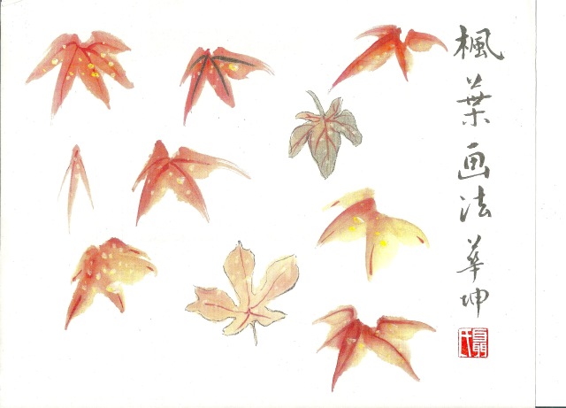
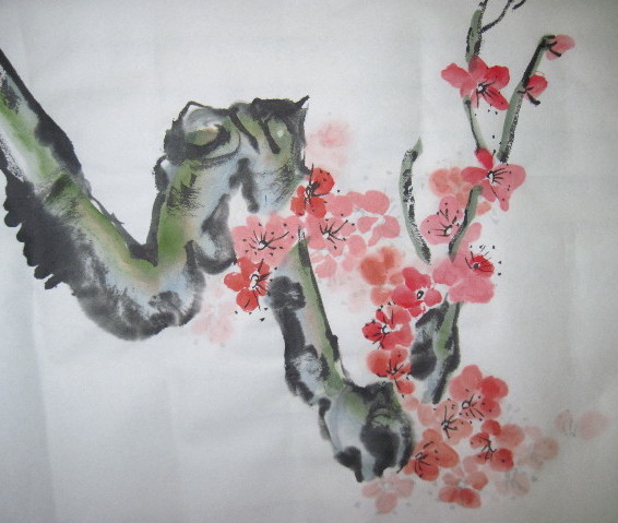
You have to understand some principles of abstract art before you can ‘get into’ what Picasso was doing with his ‘cubist’ approach, breaking up subjects or objects into pieces and re-arranging them to suit his own mind. You may need a primer on the nature of pointillism to grasp what Seurat was aiming for with his colored dotting technique. Likewise, when studying some of the CBP compositions from ages past, you do need to have some understanding of the principles of composition, the nature of brushwork, tonalities of ink, modeling methods for texture, and so on.

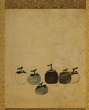
The need for context is never more obvious than when examining one that is highly  touted. When I first tripped over the 13th century Chinese painting titled The Six Persimmons, attributed to the monk, Muqi Fachang, or Mu Ch’i Fa-Ch’ang, my curiosity was hugely aroused. Just what was all the hoopla about? And why was it housed in Japan? It has been billed as the ‘ultimate in painterly simplicity’.

.SixzPersimmonsSepia

For more about the painting see this entry.

Berkeley’s Professor Emeritus James Cahill devoted a full half-hour in his lecture series (lecture 12 part 2) on landscape painting to exploring the mysteries of The Six Persimmons. Here is just that lecture.

And here are his lecture notes which I found after I’d laboriously made my own!

Introducing the Zen (or Cha-an) Painting:

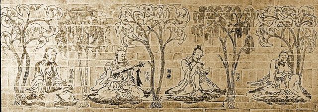
Some grasp of what constitutes a Zen (Chan in Chinese) painting and history of their development helps in the understanding of Cahill’s lecture, but he also integrates such background into his talk.  Basically it’s a genre of CBP developed by a particular sect of monks and shared with other literati, in which the artist creates a simplistic composition–usually of a very common subject such as a vegetable–employing some painting techniques that instills in the viewer a sudden epiphany or moment of illumination. The arrangement or treatment of certain elements within the composition command attention in a powerful way.  The small painting featuring six little persimmons was shared among Zen Buddhists monks, including those in Japan where it now resides. It is much admired by art critics and artists in both countries.

The closest thing we have to a Zen painting in the western world is perhaps the still life. 

Back to the Six Persimmons:

To illustrate one of the principles at work in the Six Persimmons, Cahill shows us a landscape grove composition featuring several trees painted in similar yet different shapes (i.e repeat patterns), all with varied (contrasting) tonal values. He draws attention to the location of the darkest one—just slightly off centre—and proffers that the three elements (darkest tone, central placement amid similar shapes) cause our eye to see the grove as we would in nature; the one darkest tree gets our attention and hence is the focal point.

Cahill goes on to show paintings done in China, in the manner of Muqi, that were kept in China. None of them has the liveliness, the mysterious immediacy that his simplistic Six Persimmons composition does.

In Cahill’s lecture he provides several visuals to illuminate his insights into why this little painting warrants attention. In one comparative slide he shows Muqi’s Six Persimmons beside a handscroll painting of eleven persimmons completed by some unknown copyist; the fruits are all too similar in tone, shape and brushwork to warrant much attention.

Two other comparative slides from Cahill’s lecture I’ve captured and present below.

CahillPoint-SixPersvs.photo

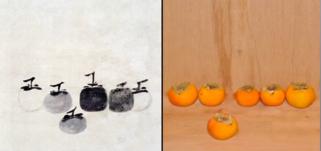
The first places the subject painting next to a photograph of six real fruits; a friend of Cahill’s took the photo in jest, but the professor of art used it to show just how complex the painting really is. The photo does line up six fruits in a very similar manner to the compositional layout, however there is little to distinguish the individual items: stems are too similar, color tones are very similar, shapes are similar, and so on. Muqi’s arrangement and treatment went a long way to convey multiple contrasting messages.

Later, Cahill shows two small paintings of a similar subject—chestnuts on a branch—with one painted in traditional manner and the one on the right presumably done by Muqi (Cahill provides several strong arguments as evidence).

CahillPoint-MuqiBrushwork

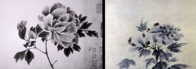
The differences in tones used for the leaves, the mixed and rough textured brushwork to convey leaf surfaces, the vitality and multi levels of interest in the Muqi composition all contribute to the commanding presence of the composition. Such was the intent for a true Zen painting; a simple subject, painted with great care, aiming to command a viewer to GAZE at it.

In essence, The Six Persimmons comprises exactly what the title says: six garden variety persimmons are painted in shades of ink—greys through darker blacks—across the page. They appear to be placed relative to one another with some plan. Each one has some individuality, and each has some ‘roundness’ or depth to its presence. They are not flat on the page, they are not just tossed on a table out of a basket, and the tonal qualities of the ink goes a long way to portraying degrees of firmness or ripeness in the fruit.

If like me, you have read and re-read passages in the Mustard Seed Garden tome or other books on the theoretical aspects to CBP, you’ve wrestled with things like the following:

“Neither complexity in itself nor simplicity is enough.”

“Neither dexterity nor conscientiousness is enough.”

“To be without method is deplorable, but to depend entirely on method is worse.”

And finally:

“You must first learn to observe the rules faithfully; afterwards, modify them according to your intelligence and capacity. The end of all method is to have no method.”

My books on theories behind Chinese Brush Painting (CBP) are rife with such loaded statements that can leave you pondering for hours. I often consider there may be even more I am missing because of translation! But there is no doubt in my mind that Muqi’s little painting has a lot happening in it, and I do want to know what those things are.

Resources on how to paint persimmon:

My main resource on techniques for painting the persimmon is the (Book 2) Fruits volume of Johnson Su Sing-Chow’s four-volume set. It is shown here next to my pocket-book size version of the Mustard Seed Garden, which is so handy to take along to thumb through when gifted with lumps of wait-times in odd places.

BookPersimmon

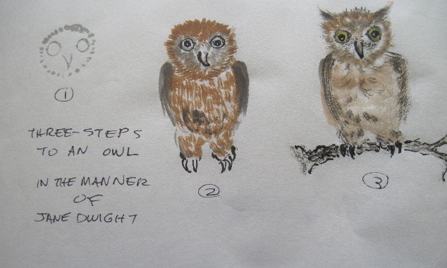
He illustrates painting the heart-shaped persimmon (most likely an ‘hachiya’) that is grown in North America and the copper-basin, a large sweet fruit that is rather flat in shape. Jane Dwight, in the Chinese Brush Painting Bible, that handy little spiral bound compendium, shows a similar approach with side-stroke fruit (her choice is the stacked Tam-tams or maybe Tamopans) and double side-stroke leaves. Both finish off their broad leaves with a little tip to the leaf, which neither have described in the text; you have to catch that tip from the visuals.

What is the persimmon?

From Su-sing Chow I garnered that there are two main kinds of persimmons, those that have soft pulp and those that have hard pulp. Soft-pulp varieties, also called sweet persimmons, are mainly red and ripen on the tree. The hard varieties (bitter persimmons) are mostly paler colors and can be quite unpalatable due to their astringent tannins. They need to be fully ripe before their chemistry alters the bitterness and the pulp becomes both palatable and digestible.

Art group member Jany Li brought a frozen persimmon (large and flat-shaped so probably was a ‘copper basin’ variety) to our group coffee break one morning, telling us on her recent trip to China she’d discovered this way of serving persimmon so as to enhance the flavor. The jury is still out on that one, as we had mixed opinions.

While hunting through my big C.A.S. Williams book on symbolism in Chinese culture for his ideas on the persimmon, I noticed he said the most widely propagated varieties are often picked after exposure to frost, which sweetens the pulp and boosts the nutrition level. That sounds like what we Canadian gardeners do with broccoli and other such vegetables, and likely what Jani’s home freezer had accomplished.

Persimmons originate in China and are deemed a fruit of good fortune and an emblem of joy. They are cultivated in every part of China except the extreme cold regions. Williams mentioned one called ‘large millstone’ that can reach 18 oz. (500 g.) or more by weight. Some varieties are native to North America; all are in the family Diospyros and go by common names such as ‘date plum’; the variety D. kaki is the most widely grown.

The persimmon tree is deciduous with broad thick leaves, and pale yellow flowers. Fruit come in many shapes—ovals, spheres (Hachiya is the most widely cultivated one), square-ish lumps (Sheng ), and one distinctive variety (Tam o pan or Tamtams) even looks like two fruits stacked, or one that wears a cap in the manner of North American acorns.

Here’s a link to a California blogger who shows us a range of varieties and do note the green leaves next to ripened fruit in some photos; other photos show trees with fruit but no leaves, as they have fallen. (Under ‘painting technique’ later on I will pass on advice to avoid green!).

Fruit sizes vary, as do the reddish colors. Of course there are many ripening into the orange tones widely called ‘persimmon’. See this link on the color name.

persimmonvarieties

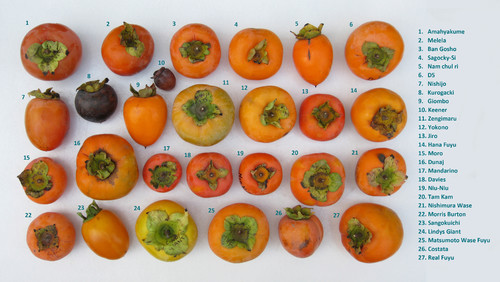
This sheet showing numerous varieties of Persimmon is from an agricultural information sheet.

TomopanPersimmonsDanDiegoMag

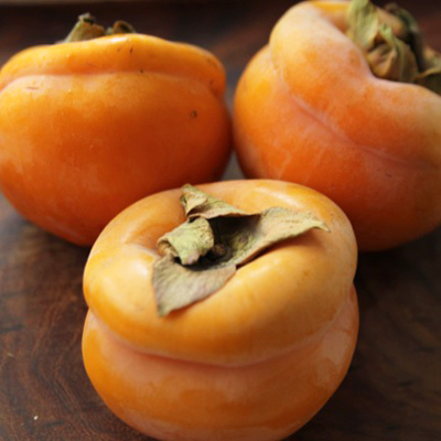
These are the Tam-o-pan variety that appear to be two stacked fruits, or one with a waist; the photo is from San Diego Magazine.

The ‘Seven Virtue Persimmon’:

Ancient Chinese lore has it that persimmons are valuable on seven fronts: they live long (about 80 years), provide good shade, offer good bird nesting, do not harbor pests/parasites, they can be used for fall decorations, are good to eat, and the fallen leaves are broad enough to write on. The painter Zhang Daquin called it the ‘seven virtue tree’.

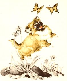
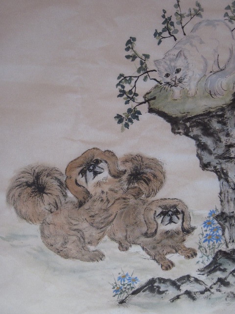
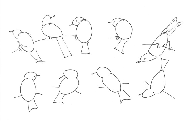
Persimmons are commonly painted with birds; or with an herb called lingzhee to convey the greeting ‘may all your wishes come true’. I stumbled upon persimmons as a subject of interest when I found some odd little birds perched among them. While studying sparrow I became intrigued by painting birds head-on; getting the eyes either side of a flat stroke for the head offered a challenge. Two sparrows in this pose in a persimmon tree showed up in a Google search more than once. They got my attention and then The Six Persimmons commanded my attention.

Steps in Painting Persimmon:

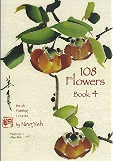
Whether rendering persimmon in ink or color you’ll need some knowledge of the distinctions of their parts: stems, leaves, peduncle, calyx and fruit. Su-Sing Chow paints both heart-shaped (hachiya) and stacked (Tam-tams) using ink tones for the leaves and color for the fruit; he says avoid green for the leaves suggesting they have turned to fall colors when the fruit would be ripe, so fresh green would not naturally appear next to red fruit. Dwight also shows the pairing (ink leaves and colored fruit) and the few online comps I have found involve ink-toned, greenish or brownish washes for the leaves. Ning Yeh’s recently published Book Four (108 Flowers) in his series of Chinese brush painting lessons, features persimmon on the cover; his treatment is distinctive and it does use green for the leaves.  (The book is on my wish list!)

NingYehBook4

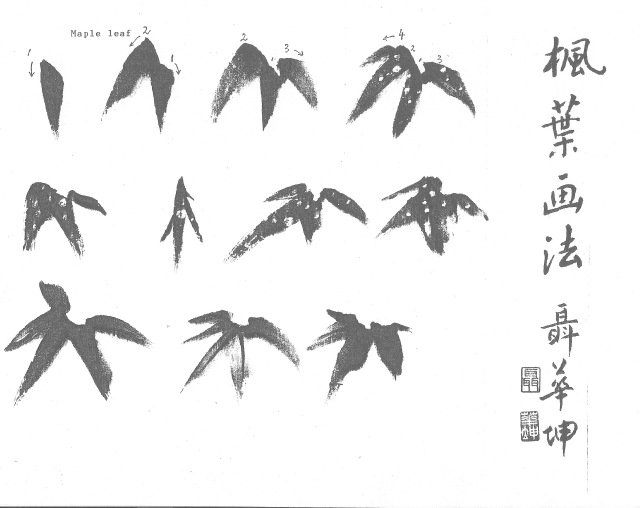
Painting the leaves:

Paint leaves first, aim for large size relative to fruit, avoid green as the leaves have fall colors or have dropped by the time fruit ripens.

Plan the comp with leaves and stems intended to surround a few feature fruit; you may be swiping in the fruit so they are behind a stem or partially screened by a leaf.

Bigger leaves require two strokes. Use water and ink, with some brown. Differentiate between light and shade (lighter ones behind fruit, on top of the tree where sun hits them; darker for undersides or out of the sunshine.) You may have to come back and tuck in leaves or parts of leaves behind fruit once they are done/dry.

Add veins to leaves when damp; though parallel they must not be uniform.

PersimmonStudy2

My first study sheet of persimmon leaves; the brownish-ink I thought I had applied in tones but the leaves dried to similar values.

Painting branches/stems:

“Suspend the wrist and use a centre brush stroke; apply inner strength, move the brush slowly, sustain and disperse the strength of the brush stroke to the very tip of each stem.” says Su-Sing Chow. Strive for crisp and fluent brush work.

Choose spaces for each fruit, close to a branch with room for a short stem/peduncle.

Painting the calyx:
The persimmon has four sepals/sections to the bud that, when opened, lie splayed atop the fruit. They are best outlined in ink with a detail brush, colored partly with umber, and finished with light mineral green.

Dwight left hers outlined only.

Painting the peduncle:

This short little stem that supports the fruit on a branch needs to be crisply done in dark ink. Be sure to tuck the stroke end back on itself and not just stop smoothly.

Painting the fruit:

Depending on variety portrayed—heart-shaped ‘hachiya’, larger and flatter ‘copper basins’ or the stacked ‘Tam-tams’ –the brushwork used involves side-strokes of color. You can play with loading a brush with orange dipped in reds. For the heart-shape you employ two paired strokes, for the stacked you place c-shapes one above the other.

Work from left to right, from top to bottom of fruit; then place the right to left stroke if doing heart-shapes. Patch up any ares with the brush tip to fill in the shape.

Leaving a bit of white showing between the strokes is desirable as it suggests light gleam on fruit; it also retains some of the curving look (3-D) to the fruit.

Use a larger soft brush

Practice to develop a ‘feel’ for the wetness, the color blending, the speed of the strokes, etc.

PersimmonStudy1

I tried both heart-shaped fruit and stacked ones. The bit of mineral green on the sepals has a nice effect.

Planning a composition:

Think out an arrangement ahead of time, such that the fruit can be shown with varied ‘faces’. Details of the four sepals go a long way to help convey the ‘turn’ of your fruit. Having leaves on all sides of fruit helps create the desired 3-D effect. Various ink tones in the leaves are desirable.  I set up my table and tried to replicate one of Johnson Su-Sing Chow’s exercises:

And then for fun took a stab at the composition found online showing two head-on cartoon-like sparrows:

TamtamwBirdsComp

Emulating Muqi’s Six Persimmons?

I have yet to try painting just the fruit, in just the ink….it’s too much fun playing with orange and red brush loads and the side-stroke shaping of fruit. I’d think mastery of fruit shapes, calyx directions, and crisp little peduncles are all necessary first. Striving for ink tonality and clever placement of fruits in different shapes and configurations will take time.   One has to be grateful to the Japanese Zen-Buddhist monks who carefully preserved the Chinese monk’s precious painting. In one of those online sources documenting the painting’s provenance, the story is told of a monk who saved it from a burning building by cutting his stomach open and tucking it inside his abdomen. Apparently the evidence is in a red blood smear on the paper near a corner or back of the paper. Ah, those art-collectors who create myth to enhance value…could it possibly be true?


Posted in Chinese Brush Painting, composition, persimmon | Leave a comment

All in the eyes: painting sparrow

Shuttlecocks. That’s what many of the sparrows appearing in Chinese brush paintings look like to me—just extremely round heads with a trailing splay of feathers. Their heads are too big for their bodies. Sorry, I don’t think the effort to capture the spirit of the bird with such portrayals is working.

Sparrows have long been a favorite choice to paint with willow or bamboo, probably right back to the Song dynasty when the bird-and-flower genre was invented. They are indeed a cheerful little bird, one that twitters and hops around a lot. They also seem to throw themselves into the breeze for the sheer fun of it. They are painted perched on branches or rocks, usually in pairs or groups, and often airborne just after lift-off or just before landing. Those last two postures take some understanding.

I’ve been looking at a lot of old and newer paintings that feature sparrows and I’m not certain who decided they should be painted so ROUND, and ill proportioned. Generally, sparrows are small, plump, brown-grey birds with short tails and stubby, powerful beaks. (They actually have an extra bone in their tongue to aid in picking up seeds.)

What does draw my attention in sparrow painting is the eye treatment. There seems to be two basic ways of portraying them—one involves an outlined oval with a central black pupil (which can also be enhanced with a white highlight), and the second is to use a simple black round dot.  I’ve tried both methods as shown in these two small studies..

SparrowStudyRB  SparrowStudyYB


About the bird:

The differences between sparrow species can be subtle. Members of this family range in size from the chestnut sparrow (Passer eminibey) at about 4.5 inches long to the parrot-billed sparrow (Passer gongonensis) at about 7 inches. A fellow blogger named Jennifer Stone has a post dedicated to differences between two common varieties—the tree sparrow (Passer montanus) and the house sparrow (Passer domesticus). She includes lots of details as well as distinguishing photos here.

Sparrow folklore:

For a seemingly small and ordinary-looking bird, the sparrow has certainly amassed a range of significant meanings to mankind from different cultures and in different times. One flying into the house in my grandmother’s day meant an impending death in the family. In Greek mythology the sparrow was associated with the love goddess Aphrodite and deemed a symbol of true love.

The Indonesians saw the sparrow as a good luck omen, portending everything from imminent rain to fortune in love. According to the ancient Egyptians, sparrows would catch the souls of the recently deceased and carry them to heaven. Sailors often acquired sparrow tattoos in hopes the image would thus carry their souls to heaven should they be lost at sea.

Chaucer and Shakespeare both relied on the sparrow as symbols of lust and lecherous behaviour. My reading also revealed that sparrows were sold as food in Elizabethan times, and of course biblical references abound, mostly exploiting the sparrow’s small size to show heavenly regard for even the tiniest of creatures. Others employ the sparrow as symbolic of pious behaviour, hope, fertility and resurrection.

One surprise to me was discovering a tale from the brothers Grimm that exploited the cleverness of a sparrow to illustrate the triumph of goodness over evil in a rather graphic manner. It reads more like an Aesop’s fable.

In China the sparrow was supposedly a candidate for the national bird, losing out to the much larger and perhaps more exotic, red-crowned crane. Sparrows were perceived as a symbol of humility, their feathers being simple and relatively unadorned. For many, the fact this species of bird would rather starve itself to death than be bred in captivity showed great spirit. Together with their symbolic associations of strength, vitality and perseverance, it was thought that this would make the sparrow an appropriate symbol of the Chinese people — despite the fact that Mao Zedong attempted to eradicate sparrows in the 1950s.

Painting the sparrow:

Until recently I had few resources addressing sparrow painting that I liked. As mentioned, several artists render these little birds in a plump manner with ill-shaped bodies and wings. (Even worse, the wings are sometimes curved concave; cute they may be to some viewers, but how they fly with wings caved in boggles the mind.)

SparrowPlump

Many good bird books will include outline sketches (such as those shown below) to illustrate the correct ratio of head to body size and suggest postures for painting.

BirdShapes

A rather basic book on bird-and-flower painting I picked up on eBay doesn’t name the bird illustrated in their simple step-by-step instructions, but it can only be a sparrow based on the images. It is shown on the left below:

SparrowBooks

The book on the right, which addresses several birds commonly used in CBP, is the one I used as a guide for sparrows with black dot eyes.

SparrowStudyYB

(TIP: Delightful Lotus admired the book for its several pages of kingfishers, but discovered the treatment of bird feet was not always accurate. One has to consider all resources critically and trust your own “creature knowledge”.)

It was an online resource that I used for the study based on outlined eyes. The artist also employs distinctive spotting on the bird’s back. His tutorial can be found here.  His manner of painting the eye certainly adds to the expressiveness of his compositions. Here’s my study again, but do check out the video which shows five on a branch.

SparrowStudyRB

My preferred sparrow characteristics:

–expressive eyes, yellow on the eyeball for contrast

–sharp beak

–spotted back feathers

–a head to body size ratio close to realistic

–wings curved naturally (not concave in flight, puh-lease!)

How to paint my ideal sparrow:

  1. Eye and beak—using a detail brush dipped in black ink paint a black pupil within an eye outline. A straight line across the top of the eye helps contribute to a focused appearance; leaving white or adding a white highlight after the pupil is dry also helps yield a piercing stare to the gaze. Strive for a short, sharp beak executed with a firm stroke. Train your eye to ‘see’ where the bird’s eye should be placed relative to the beak—behind and slightly above the ‘gape’ line. When dry, add yellow mixed with burnt sienna or a minute amount of ink so the eyeball really stands out. Raggedy Bird artist Neil Armstrong mentions white will also have the same effect, but I prefer the dull yellow.  I made this quick sketch to show how placement of the pupil can alter the bird’s look:

SparrowEye

  1. Head and body (upper back)—using a larger soft brush loaded with dark brown touch the brush to the paper and ‘plant’ a stroke for the head. It takes practice to control the moisture and color in the stroke. Some blurring of the edge is okay, but you want the pointy part that will be ‘forehead’ to hold the darkest color to the stroke. You place this stroke with the ‘prow’ aimed in the direction the bird is facing. The body lies behind the head, is made with one large and maybe two smaller strokes on either side with a ‘wipe’ stroke that may be slightly curved to convey the roundness to the bird’s body. You are not filling in the entire back of the bird, just suggesting the fullness of the shape and allowing a viewer’s eye to pick up the overall sense of the bird. You want these strokes made quickly and confidently. Again, it takes some practice to get the moisture level, color placement, and ‘swish’ just right.
SparrowStudyYB3

The bodies on these three turned out a deeper indigo than I intended, but their postures are useful to try again. This trio is on the cover of my general bird book mentioned earlier and I love  that head-on pose on the far right.

  1. Wings, lower body and tail. Using a lighter brown for the under body, and dark ink or really dark brown for the wing tips and tail seems to provide good contrast to your sparrow. Depending on whether your bird is perched or flying, you may have to define more wing feathers. Yang O-shi’s book Bird and Flower Painting offers six poses of the sparrow perched (sitting) that are very useful to learn; she also offers several in-flight poses for practice. In some of the compositions in the same book her sparrows have open beaks and appear to be ‘speaking’ to each other.
  2. Legs, feet and back dotting. Paint the legs and feet with the detail brush dipped in dark ink. The sparrow clutches on to branches with three toes forward and one pointing to the back. In flight, the legs hang loosely below the body, angled by the air draft with toes slightly curled as well. The artist at Raggedy Bird touches up his sparrow body outlines, adding feathery bits at the beak, the top of legs and along outline edges. He also sprinkles dark dots across the sparrow’s back topped up with white paint. These final touches contribute significantly to the character and spirit of his birds.

Reflections:

  1. Although the eye painted as an outlined oval with a black pupil is striking, sometimes the eye done as a simple dark dot can be effective.
  2. Getting the eye placed properly with respect to the gape line, that being the break between a bird’s upper and lower mandibles, is getting easier for me.
  3. Rendering a sharp little sparrow beak with a single stroke takes practice. Moisture level, the precise curve, length and speed to the stroke all must be ‘just right’.
  4. Painting sparrows in bamboo requires planning and coordination of TWO creative processes—the birds plus the bamboo. A simpler setting that can be roughed in after the birds are finished is easier to execute.
  5. A single sparrow (or maybe two?) with head cocked just so, eyes brightly focused on something, and body poised for action, can make a nice little scene.
SparrowComp

One comp I was sort of pleased with; for little birds they are a BIG challenge!

Now that I’ve studied sparrows more fully in order to try and capture their essence on paper, I can see why they might be considered as ‘soul-catchers’. They do move about busily and seem to be aware of every movement in their immediate surroundings. Animated, perky, and energetic—they truly are all these things. That they could sense the passing of a soul is entirely credible, but I question they’d stay ‘on task’ long enough to carry one to its destination. I’d be more inclined to trust my soul to one of the big water birds. Just look at the steady wing beats and determined stare of a heron, cormorant, or pelican as they take off across a stretch of water. Sparrows flit. Soul-carrying strikes me as much too serious a business for such a little bird.

Posted in Chinese Brush Painting, sparrows | Leave a comment