More joy, painting magpie 2

Despite painting many magpies I’ve still not generated a whole lot of ‘good fortune’ this month: back-to-back nasty colds, a dental mishap and not a single magpie to be pleased about.  This one in a colorless setting was encouraging, but it looked too generic for my tastes.

IMG_6885

We had a timely workshop on plum blossom from Nenagh Molson that helped boost my confidence with the traditional setting for magpies, but I wanted to do a better job of the bird. So I reviewed Chow’s pointers, studied images I liked, and put brush to paper.

My notes review:

  1. The Head:

–start with eye and beak, outline strokes using a fine brush and dark ink. For pointers on better bird beaks check out Virginia Lloyd Davies notes and video here.

–define the shape for the head using light ink (can continue with a rough sketch of the full body with main outlines of wings, chest, and tail; key is that the tail is aligned down through the central back)

–fill in the head shape with black ink using a fine brush (or the tip of a larger brush) placing strokes in the correct direction feathers follow (away from the beak, down through the back)

–Chow says: make sure the fine coverts on the brow are loose and natural looking.

–continue stroking in ‘feathers’ (coverts) down the chest, becoming lighter in tone when reaching the back.

  1. The Body

–a key bit of anatomy to be aware of is the alula (or bastard wing). The Latin word means winglet, and it basically refers to the first freely moving digit on the wing portion; it typically bears three-five small flight feathers. Depending on how you pose your bird, the alula will be more or less defined, but you will always want to think about where that hook-like stroke should best be placed. A bird’s wing has three bending points—shoulder, elbow and wrist—and the alula (see pink section 3 below) is located at the wrist.

280px-Alula

Birdwingimage


–use dark ink for the upper-tail coverts, making the center pair the longest (slightly longer than the bird’s body length)

–add thee pairs of upper-tail coverts in symmetrical fashion, either side of the main tail feathers.

–use light ink to define feathers that LINK the back to the tail and to fill out the wings. You want the bird’s body to appear as a single entity, yet leave wing areas sufficiently “open” to take some blue color, and the area from body to tail to take some burnt sienna-ink wash later on.

  1. Legs

–magpie legs can be rendered in the usual manners used for rooster, heron or other birds—either outline in dark ink and then add color, or put down with medium ink and then mark with darker ink for the claws and scaly look while damp.

  1. Coloring

–use a greenish-yellow for the eye

–reddish orange for a tongue

–mix an indigo/sky blue wash, dull it a bit with ink and apply over the wings

–mix a burnt sienna/ink wash to apply over the body feathers at the base of the tail

–Chow mentions keeping white speckles showing on the bird’s wrists, that bending point

–beaks are more realistically a grey-indigo mix, but a yellowish tone is not uncommon in compositions.

My studies:

This slideshow requires JavaScript.


Reflections:

After several sessions playing with magpies painting—trying different poses, trying different strokes for the tail effect, trying to use color for effect—I considered what I was learning, what was working, and what was still eluding my brush.

I had learned more about bird wings, bodies and tail feathers. I liked the expressiveness of magpies painted by certain artists, and I did not think I would soon achieve more ‘realism’ in portraying the bird.

I went back to my books and files. I discovered more magpie compositions in one of my books dedicated to a selection of popular Chinese flowers (Painting Flowers by Jia Pao-min) that appealed to me, and realized they had aspects common to those in my specialty book on magpies—exaggerated eyes, rough feather work, loose color applications.

MagpiesJPM


I found more of Xu Beihong’s magpie compositions online, recognized the simplicity of line and color he used so superbly in his horses also worked in magpies, and printed out a few examples.

XBsevenmagpies


Two magpie paintings by Virginia Lloyd-Davies also had great appeal.  One is simply a single bird, a magpie portrait if you will:

VLDmagpie

In the second one she uses wisteria for a setting:

VLDtwoMagpies

With these conclusions in mind I set out to complete a full comp with several magpies in plum blossom, aiming for the more expressive (less realistic) style I both admired and felt more capable of rendering.  I called this  one After The Rain.

AfterRain2

Posted in Chinese Brush Painting, how to paint birds, magpies | 3 Comments

Glad tidings they bring (magpies)

Some of us have been struggling a bit to get back in our painting grooves after the holidays. (Good to know I wasn’t the only one!) After some unsatisfactory pine-and-panda painting sessions I put the subject aside and poked through my library and files. Others around me were trying new papers, new brushes, and new methods. I settled on a new subject–a traditional Chinese symbol of happiness and joy, the magpie. If in life it truly is a harbinger of good fortune and joy, then painting it should also “fix” my poor luck at the art table, right?

My first magpie appeared long ago as a flash of black and white rising from the highway in front of me; my mind flashed: flying skunk? It was the Common Magpie we know in North America, with its distinctive long tail, and all-over smatterings of basic black and white. I’ve since learned that the ‘pie’ part of its name refers to exactly that, the large blotches of intense colors. Apparently the clever Pied Piper of Hamelin who rid the German town of rats earned his title from his habit of wearing clothing covered in bright patches, or at least wore multi-colored outfits.  For more on the nature of pied plumage  look here.

What is the magpie?

There are 20 species of Magpie and Treepie in the world and they are mostly confined to an area centered in India and China. Our familiar one, the Common Magpie, is found in Europe, Canada and parts of the USA. Spain has an Azure-winged Magpie, and California is the only region favoured by the Yellow-billed Magpie. All magpies are of the corvid (crow) family, except for the Australian Magpie, which is classified as a shrike.

The Common Magpie was originally known simply as ‘the Pie’, but in 16th century England the prefix Mag was added, meaning ‘chatterer’. All are capable of mimicking other birds. The raucous ‘caw, caw, caw’ call is given frequently, reflecting the intensely competitive and social nature of this species. They can be trained to talk and are known for lifelong pairings.

Magpies nest in trees and tall bushes, using sticks and mud as building materials and crafting a dome-roof to protect the nestlings. With its black and white plumage, and green and blue gloss, the magpie is an unmistakable bird. In flight; it can be easily distinguished by its long-tailed profile. In the open it flies, rising awkwardly, with quick flaps and glides, like a skittering kite. Among trees the species moves confidently, reflecting its agility. On the ground the tail is often held high as the bird ‘kangaroo-hops’ along. Young Magpies have a washed-out appearance and short, stubby tails.

Large numbers of magpies (just like their common crow cousins) gather in ‘parliaments’. No one is entirely sure why, but speculation is that gatherings occur when a pair tries to invade another pair’s territory; the ensuing competition for breeding space may attract large numbers of magpie ‘gawkers’ or onlookers. And the gawkers soon become squawkers.

In common with jackdaws, magpies are attracted to shiny objects and are notorious for stealing rings and other jewellery left on windowsills or tables out of doors. (I have been known to confess a ‘magpie complex’ when my propensity to buy small treasures at thrift stores is noticed.)

The Magpie in Chinese culture:

The belief that magpies bring happiness now shared by most Chinese people comes from the Manchu culture. One legend involves a boy named Fancha and the most ancient patriarch of the Manchu people, Bukulirongshun.

One day a heavenly goddess (Fokulon) and her two sisters were playing beside a lake when a beautiful magpie with a red fruit in its mouth flew above them. The magpie dropped the fruit. Fokulon picked it up and ate it. Some months later she gave birth to a boy she named Bukulirongshun.

Bukulirongshun and his descendants were all heroic and skilled fighters and thus became a threat to neighboring tribes. They formed an alliance and decided to wipe out the rising tribe. A boy named Fancha ran from the slaughter with the alliance warriors hot on his trail. He kept running until exhausted and when he halted, a magpie lighted on his head. He stood motionless hoping to look more like a tree trunk in the dim field. The hunters were deceived and ran on in another direction. Fancha thus became the only survivor of the genocide, thanks to the magpie.

Fancha was grateful to the bird and believed it to be something sacred; it had brought him happiness and good fortune. In keeping with those thoughts, killing a magpie is also thought to bring bad luck or misfortune.

In other cultures the magpie (or simply its song) is variously associated with approaching better weather (Mongolia), impending news or the arrival of friends (Korea), or a good drunk/winefest (Italy). In parts of France, villagers heeded a magpie’s call as warning of an approaching wolf. The Germans had a system for covering ALL of those bases—one sighted magpie was deemed unlucky; two brings merriment or marriage; three is a successful journey; four is good news and five indicates you should expect company.

My research uncovered many strange customs pertaining to the magpie, such as carrying an onion to counter the bad luck it carried, or chanting verses. One website ended with this caution that magpie-magic is double-edged: It requires mastery of your magpie spirit to achieve things; un-mastered, it will be self-destructive. Gossip, or uncontrolled chatter, and an unreasoning attraction to shiny things – be it materialistic objects, people or an inability to concentrate – spells danger just as oratory, or controlled chatter, concentration and the quick opportunistic observation can be used to devastating effect.

My interest in mastering magpie painting thus had new impetus!

Painting resources:

I have two excellent books on painting magpies. One is dedicated to the familiar black and white bird and the other throws in the Grey Magpie (softer grey color with a reddish breast) for good measure.

  1. Book No. 3 in Johnson Su-Sing Chow’s series The Fundamentals of Chinese Floral Painting.
  2. Magpie Map (Chinese) by Wang De Lu Hui

IMG_6841

My studies:

Chow’s book put the magpie in a common setting—contrasting with red plum blossom, which he called Ascent to Joy. He provided excellent introductory steps to getting the bird ‘right’. Wang’s book is a trove of expressive-looking birds in many, many postures. Then I also had access to my Bureau of Better Chinese Brush Painters (BBgirls?), those who have been painting the flower-bird genre for many more years and are very knowledgeable about birds to boot.

I STARTED to follow Chow’s basic steps:

MagpieStudy


I played with heads as per Wang’s book:

MagpieStudy Head

I neared execution of a full bird:

MymagpieInProgress

Then I consulted the BBgirls: Which direction do you use for the tail feathers? How long should the tail be? etc.

One paints the tail strokes toward the bird; another paints away from the bird. One tactfully interjects: depends on what effect you want to achieve.  I gave painting in both directions some practice:

MagpieStudyTails

OH boy, I WILL have to figure out what works for me…just like the old ‘chicken-egg’ argument over which came first, I had to discover that “eyes and beak first’ for bird-painting gave me a more confident bird. Some books SHOW starting with a sketch of the body shape. So, discovery time it will be for me and my birds. And yes, Bird Woman I am looking in bird books and at photos of real birds; I do NOT want to replicate bird anatomy errors committed by others.

realMagpie

While some artists show the magpie tail roughly equal in length to the bird’s body, this image shared by Birdwoman shows the tail is LONGER.

I do LOVE Wang’s expressive magpie eyes, however, so I will try to emulate his STYLE. Right bird proportions yes, right coloration yes, but accurate eyes….no.

XuBeihong doublehappiness

This simple composition by Xu Beihong, the acclaimed horse painter, is called Double Happiness. I am intrigued by the bird postures he chose.


The three compositions above were in an art book Nenagh Molson recently used to illustrate plum painting. I couldn’t help but notice the pairings with magpies and that the bird’s pied plumage fits naturally with the limited color scheme.  I AM inspired to keep on pursuing the magpie.  I have yet to work through ALL of Chow’s directions for body, legs, feathers, and coloring. And I may even have to brush up on plum in order to complete the composition; those darned holidays do mess up one’s continuity.


Posted in Chinese Brush Painting, how to paint birds, magpies | Leave a comment

Pursuit of the perfect panda painting

Growing up I had uncles who loved to tease the heck out of us. Their corny jokes are hard to forget. One I can’t seem to shake is Q: what is black and white and red all over? A: the newspaper. Then that morphed into Q: what is black and white and black and white and black and white? A: a nun rolling downhill.

That’s the utter nonsense kicking around in my head while I ply my brushes painting pandas chomping on red bamboo. The subject was addressed in a timely Nenagh Molson workshop before Christmas to give us some non-traditional ‘red’ ideas for greeting cards. I didn’t get around to doing ‘homework’ until now.

Painting pandas

I’ve addressed the basics in an earlier blog.  As always though, there’s something for everyone in one of Nenagh’s sessions. And doing the homework meant I dug out my books. I have three dedicated to the subject, jam-packed with LOTS of inspiration.

3panda books

And art group buddy Dormouse seemed to be on the same wavelength as I was this week, because an email from her brought me this outstanding image of pandas in a pine tree. “Photo-shopped!” pronounced the others at GH this week!


pandatree

I wish I could source this image for you, but it has been over many digital miles and I can’t find the origin. Isn’t it fantastic!

Pandas simply aren’t that sociable, unless in captivity together maybe. Twenty-seven in one tree is amazing. Digitally altered or not does not matter—the image offers lots of variety in panda poses!

Nenagh’s workshop had numerous inspirations as well.


Panda Painting pointers:

  1. To get a furred edge to panda body parts (or on other furry animals such as cat, dogs, ducks.) learn to “break the ink”. Paint your body part, let it dry almost completely and then run a brush of CLEAR WATER along the edges.
  2. To help convey three-dimensions to the panda’s upper arm use THREE strokes—one on either side of the planned limb, and then one overlapping the both of them through the middle. You can narrow the limb at the elbow.
  3. Add dry brush strokes to face and body using light ink to suggest the fluffy white panda coat.
  4. Think about the oddly shaped head and body and capture that in your poses.
  5. My books also showed using light colors such as vermillion, bunt sienna, and even green as hastily added light tints to the edges of the panda’s white coat.
  6. Try under-painting the panda ears with pink for realistic inner ears, especially if you’re working in large scale.
  7. Traditionally you try to stroke the distinctive eye ‘patches’ in dark ink LEAVING the white inner area white. Nenagh always advocates using your white paper instead of using white paint. But should the paint blur and fill in the eye, don’t be shy about fixing it with white paint once the ink dries.

PandaStudyPandaStudy 2PandaStudy 1


With these things in mind, I set out to compose a group of pandas in a pine tree. I started with an estimate of the length of paper that would fit in a tall frame I had on hand, tons of panda poses (thanks Dormouse for the inspirational tree!), and lots of panda-pine-bamboo comps in my three books.

I roughed out seven bears (an odd number is best) and the trunk and major limbs for a pine tree. I opted for several pandas at the base of the tree munching on bamboo. I used some of my new greens to get the bamboo in the panda hands, mouths, and laps. Even before adding the blue-green to my pine needle clusters I considered I was going to have problems with contrasting greens—blue green in the tree and grassy green in the bamboo. I extended the bamboo into a bit of a grove at the base of the tree trying to overcome the inverted Tee look to the rough comp. I stepped back.

My PandaPlan1

Midway through this painting, and I’m not seeing how to tie together the two areas that involve such different greens. It looks disjointed. Maybe I should cut back to a smaller size?

Further consideration had me seeing different pine needle strokes in different areas of my pine tree. I spied sections of the tree trunk that needed fixing—a trunk has to NARROW gradually as you move toward the treetop. That was easily fixed, but the differing pine clusters bothered me. Assured by some of my art group buddies that the self-critic was on overdrive, and that only I was bothered by the foundation to pine clusters, I forged ahead adding color, first the dark blue-green strokes over the needles, then the colored wash over the clusters.

Still not happy with my pandas I considered cropping the comp to use only part of it–maybe just the middle, or perhaps the three uppermost bears?


With indecision ruling the day and frustration over the pine mounting, I put it aside for another day. Next week is another Nenagh Molson workshop and she loves to see our ‘homework’. Boy, have I got a panda/pine problem for her!

Posted in Chinese Brush Painting, painting pandas | Leave a comment

Bring it on! (the Money Frog)

Who couldn’t use a little extra money this time of year? Well, the prospect of free-flowing cash could be as simple as placing a frog on your doorstep! Not just any frog. This has to be a sculpture or image of the magic three-legged frog, aka Money Toad, Fortune Frog, Wealth Toad, or Chan Chu.

My pursuit of figure painting led to the discovery of Chan Chu when I tripped over various paintings of Liu Haichan, an immortal allegedly based on a civil servant and alchemist of 10th century China.  Here’s one example.

LiuHaiwithToad*

and another:

liu-hai-play-toad-chinese-painting

He is often painted playing with a frog—petting it in his lap, dandling toys in front of it, happily showing it off to anyone he encounters. The most common toy is a string with coins threaded on it, supposedly money the toad has helped Liu Hai pull from a well, or coins Liu Hai uses to entice the toad out of the well.

It’s also believed that the Money Frog appears every full moon, near houses that are about to receive auspicious news. Some of the tales suggest the frog/toad could also transport Liu Hai anywhere he wished. In Outlines of Chinese Symbolism and Art Motives, C.A.S. Williams pulls together lots of these legendary tidbits about the magical amphibian, and names my inspirational composition of Liu Hai and his pet as “Liu Hai sporting with The Toad”.

Among the various tales my favorite has to do with the origin of the tripedal toad. Legend has it that a lunar goddess stole the elixir of life from her alchemist husband and then fled to the moon where she was turned into a toad.

Liu Hai is sometimes painted on Mahjong tiles too, with his three legged toad and string of coins:

Moneyfrogtiles

Two paintings I recently completed were initiated as figure painting studies, but evolved into portrayals of the Money Toad. A challenge for me was to pose the frog in such a way that one is aware of the traditional missing hind leg. Money Toad sculptures don’t make this fact terribly obvious, but placement of such a sculpture near a front door would encourage me to examine it for a missing leg. Such sculptures I have viewed usually include a handful of coins and the significance is more readily picked up. Other artists seem to have faced this challenge as well; the toad is often portrayed with red eyes and spitting out coins. It would be hard not to realize such a toad/frog has some special meaning. (If you go back to that Wikipedia link near the top of this post you can see an example of a red-eyed sculpture.  He looks a tad strange to me, if not outright evil.)

Skipping2 copy

In this first one, I planned for a tripedal toad, but forgot while I was outlining his limbs and he ended up with four legs!

In this next painting I aimed more specifically to portray the Money Toad with his traditional companion:

MYLiuHaiMoneyFrog

If images of Liu Hai Sporting with The Toad do indeed attract wealth to a home, I should soon know. These two have just been filed in the shelves in the foyer of my home. Like I said, bring it on!

Posted in Chinese Brush Painting, painting figures, painting frogs | Leave a comment

Impressionism, extremism…Zen?

Finding your style in any artistic endeavor is always a bit tricky. I wrote ‘finding’ as opposed to ‘developing’ because I believe we are all capable of playing at art, but some of us are better at silencing the judgmental tones of our Left Brain and trusting the impulsive, creative gifts of the Right Brain. Granted, once we glom on to our preference for realistic landscapes, large boldly colored flowers, or whatever the case may be, we tend to work more at that thing, and hence ‘develop’ the inclination.

I know what I like: three of the four gentlemen, figure painting, and pretty well any animal. And I don’t mind depicting any of the usual ‘guests’ that go along with rendering those things. One concept deeply associated with Chinese brush painting (CBP) and sumi-e is that of portraying qi—one strives to capture the spirit or essence of a person, place or thing when painting. That I embrace as well.


HoteiOnAboatbyHE

Paintings such as this one by Hakuin Ekaku called Hotei On A Boat  are most appealing.

Three recent events made me think more about individual style in CBP, and the portrayal of spirit or inherent ‘being’.

BIG insight from LITTLE images

Friend and mentor Nenagh Molson lent me a book on figure painting. It was all in Chinese and did not have an ISBN number. But it did have page after page of intriguing illustrations with a definite visual message. The illustrations consisted of numerous classic figure/zen paintings from centuries ago; I quickly recognized such entries as The Sixth Ancestor Chopping Bamboo, Hotei Wading the River, and Catfish and Gourd. What was different about this presentation is that for many of them the editors presented at least three images—one showing the whole composition, and then two showing closer and even closer detail shots.

To a CBP artist who loves figure painting, these illustrations are hugely important. When we are accustomed to seeing images of painting only in books we can lose sense of the true impact they carry. Many ink paintings were created on large scrolls—four feet tall and 15, 20, and 30 feet long! Such images shrunk to less than page-size in any book—even those we call oversize—show us very little of the true brush work and tonal value range of the ink. We can’t see the magnificent swipe that carries dark tones to the edge of an arc, imparts thick and thin shaping to lines, or leaves degrees of wet and dry to rapid or slow strokes.

Below are three successively closer images of The Sixth Ancestor/Patriarch Chopping Bamboo; just SEE those brushwork details as the lens takes you closer to the work!

6thPatBambooStudy1  6thPatBambooStudy2

6thpatbamboostudy3.jpeg

Here’s the same revelation using the painting called The Sixth Patriarch and Tearing of a Sutra:

6thPatSutraStudy1 6thPatSutraStudy2

6thPatSutraStudy3


Walking the Dog

With a Dog Year (2018) approaching, many in my art groups are turning to painting dogs. While the Pekingese is considered the quintessential Chinese dog, any breed of dog can be used to represent this sign on the Chinese Zodiac. I have blogged about painting Pekingese before and have dabbled at depicting other breeds, with varied success. It was heartening to discover while reviewing past dog lessons of dear friend and mentor John Nip that he too faced some issues in getting proportions and scale of doggy parts just right.

And then I hesitated as I examined his dog portrayals…was he truly ‘getting it wrong’ OR was he ‘deliberately distorting a line or feature’ with the aim of humor or whimsy? Perhaps his oddly shaped ears and funny muzzle that didn’t quite convey ‘Pekingese’, and didn’t truly say ‘spaniel’, yet definitely held quizzical appeal in doggy essence, was the intended artistic result? Was he giving me the impression of a funny, furry creature balefully looking up at me after perhaps toppling a potted plant or leaving wet paw prints across my kitchen floor? Maybe he had just captured the true essence of a naughty, playful pup? Did it matter that I didn’t recognize any one breed in the portrayal?

JNdogs3  Myyellowdog

John’s dog is on the left; on the right is my version of a playful puppy peeking out from among some yellow blossoms, probably wintersweet.  Now is it a spaniel? a mutt?

Getting more into ZEN

I’ve acquired several art books dedicated to Zen painting. Two are oversize volumes loaded with illustrations of art housed largely in Japanese galleries/museums. One is a smaller book with a more academic approach—it shows numerous classic Zen paintings, and includes an essay for each, discussing its zen qualities—mentioning the theme, the intellectual challenges, the koan that many see in it.

Zenbooks

One painting that really stands out for me is Three Blind Men Crossing a Bridge from 17th century artist Hakuin Ekaku.

BlindMenBridge

I was initially drawn to the image because of the simplicity of the composition, the figures in profile, and the intriguing title that suggested there was something mind-bending about the subject material. Authors Stephen Addiss and John Daido Loori gave me greater appreciation of all three aspects. Here’s some of their commentary:

The great master Hakuin is pointing to the difficulties we encounter while attempting to navigate our lives. He advises that a mind that can cross over is the best guide. I ask you what is the mind that can cross over? What does it mean not to just look but to see? ‘Seeing’ is a whole body and mind activity in which the separation between seer and seen has completely dissolved. As Thoreau said, it is a seeing that is ‘beyond the verge of sight’. At just such a time the ‘mind that can cross over’ realizes the other side and this side are a single reality.

Addiss and Loori helpfully draw attention to some key elements in the Zen painting: The three men are blind, yet are attempting to cross the bridge (achieve enlightenment in ‘Zen-speak’) each in his own manner. One reaches out with his staff, another is down on his hands and toes to feel his way, and the third has placed sandals at the end of his walking stick in the manner of a trapeze walker using a balancing aid. The bridge does NOT completely cross to the other side; there is a noticeable gap. The bridge, albeit incomplete and hence not a true bridge in my estimation, spans what could be a very deep gorge. The authors say that Hakuin drew on folklore and everyday life is his creations; here he depicted an imaginary bridge in the mountains hear his home and added three legendary blind men to help convey his insights into the meaning of life.

What the thinking did to my painting

While these thoughts were filling my head, I was playing with figure painting. Looking at some ancient compositions I was surprised to find arm extensions not truly anatomically correct, some foot twisting that could only mean a practiced yogi or extraordinarily flexible individual, and even some unrealistic bone lengths.

Look closely at the shoulders of the two fellows in this painting with up-raised right arms–the one pummeling a downed guy on the left, and he one lifting his instrument to join in the skirmish.  The right upper arms should have more length to them to be anatomically correct, should they not?

vagrantsbadarm.jpeg

Similarly in the figure below, the right upper arm again seems to be  ill-proportioned.

5thPatBadArm

This last figure was titled Patriarch returning from Chopping Wood. Perhaps the artist intentionally distorted that arm to enhance the sense of weariness and muscle soreness. (On days when I have foolishly over-exerted myself in the garden–cleaning up old beds or turning sod for new ones–I swear various body parts have felt badly distorted!)

I wonder if the twisted forearms, the wrenched ankles, or lengthy calves really matter? Does my eye not simply take in the full figure? And, more importantly, when I lay down strokes to show a foot, an arm, or leg, do I have to leave a solid trace to the boundaries of the skin and bone? Did the masters not leave some of the delineation to the imagination?

I pledge to worry less about incomplete lines in my figures and strive for strokes that reflect the energy of the individual: an angry figure will get Zs and Ws as per the patriarch ripping his sutra, happy figures such as Hotei wandering around with his bag of goodies and odd companions warrant only curved lines with lots of thick and thin variations.  I’m not so sure I buy into the idea that the bridge the blind men attempt to cross should be incomplete.  I want to know they have a real chance of crossing over.


.


Posted in Chinese Brush Painting, painting figures, painting qi, zen art | Leave a comment

Out on a limb: pine cones

All that exists is, in a sense, the seed of what will be born from it.” — Marcus Aurelius

With pine branches being such a common setting for animals or birds in Chinese brush painting (CBP), you’d think there would be an abundance of instruction for portraying pine cones. There is not. Many of the books that address painting pine, and there are many, look at the tree and branch shapes, the bark, and the needle clusters; they overlook the cones entirely.

From observations on my many walks and hikes I am quite aware that cones can emerge from branches of different conifers in different ways: some point upwards and some down, some present as long and curved while others are fat and round. Some appear tightly wrapped when new and then loosen up as they mature. Some emerge in clusters while others present as individuals or pairs.

Sorting it all out can be challenging. Here is a site that increased my factual knowledge of pines and their cones.  And another. My research led me to this site that has great information and a diagram naming pine cone parts at the end.  It’s also where I discover a bristlecone pine tree in California considered one of the oldest living organisms on earth, aging out at 4800 years old!

And then I wondered just how much I really had to know?

MyConeColl

Here’s an assortment of pine cones I’ve collected over the years and have never altered into the intended Christmas crafts. What a trove for painting!

Here’s a cone assortment recently spied on a mantlepiece at Goward House (where one of my art groups regularly meets).  The large one at the back is about eight inches tall and the smaller ones out front have opened into rosette shapes.

 GHcones

Conventional pine boughs

Most of us westerners consider pine boughs with a few cones to be standard Christmas card fare. Add a chickadee, cardinal or Canada jay and a dusting of snow and you’ve got the makings of a cute card. But which pine are we painting, and how should we depict the cones? And maybe we are unwittingly depicting a spruce or hemlock, or other conifer…does it matter? Perhaps my CBP instructions for depicting cones, limited as they were, would be enough for me to capture their essence in a credible manner?

Kate'sConesID

A watercolor artist named Kate Dolomore has taken many more pains than I to sort out pine cone identities for this helpful field guide.

My resources:

Among my general CBP instruction books that do include cones in their sections on pine painting are these:

  1. Johnson Su-Sing Chow in his Manual of Bird Painting No. 3
  2. Caroline and Susan Self in The Art of Chinese Brush Painting
  3. Jane Evans in Chinese Brush Painting
  4. Yolanda Mayhall in The Sumi-e Book
  5. Wing K. Leong in Chinese Painting Step by Step
  6. Fang Zhwu-shiung in Painting Cute Animals

conebooks

I considered the similarities of methods in these books and attempted to emulate the lessons from four of them.

My studies: 

  1. Su-Sing Chow’s method included color washes. He employs dabbing strokes of dark ink, starting at the cone tip and working toward the cone base. He places those dabs in roughly defined arcing rows, aiming to convey a rounded shape. From the base he inks in a short, firm stem that attaches the cone to a pine branch (peduncle). In keeping with the traditional manner for suggesting the green coloring of pine needle clusters (graded washes over clusters) he lays a reddish-brown wash over the cone. One could vary the ink shades used for the individual ‘scales’ in a cone, define them in brown shades, and play with adding accumulated snow (using white paint) for variations.

ConeStudyChow

  1. Caroline Self and Yolanda Mayhall both illustrated cone painting using a tick-stroke with dark ink. Ms. Self suggested working down the left side of your cone first, then doing the same on the right side, and finally filling in three or more such rows of ticks to flesh out the central part. It helps to know that the peduncle (that short stem attaching a cone to a pine branch) extends as a central core to the entire cone. Mayhall’s version was a slender, longish cone, while the Self depiction offered insight into conveying a fatter cone. Here’s my attempt at mimicking the Self study.

ConeStudyCSelf

  1. Jane Evans’ method for painting pine cones appears to be a variation of the Self method. Here’s my study following her technique. Her strokes are based on the tick-stroke, just executed with a bit more of a flick to the brush, or ‘flourish’ as you plant and then drag the tick off into the air. Clearly you can work up a rhythm to planting your strokes and you’d be wise to have visualized the shape and placement for your cone before laying in the first stroke.

ConeStudyEvans

  1. Wing K. Leong provides a slightly more detailed rendering of cones. He used a dabbing stroke that he twisted slightly to create a slightly rounded dab. He creates them with a brush loaded with light ink dipped in medium dark ink, and then with a fine brush loaded in dark ink, he adds the little hair-like projection (aptly called a prickle or bristle) at the tip of each of the scales protruding from the core of the cone.

ConeStudyLeong


Compositional concerns:

Once I had played with using tick strokes and the rounded, double-load method I moved on to trying a full composition. My cone quest was inspired by the unusual posture of a large squirrel discovered on someone’s Pinterest page. The creature dangled precariously from a pine branch, swinging towards the viewer, and as I contemplated how to use the pose, I realized he needed a focal point for his upward gaze. Enter the need to paint a realistic pine cone.

First I worked out the niceties of squirrel body parts. Those paws they use to turn and manipulate food items do NOT have an opposable thumb as one might conclude from watching them dismantle a cone at rapid speed. They have four ‘fingers’ (with the two middle ones being longer than those on either side) extending forward, with a fifth much shorter one placed behind the set of four. Think of other pawed animals you may be more familiar with, such as cats or dogs, and you’ll recognize the back ‘pad’ as that hind-most finger/thumb.  That fifth ‘finger’ is used strategically to create an opposing force against the pull of the other fingers, when squirrels crawl vertically down tree trunks.

Not having painted fur in some time I had to refresh my memory of laying down dry brush strokes and using colored washes. Red squirrels have pointy ears, whereas the large grey squirrels that scamper in the oaks outside my townhouse window have rounded ears. They have beady, dark eyes and short whiskers. There must be a squirrel species in Asia with distinctive stripes similar to the chipmunks we know in North America, as many CBP compositions feature such creatures.

SwingingSquirrel

My reason for wanting to paint pine cone was to give this furry fellow a suitable focal point.

It took several attempts to get the squirrel and pine worked out before I could drop in my pine cone. I’m quite happy with the end result, but nevertheless still want to discover what kind of pines sport which kind of cones. Here’s a starting point. And another.


Posted in Chinese Brush Painting, composition, painting pine, pine cones, squirrel | Leave a comment

Getting there…by gosh or by golly, a horsey adventure

Growing up in the 1940s and 50s in the Robson Valley we lived through a lot of transitions: from coal oil lamps to electric lights, from wood stove to central heating, from horse and buggy to cars and trucks. In those heady times of modernization we sometimes had to fall back on the old ways whenever the new ones didn’t quite work as they were expected.

This was never more obvious than during the winter when snowstorms plugged up roads and vehicles couldn’t get through until the highway crew (my Dad among them!) cleared the way. There were occasions, such as the annual school Christmas concert at our community hall, which one simply had to attend; yet we often faced snowed-in roads impassable by car. That’s when Dad would simply go out to the barn, hitch up the team, and get us to the concert on time! It wasn’t unusual to arrive to a parking lot filled with some vehicles as well as several horse and buggy combinations.

Sleighride2

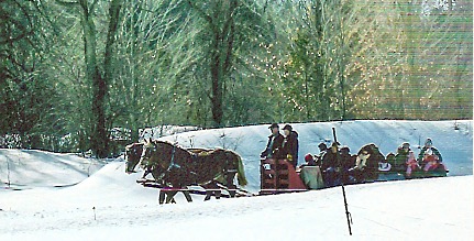
Horse drawn sleigh rides offered as tourist attractions always get my attention. Sugaring-off in Ontario holds lots of appeal for this gramma and her camera.

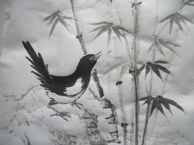
I’ve blogged about painting horse before, relying on many early memories of horse anatomy and behaviors. The image of two horse rear-ends trotting along in front of our wagon as we headed to the post office, train station, school or neighboring farms is lodged deeply in my brain, both left and right sides.

I can hear the clip-clop of their hooves on the hard-packed country roads in summer, the snorting of horsey breath, the jingling of harness, and even sounds of birds chirping and twittering along the wayside. I can smell the earthy animal scents of sweat, dung, saddle soap and plain old horsehide.

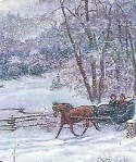
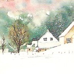
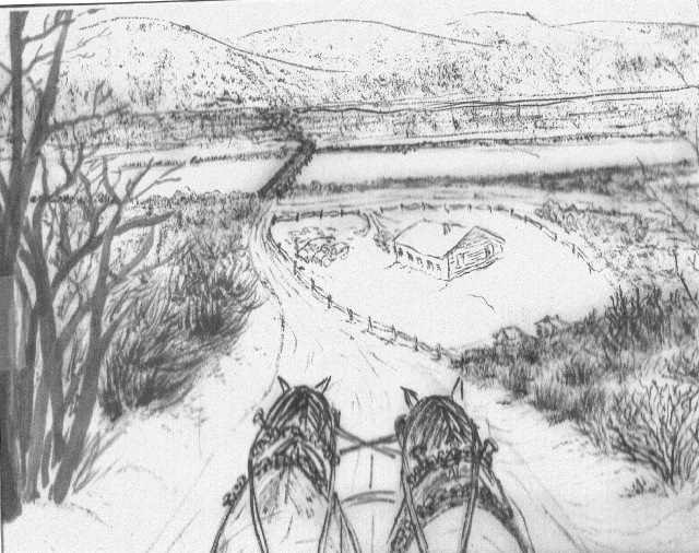
So it is that when I tripped over a painting of a country vista as seen from the driver’s seat of a buggy—yes, staring into the rear-ends of two horses—and ahead to a farm yard nestled in a valley, I was inspired to try and replicate a similar childhood memory.  (You can find such images via a Google search using tags such as “snowy sleigh ride images”.  Few seem to be tagged ‘rear view horses’.)

My painting plan

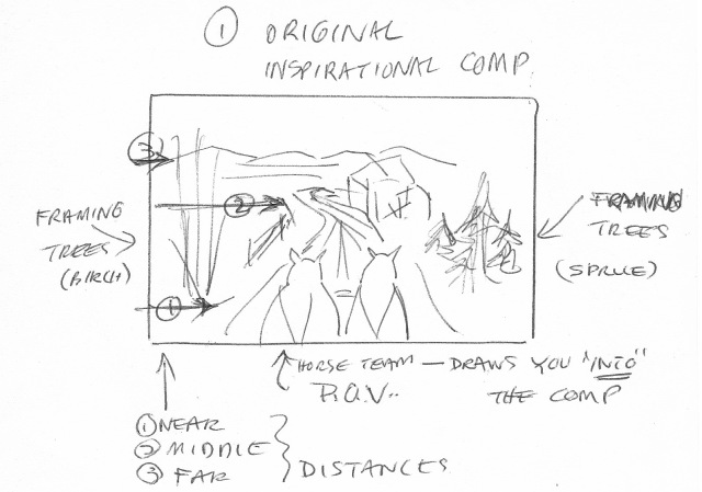
The inspirational composition at first seemed simple enough. The horse rear-ends were front and centre, dominating the scene. To either side were some tree clumps (birches on the left and evergreens on the right) framing the scene. The horses were headed away from the viewer, drawing you into the picture. The visual had depth to it.

Dunsterhall

And that’s where things started to get a bit complicated. The whole scene was in winter, complete with snowy trees, roadsides, roadway, snow-covered rooftops, and distant mountains. I had instantly determined I could paint the horse; I could depict the trees, the buildings, the middle and far distant elements. There was the small matter of figuring out how to “save” the white of the paper to keep the snow-covered bits looking white, and learning how and where to trail in blue-y lines to define the snow.

There were also two huge challenges posed by the perspective and the desire for some aspect of realism. Yes, I had instantly recognized that the horses in the painting could be my horses, the mid-distant buildings (their destination?) could be my old community hall, and the distant mountains were easily my old valley guards. I was back in time, heading to the Christmas concert with horse harnesses jingling, nose tingling from cold, and my young heart filled with excitement and anticipation.

Inspired and driven by such strong emotional connections some artists can create amazing compositions. Could I be one of them?

Dunsterhall 1The clash between what is/was real and what works for a painting can literally ruin your intentions. The inspirational scene, although having at least three ‘distances’ (front, mid range and far), comprised essentially three, layered, horizontal planes. And this is often the way landscapes are presented in traditional CBP compositions, albeit they are envisioned with certain other principles in mind.

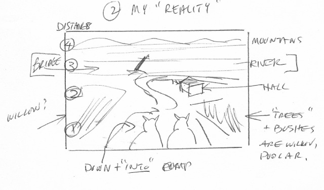
They are fairly easy to sketch. For my remembered scene I wanted to add the sense of descending a hill into the destination community hall, as well as rounding a corner. That’s the way it was: you went down Blackwood Hill (named for the nearby farming family) just before you rounded a corner…and then surprise, you came upon the hall.  Of course my childhood nostalgia may be mixing up some of these sensations and perspectives, but that’s my memory and I’ve got the artistic license here!

Dunsterhallpic

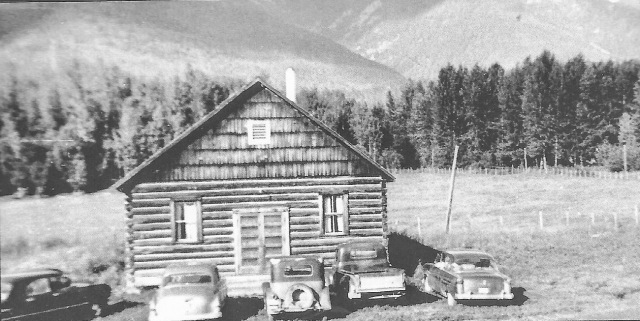
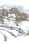
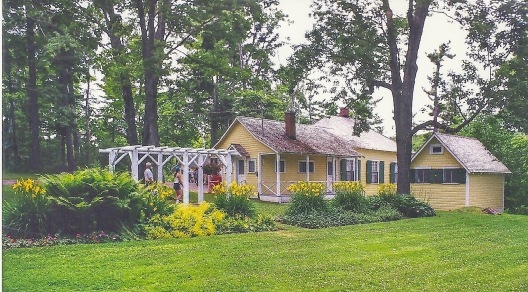
Here’s the community hall of my childhood, complete with what looks like my Dad’s truck. The approach I am recalling is from the opposite direction, along that fence on the right side of this photo.

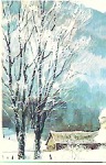
To complicate matters, the hall was located at a fork in the road on the north side of the Fraser River right at the foot of a landmark bridge. Yes, I had some further detailing to drop into my scene, adding yet another ‘layer’ or plane, if I truly wanted the scene recognizable to others. So my perspective was more ‘western’ than oriental, I had an extra plane to incorporate, I had snow to depict in all its nuances, and I had deciduous western trees to portray, not the conventional oriental pines I do know how to cover with snow….

DunsterBridgeBill Arnold

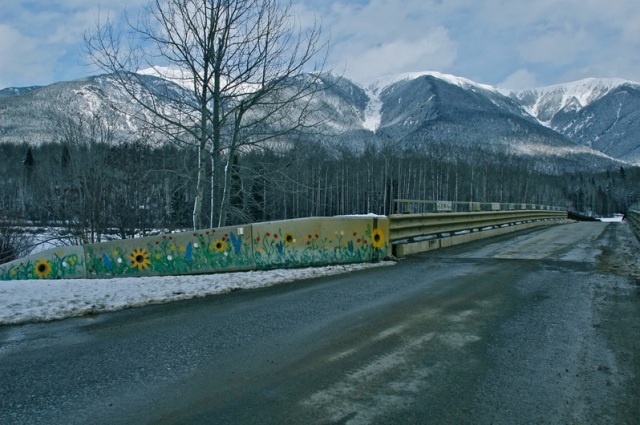
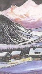
This is a more recent incarnation of the Fraser River Bridge crossing near Dunster BC. The photo (credit Bill Arnold) was taken facing southwest (away from the hall) and gives an idea of the shape of the Caribou Mountains in the background.

How did I get myself into this situation and could I paint myself out of it? Oh, and did I mention I started laying out this composition in an art group painting session, meaning I had the added pressure of potential friendly queries as to how my painting was coming along! Of course that last bit of “pressure” also comes with positive encouragement, helpful direction, and expert critiquing. Hurrah for art groups.

My painting progress

To say my painting went through several transformations would be understatement. When I wasn’t actively doctoring my scene, the image would loom up in my mind and I’d mentally adjust elements. I also left the painting lying on my art table where I could take frequent peeks and let ideas float around.

Step 1: With a preliminary sketch worked out (see above) I selected a clean sheet of Moon Palace and lightly transferred my main lines to the paper using a small brush and pale indigo ink. Such ‘first lines’ easily disappear into a scene as you enhance shapes and elements with ink and color. Furthermore, with my scene intended to be a winter scene, if any of these first lines were to later become ‘false lines’ I could pass them off as snowdrifts. My main lines were the distant mountain ridges, the river banks and bridge, the community hall and surrounding fence, the silhouettes of the horse rear-ends, the snowy tracks of the roadways, and the bushes at either side of the road.

Step 2: Adding textures and details with ink and mostly a dry brush came next. I easily added the harnesses and defining manes to my horses. Our horses had been a white mare (Lou) and a grey stallion (Rocky) but in the interests of scenic impact I planned to paint two chestnut mares. The dark brown would offer better contrast to the snowy scene and help focus attention where I most wanted it.


Dunsterhall 2textured

This is a photocopy I made of my preliminary ‘texturing’ of the landscape. the aim is to have greater detail showing in the foreground and less clarity or details further away. I tried to angle and curve the road for an interesting perspective on the scene.

My distant mountains were given a rough brushing to suggest tree cover. The bridge of the time had low railings and was slightly wider than the width of a single vehicle. Leaving a pure white expanse for the river was simple enough; defining the siding of the wooden structure that was the community hall at the time required a bit of research. I consulted old photos for the roofline, number of windows and positioning on the lot. I recalled two-tier barbed-wire fencing strung between fence posts and dropped those in. Then my landscape painting bogged down.

I faced two challenges—1. How to define trees and bushes on either side of my roadway with gradually diminishing definition as the eye moved from foreground to middle to far distance, and 2. How to cover everything with ‘snow’.

At this stage I stopped and researched ways of depicting dried grasses, low bushes, and deciduous trees such as poplar, willow and birches in winter. Most of my findings pertained to painting with oils or acrylics. I gathered some old Christmas card and calendar scenes filed away for just such ‘kick-start’ thinking and hunted on the Internet for watercolor treatments of snowy, winter roadside scenes.

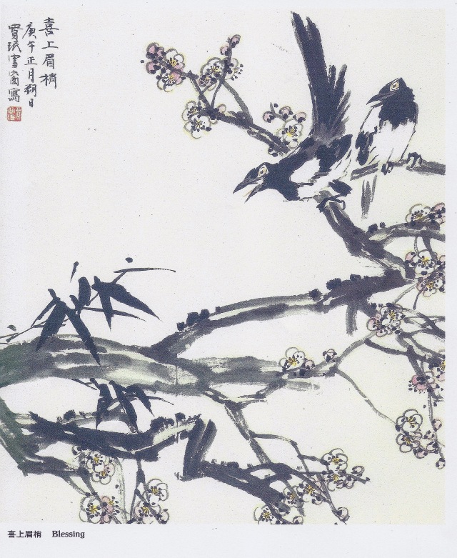
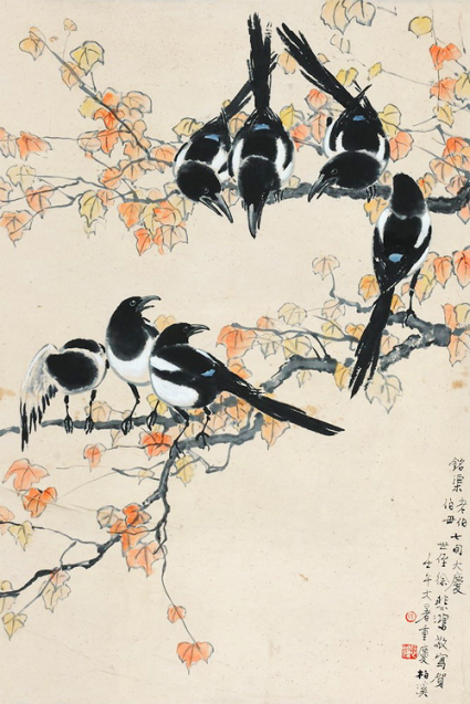
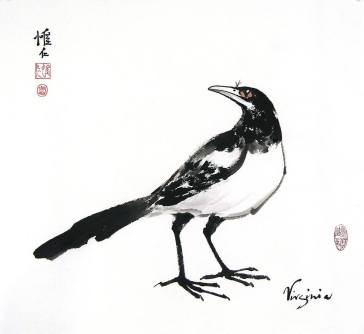
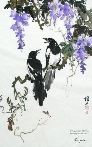
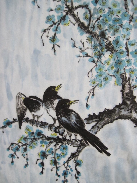
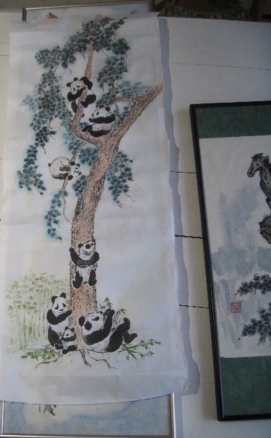
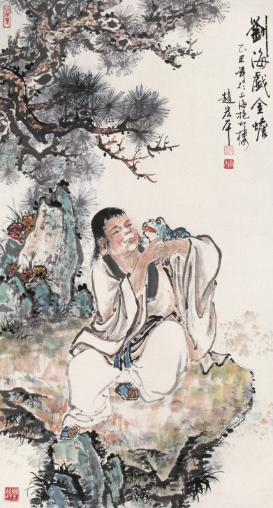
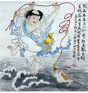
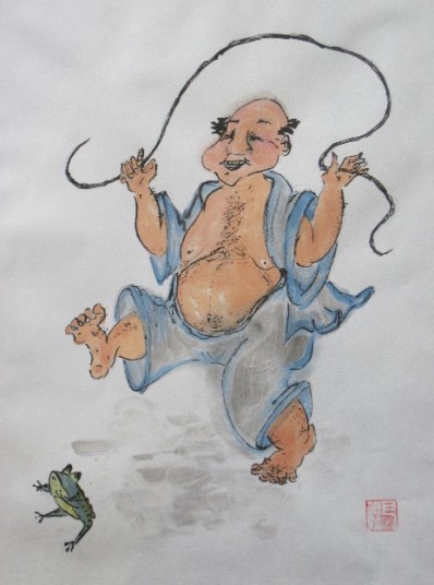
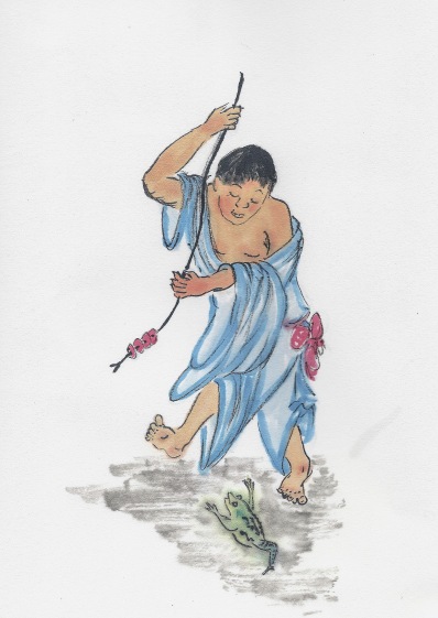
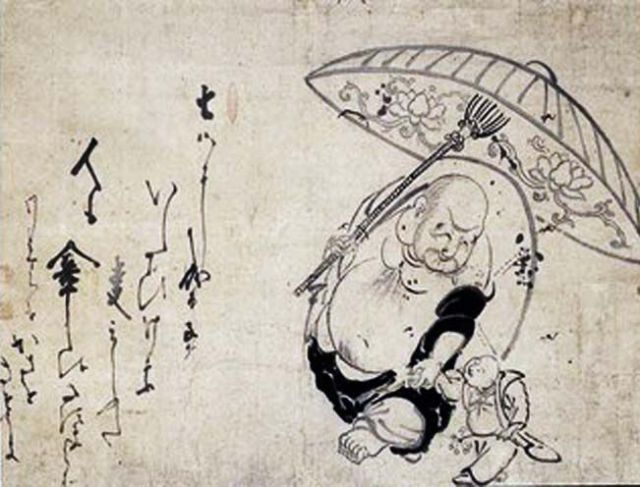
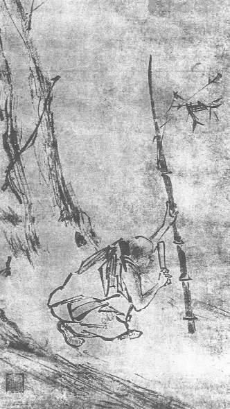
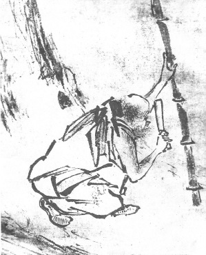
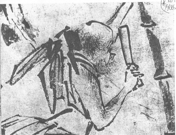
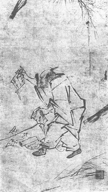
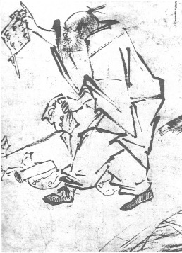
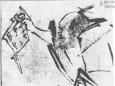
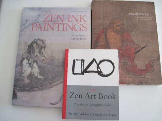
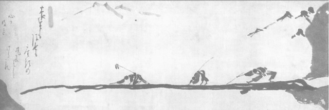
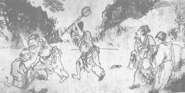
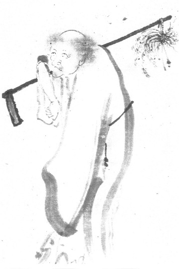
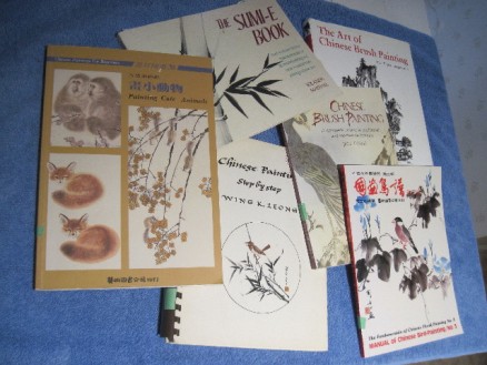
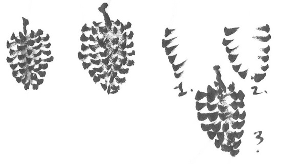
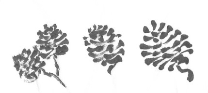
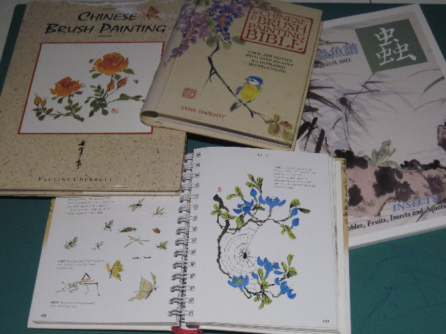
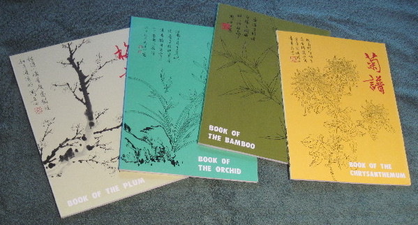
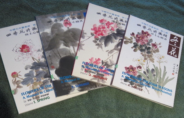
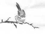
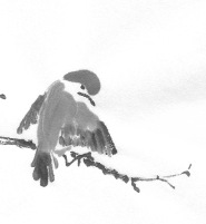
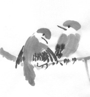
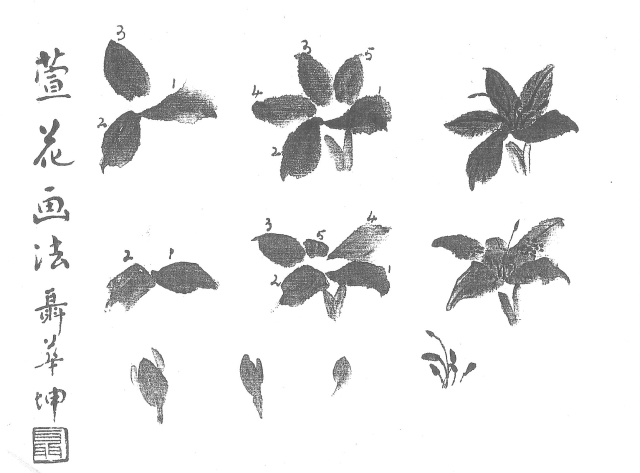
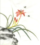
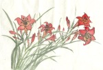
I had previously rifled through all possible Chinese brush painting (CBP) instructions on landscape painting, on my shelves and on the Internet, and amassed a slim file of ‘maybe’ techniques. Western scenes such as the one I aimed to depict have not been widely treated in this manner.  Here are some thumbnail images of items I consulted for inspiration and guidance:


Knowing the most likely successful approach would be to define tree silhouettes, bushes and grasses with ink (or maybe color), create shading and depth with indigo, and then wash the scene in blues to suggest early evening light (gloam) I tested some possibilities on smaller bits of paper. I went ahead and tried some of those methods, then had to re-create my landscape from scratch. More than once!

It was tricky to figure out a satisfying overlapping of bushes at either side of the road to help enhance the depth within the picture and ‘frame’ the focal point of the vignette. I would have liked using evergreens (at one stage that is what I did on the right hand side) as I knew how to use them, BUT they were not ‘right’ for my true-life scene; they grew further back from the roadside. Horses of a different color would never matter to other observers, but inauthentic landscape elements would. I had to figure out the darn trees.

Step 3: Adding color. I painted in pale yellow light spewing from the hall windows, used burnt sienna in the grasses, washed chestnut shades over my horses, and added snowdrift and snow bank lines (thin ink lines first, followed by blue snow shadowing). I dabbed in white paint in the foreground to depict snow clumps on branches. With the line definition complete, the texturing in place, and main elements colorized it was time to wash the whole in blues to try and capture the late afternoon winter light.

With my whole painting dry, I wet my distant mountains and colored them with a light indigo wash. I added purple tones to the mountain bases. I wet the rows of bushes along the river and gave them purple/blue tones. I treated the bushes on either side of my road similarly, striving to keep sky and snowy fields white. With a small brush I then trailed in blue shadows along the roadways, ditches, and fence lines. The shiny bells on my horse harnesses required some white paint to enhance their look, make them pop.

DUNSTER1 copy

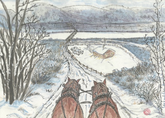
Step 4: Final tweaking. As with any painting, landscape or otherwise, it helps to step back from time to time and examine it as a whole, looking for things that work and those that need touch-ups. As my intention was to use this scene for an art card, I dropped small black mats over it from time to time to “see” how it was shaping up.

matcropping

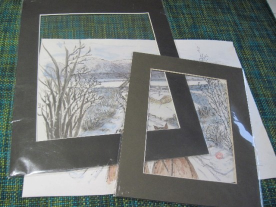
I pack plain black matts in 8 x 11 and 5 x 7 inch sizes in my art bag to aid in planning paintings so that they meet pleasing and useful proportions.

Even now, after accepting the above image to be as ‘finished’ as possible days ago, I can see that some branches in the clump of bushes on the left should be dabbed with more snow caught in the vees and upper surfaces.

Concerned that the horses lost their dominance when the scene was fleshed out on either side of the road, I used a smaller mat to capture less of the scene.
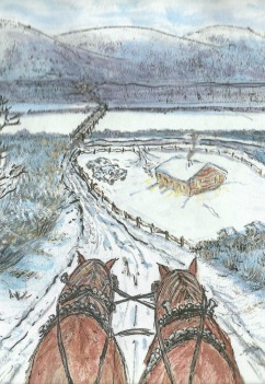
DUNSTERcropped copy

My final landscape:

After gluing and drying the painting, I scanned it in and created a card. It seemed to need the added ‘oomph’ of blue borders.

Thehorserearcrds

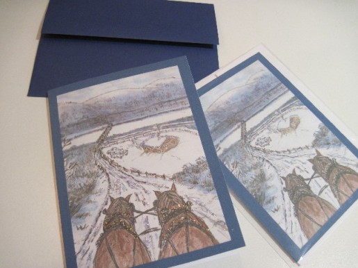
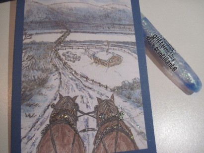
And then because I have some grandchildren who love glitter-glue….

BlingedCard

Reflections:

I love the horses and other main scene elements. I want to work more with snow and bushes/trees at mid and far distances. It’s not easy making artistic decisions when you have a particular scene in mind, and want to ‘keep it real’. I had several old photos of the hall to help guide me but none showing the true shapes of the far mountain ridges (Caribou range of the Columbias.) We all seem to have taken photos pointing in the opposite direction, toward the Rocky Mountain range.  And of course, once started on revisiting old memories many more come to mind as painting subjects.


Posted in branches, Chinese Brush Painting, composition, Dunster Memories, landscape, painting horses, painting landscapes | Leave a comment

When other visitors won’t do, paint spider

Unexpected garden visitations in the form of ‘creepy crawlies’ have never really bothered me. But when I moved to Victoria some eight years ago I had to get used to the sudden appearances of great big spiders in my home. See this local newspaper article for details.

They typically pop up in bathtubs, around the fireplace hearth or—most startling of all—in the middle of the floor of a room I’ve just entered. Such encounters involve the both of us remaining stock-still as we assess our next move: the spider looks for an escape route and I look for a ‘whacker’.

Despite reading articles such as the one linked above, and hearing all kinds of assurances that the European funnel web spider is relatively harmless, I am invariably spooked by their ‘visits’. It has something to do with the flurry of movement as they scramble away, or maybe the contrast of dark body against a white bathtub or beige rug.

Painting an insect (or small human figure, an animal or bird, beetle, butterfly, etc.) into a Chinese brush painting (CBP) composition is conventional. You do it to enliven the scene, to show interaction of creatures with nature. One of my instructional books says it ‘adds an exotic element’.

Most brush painters quickly develop a repertoire and often have their preferences. So far, I’ve not given much thought to my arsenal of ‘visitors’. But last week’s art session came on the heels of time spent with a grandson who can’t get enough of the Eensy-Weensy spider song. So when it came time to finish an autumn scenario I thought I’d simply drop a spider into the mix and put it aside for gluing.

Not so simple…I wrecked my painting. (His body was too blobby; his eight legs looked strained; the thread he hung from was too thick…and so on, and so on.) I turned to my bookshelf for help with spider painting.

Spider painting resources

Even though the spider is NOT an insect (which have six legs, antennae and wings) they are often addressed in the same chapters as insects in CBP painting books. Spiders are classified as Arachnids and are related to scorpions, lobsters and crabs. (For more on anatomy look here.)

What an artist needs to know:  there are two major body parts divided by a slim ‘waist’; they have eight jointed legs which emerge from the abdomen; spinneret/s are hidden in the butt end; facial appendages vary from spider to spider and have fancy names like chelicerae and pedipalps, but a few tiny lines convey the intent for most varieties. Spiders do not chew food; instead they inject a juice that liquefies the substance, which in turn is sucked up.

My most helpful resources proved to be these:

  1. Pauline Cherrett includes them in her book Chinese Brush Painting.
  2. Curiously the composition she painted for her book is also in The Chinese Brush Painting Handbook edited by Viv Foster.
  3. Jane Dwight has also illustrated spider painting in The Chinese Painting Bible. She does both a striped body and a spotted version.
  4. Johnson Su-sing Chow addressed them in volume 3 of his four-volume set titled Fruits, Vegetables, Insects and Aquatic Life.


SpiderBooks

Cherrett’s morning glory composition with a spider in its web as the focal point appears in her book (top left) and again in the Brush Painting Handbook edited by Viv Foster, open at the front.

Spider steps

  1. With dark ink and a detail brush define a small round head with two cupped projections facing forward.
  2. With burnt sienna/red mixed into a soft brush paint a larger round shape for the body.
  3. While the body is damp add stripes in dark ink. (Su-Sing Chow painted lengthwise, Jane Dwight painted horizontal stripes.)
  4. Add four pairs of legs extending from the body. Each leg should have about three segments with the tip of the outermost tapering to nothing. They are typically used in pairs, hence the first on either side of the body often point forward while the others are pointing backward; two pairs forward and two backward, or the two hindmost cling to the end of a thread/twig while the others are engaged in activity.

SpiderSteps

Web designs

While you may simply ‘drop’ a spider into a painting literally hanging from a thread, there are times you may want to create the environment of a web. The spiders that sneak into my home are usually of the European funnel spider variety and they make messy funnel-shaped webs in the garden. (I’ve found a few underneath furniture as well.) Their webs are not too glamorous-looking but would likely be easy to depict with a scribble of lines.

The more familiar webs of garden spiders take greater consideration and can enhance a CBP painting or even become the main focus (such as in Pauline Cherrett’s rendering noted above.)

Su-Sing Chow offers considerable advice:

–use a very fine brush with a delicate touch, relatively dry ink.

–draw the dominant radiating threads first and attach to leaves, branches, etc.

–paint your spider near the center of the area planned for the web (you can plan the middle of the web to be ‘off centre’ for greater interest I would think!) Cherrett will have painted her surrounding morning glory before moving to the web design.

–the radiating threads do not have to be equally spaced but need to appear natural.

–drop in the connecting horizontal threads; these are typically closer together near web centre and farther apart as they reach outward.

–longer threads should appear to sag as though the wind is blowing against them.

–where threads intersect or meet, let your brush linger slightly to depict the slight knob of joined ‘silk’.

–strive for lines that are thin, even and strong.

Spider as savior

When I returned to my ruined painting to reflect on where it had gone sideways, I considered if it could be salvaged. After all, sometimes you use a spider or other ‘visitor’ to cover an ink drop or imperfection in fibrous paper; could another object/creature be used to cover my spider? Given the size of area covered by my blobby spider, and the need for dark ink to mask it, my salvation could only lie in a large black mass, hence a cat. Here’s the outcome, scanned before a final layering of extra dark ink to mask the original spider covered by the cat body.

spiderCat.jpeg

From now on I aspire to PLAN more carefully should a spider happen to be the most appropriate visitor for a painting. I’d much rather they drop into my paintings than my bath tub, that’s for sure!

Posted in Chinese Brush Painting, painting spider | Leave a comment

Harmony and Joy, two birds on a branch

While updating my growing CBP library database recently I discovered a few books I had missed inputting. As I flipped through one to consider its most relevant coding I discovered a composition with two sparrows flitting through maple, two subjects I had recently studied in depth and blogged about.

Although pale in tone, the maple leaves were artfully arranged and the birds captured with realism and spirit. The nearby text had a reference to a much-admired master painter, Johnson Su-sing Chow. But the book title cited seemed much too lengthy: The Fundamentals of Chinese Floral Painting No. 3 Manual of Chinese Bird-Painting /No. 1.

Bluebirds

I’ve ‘played’ at painting little birds before, but lacked detailed and systematic instructions; my new book find fills the gap.

My library already includes three wonderful four-volume sets by this outstanding artist/instructor and I know them well. There’s the set on the four gentlemen (bamboo, plum, orchid and mum), there’s one on flowers of the four seasons (spring, summer, autumn and winter) and the third covers Aquatic Life, Fruits, Vegetables, and Insects. My heart did a little flip at the latter part of this long book title in front of me…bird painting? Dare I hope there’s another four-volume set out there?

ChowFourGents

Chow’s four-volume book set on painting the Four Gentlemen

ChowFoursSeasonsFlowers2

Chow’s four-volume set on flowers of the four seasons

ChowVegFruitsetc

Chow’s four-volume set on veggies, fruits, insects and aquatic life

Ten minutes online and I had my answer. It must have been the confusing sur-title reference to floral painting that had thus far kept the set of books undiscovered. Lucky for me a single ABE Books bookseller had all four volumes, and in new condition.

IMG_6505

Chow’s four-volume set on Bird Painting

When the books arrived I found more reason to understand their secretive existence—unlike those in the companion sets these lack ISBN numbers. You (and the seller as well) have to enter the full title precisely to get a true hit in used book databases.

Chow Birds as “missing link’?

Most of us start our love affair with Chinese Brush Painting (CBP) with the traditional four gentlemen, and eventually move on to flower/bird compositions, maybe animals and/or landscape painting. The detailed and helpful instruction afforded by Su-sing Chow’s books follow that route as well—four books on the gentlemen, four books on flowers (one-half of the flower-bird combo) and four more on bird painting. And lo and behold, as I flip through the first several chapters of the first volume I see his path to techniques for individual bird species follows a familiar sequencing—start simple and increase the degree of difficulty in detailing.

He starts with a basic formula in monochrome tones—one-stroke head, black dot for the eye, black swoosh for a beak, three overlapping strokes for wing, dark dabs for covert feathers (those that overlap or ‘cover’ the next layer), wing tips and two for the tail, a long thin line for the chin, chest and belly, then narrow lines for the legs and finally three toes forward with one heel back.

ChowBirdA

Stroke direction can be important; painting the beak toward the head results in a tapering toward the head. The two tail feathers are also best painted toward the bird’s body.

Chow calls it “abbreviated ink” style and it appears consistent with the Japanese sumi-e approach to oriental painting. It is also the introduction to bird painting I have witnessed demonstrated by three master painters in workshops/lessons I’ve been privileged to attend. His four-volume set on bird painting is the (detailed) instructional link from ‘four-gents’ to traditional ‘flower-bird’ that I didn’t know I was missing!

Su-sing Chow’s first bird posture is strictly a left-facing profile; then he does the same facing right. And then he devotes several chapters to simple variations—branch-grasping, quick dodging, preening, glancing up, glancing down, and so on. There’s more than two-dozen poses complete with observational tips of bird behavior.

The illustrations are all done in two ink tones (light and dark), the brushwork is all fully explained (direction, tone, speed, degree of moisture), and additional elements are kept simple (a branch, a twig, a swaying bit of willow. Su-sing Chow prescribes much practice with these little darlings before taking on other more distinct and complex species. He eases into sparrows and swallows in the last quarter of his volume one. The remaining books of the set graduate to other more complicated species—mynahs, kingfishers, ducks, geese, peacocks—some 26 species in all.   This four-volume set offers the ideal transition for beginner painters wanting to move ahead with their CBP studies.


My studies:

Having benefited from Chow’s excellent instructions in the past, I sat down to try and work through his many ‘abbreviated-ink’ compositions and thereby ‘learn the poses’. I couldn’t do that in one sitting; I managed most of his perched and standing poses in one afternoon but the duos overlapping and birds in flight had to wait for a second afternoon.  I have previously blogged about painting little birds and some of Chow’s advice reinforced former insights, but there were a lot of new ideas in his introduction.  After the first left-facing pose he demonstrates four similar poses.  My efforts are here:

ChowBirdA 2  ChowBirdA 1  ChowBirdA 4

ChowBirdA 3 ChowBirdA 5

Then he moved on to pairs of birds (he described them as ‘harmony and joy’), which I tried to emulate:

ChowBirdB3&4  ChowBirdB1&2

And he demonstrated three ways to ‘perch’ little birds:

ChowBirdC3   ChowBirdC1 ChowBirdC2

Then he gives us five ‘flight’ poses (and yes, I was having trouble with tail feathers appearing smooth; my birds do look a little bedraggled. )

Chow next provided four poses on branches; he recommends paint the bird first (in relatively wet ink) then render the branch in dry ink, placing the branch between the bird’s feet before branching left and right. Here’s my studies for this group:

Chow’ s last group of bird poses were a bit more tricky; I tried the ‘building’ from one to four birds that he demonstrated:

ChowBirdF 1

Here’s One…


ChowBirdF 1&2

Add Number Two (oops, no tail….)

And then add Number Three and Four:


I gave the last two another shot:

Throughout his introduction to bird-painting Su-sing Chow frequently cites his own observations and other ornithological wisdom, all of which contributes to sound compositional advice. (I have lots of notes!)

In another  book dedicated to this artist’s body of work that resides on my ‘oversize’ book shelf, I discovered a composition of small birds in a tree that clearly incorporates many of these introductory bird poses.  He titled it The Tune at Sunrise.  Here’s a thumbnail of his version on the left and my effort is on the right.

His pose of the left-most bird on the middle branch is intriguing and merits further study. And I still have three whole books of Su-Sing Chow birds to work through!


Posted in Chinese Brush Painting, composition, how to paint birds | 1 Comment

What, me worry? (painting daylily)

Not a big fan of flower painting, I can be enticed when there’s a neat trick to learn or a great story behind the plant. Painting daylilies is covered off in several of my CBP books, but when I recently tripped over a Henry Li instructional video and saw that he used a hake brush to render both the flower and the leaves, I stopped to take note.

Now I’ve used hake brushes before. They come in handy for quickly laying in washes or defining distant hills or mountains. I’ve used one to apply a thin glaze to a salmon and have whisked white guard hairs to the surface of a tiger’s fur coat.

With this video I now have even greater admiration for the versatility of the flat, goat-haired brush known as the hake. Mr. Li demonstrates how to use it to define daylily petals as well as the flower stems (called scapes) and leaves.

Helpfully, he explains the petal stroke (inside-out, he calls it) and comments on his composition as it emerges. He also shows how to correct the dreaded ‘parallel stroke’ fault (aka railroad tracks) that can absolutely ruin a painting. Watch carefully how he adjusts his leaf cluster to overcome the initial parallel paths.

Named for its habit

The daylily (Hemerocallis fulva) is native to China and is indeed sometimes called the Chinese lily. Hemero is Greek for beautiful, callis for day, thus the name reflects its odd blooming pattern: a blossom opens, matures and withers all in one day. Fulva is Latin for tawny, a common hue for the wild daylily (a soft brownish orange) and in China a common name for the plant (tawny lily).

Other common names include railroad lily, ditch lily, meadow lily, washhouse lily and outhouse lily. The name I heard in my childhood was homestead lily. All these common names, as one might guess, arose because of the widespread appearance of the daylily across North America in ditches, near out buildings and old homesteads.

The plant is extremely tough and grows from a cluster of rhizome-like, bulgy roots. When settlers pulled up a clump and threw them into their wagons bits often fell to the wayside (ditches) or got left behind on abandoned farms. The plants are very long lived, grow in almost any soil, and are viable even after a long period of drought.

In the ground, stands of daylily can become quite invasive, spreading under fences and into other gardens via the compost trail if you’re not careful. My first clump migrated on its own from next door, and was quickly coaxed into filling a thirty-foot swath outside my back fence in heavy clay where nothing else would thrive.

BackLaneDaylily

With blossoms that open only for one day you might wonder how they’ve gained garden popularity. Fortunately the plant opens the flowers in succession, starting with the uppermost on a scape, moving down the stalk, so a good-sized clump does sport blooms over a few weeks. If you like the look of a lot of tall, grass blades arching up from the base, the daylily can easily be a performer in any garden.

Considering all the ‘lilies of the field’…

The daylily is NOT to be confused with true lilies; the most common candidates are those known as tiger lilies  or even our native wood lilies (the one Saskatchewan claims as a provincial flower).

True Lilies–family named Liliaceae–have flowers emerging only from the TOP of their scapes, with short, spikey leaves jutting out from the length of the stalk. And you often see tiny purple-black bulbils forming in the crotches of all those spikey leaves along the scape of a lily (not a daylily).

There are indeed lots of gardeners who absolutely love the daylily and have hybridized the dozen or so naturally occurring color variants into some 20,000 combinations. From that original orange version (Hemerocallis fulva) we now have different colors, bi-colors, ruffled petals, skinny petals, and so on. The original orange (Orange Meadows) remains a favorite and so does a (shorter) plain yellow one (Stella) and a popular combination (Christmas) has a dark wide red petal with yellow throat that re-blooms later in the growing season.

In the late 1990s in my former home province of Manitoba a couple of daylily lovers donated 100s of varieties to the Assiniboine Park Conservatory where they became the basis for a feature garden. It was pretty spectacular to bike to the park and wander the field of daylilies in bloom. One of the many daylily societies that have been founded around the globe is centered just outside of Winnipeg (Beausejour) where they have created a popular tourist attraction based primarily on 100s of varieties of daylily, augmented with true lilies, peonies and irises.  Here’s a link to the Canadian Hemerocallis Society where you can see some of the many unusual varieties now available to gardeners.

DaylilyGatineau

Daylilies are an ‘old-timey’ plant often featured in beds such as these on the Mackenzie Estate in Gatineau Park.  This was the summer home to Canadian Prime Minister William Lyon Mackenzie King’s family. The tall yellow daylilies are likely Stellas.

Parts of a daylily

See this link for a widely distributed diagram which identifies all the pertinent parts to a daylily plant.  What the artist needs to know—six petals emerging in a funnel shape, five stamens and one pistil, long ribbon-like leaves that arch upwards from the plant base. Whereas true lilies sport flowers only at the top of a stalk with several open simultaneously, the daylily will first open one near the top of the scape, and other buds emerge on short stems from that main stalk. While pollen may appear sprinkled on a daylily bloom, it does not dominate the bloom quite the way those black spots do on the tiger lily.

Artistic licence?

While studying the several daylily painting instructions in my books, as well as sample compositions, I noted that most artists—including Henry Li—show only five petals. This was true of the note package some of my art group members kept from lessons given by our friend and mentor, John Nip. Here’s a sheet from his lesson plan. He used the traditional orchid brush for the petals, and prescribed a set order to placement.

daylilynip1.jpeg

My guess is that the five petals are representative while not crowding the composition. The eye can always be teased into believing a complete flower is there if it rests on individual parts that are convincing. In photos of course, the six petals are always there, but the overlapping of parts is also obvious. In a painting the eye may accept that five petals somehow complete a blossom, or that the sixth is present, just hidden by the turn of the funnel-shaped bloom.  Here’s a page from my first attempts at getting the petal formation into my head; six do appear crowded.

DaylilyPetals

Flower symbolism

As Henry Li mentions in his video, the daylily is considered worry-free and that is the message you convey in giving one to someone. It is a common gift to mothers and also shows up on Mother’s Day cards. Several other resources noted an ‘old wives tale’ that consuming daylily while pregnant would result in a male child.

In China the flower buds have long been a food item, and have made their way into gourmet cooking elsewhere around the world in recent times.

Methods of painting

The daylily does make a delightful painting subject. I have at least two instructional books that provide excellent step-by-step illustrations for painting a daylily. One is a Walter Foster book and the other is that wonderful compendium 100 Flowers by Yang O-shi.  John Nip’s note package is also enlightening.

Daylilybooks

My first daylily studies were attempts to emulate Henry Li’s method because of his use of a hake brush.  Whether you paint daylily by Li’s method or with  orchid and detail brushes in a more traditional manner, the order for elements is much the same:

  1. flowers–petals, trumpet, throat
  2. stems (scapes)
  3. bud casings
  4. leaves–long arching strokes from the root crown upwards
  5. petal striping
  6. pistils and stamens; also leaf veins (one central one)
  7. bud petals in the casings

Wielding the hake

If you’ve never used a hake brush before you may want to play Henry Li’s video several times and focus on the brush hold a few times, the petal shapes on others, and the composition on others.  There’s so much to learn from watching a CBP artist at work. In real life you also can study how the artist mixes colors, loads the brush, controls moisture, pre-tests color/moisture/brush, and so on.

Basically you hold the hake in the same manner you hold a house-painting brush, thumb on the under side and fingers on the uppermost.  For this exercise a one-inch brush is needed, and it’s best to have already ‘broken in’ the bristles.  For some strokes you pull the width of the brush downwards or upwards (a wide wipe such as in the wider parts of leaves or petals), for others you push or pull the narrow width of the brush along a path (for the narrow stems and the flower trumpet).  At other times you pivot the brush onto one of the two corners of the bristles (to form the petal tip with a blob of color).  In Li’s very first petal stroke of the video he combines all three maneuvers.

Forming Flowers:

I played Li’s video several times and used my computer freeze-frame and screen-grab features to isolate his flowers. Doing so allowed me to study the petal shapes more closely.  Here’s my study sheet showing some of the many insights thus gathered.

DaylilyPlanHake

Forming Petals:

Daylily flowers/buds are perched on the end of short stems leading off the main scape.  Do remember the blooming pattern from top to bottom and don’t have buds above the open flowers!  Buds are formed with two overlapping brush strokes.

Painting Leaves:

The daylily leaves extend from the root crown in the manner of orchid leaves, arching and overlapping.  The leaves have a central ridge or bend, and this can be indicated with dark ink applied to damp leaves, or with a color change. For painting leaves with a hake you achieve the thin parts with an angled push of the narrow width; do note how Li does an ‘angled wipe’ to get the wider portions.

Painting buds:

Buds are easily rendered with two overlapping strokes with an orchid brush, or two overlapping strokes of the narrow part to a hake, with a bit of manipulating to fatten the area closest to the bud base.

Adding the pistil and stamens:

Stamens and pistil are slightly curved, dark and therefore easily rendered with ink and a fine detail brush, best done on damp petals. The pistil stands slightly taller than the stamens.

My first full studies:

Here are my first several daylily compositions; the first three were done with the hake and you should recognize close resemblance in the first one to Henry Li’s composition.  The first two in the bottom row were done with an orchid brush in the more traditional manner, and the last one is painted using the outline method.

Reflections on using the hake brush to paint daylily:
–the brush can be loaded with yellow and/or orange then dipped in any red you have and the colors will blend in the brush.

–you can paint intense colors or water them down for pastel shades.

–you can blend pale yellow, green, even red shades into the throat of your daylily once the petals are in place. (See Yang O-Shi’s method.)

–using a hake to paint the scape results in a stroke that appears segmented because of the way you lay down the color and mimics the daylily look.  Nice effect.

–the flowers and leaves do naturally appear somewhat striped, and that is easy to do with a detail brush and slightly darker color

–five petals, while botanically inaccurate, appear to form a complete blossom; it is tricky to get the color lighter at blossom centre, darker at petal tips using the hake.

Daylily compositions:

I’ve discovered a number of daylily comps where they appear in the wild next to a rock with a bird or two perched on the rock. Quite a few artists have painted them as per the Henry Li comp. My online research to see what daylilies look like in the wild in China led to discovery of vast fields of the worry-free plant.  Here’s one showing a popular postcard image produced by Taiwanese firm Rainbow Arts and Humanities Co. Ltd.

img120160803085843976

And I thought my back lane display was pretty spectacular!!!!

Consider the lilies of the field, how they grow: they neither toil nor spin; and yet I say to you that even Solomon in all his glory was not arrayed like one of these.


Posted in Chinese Brush Painting, flowers, painting daylily, using a hake brush | Leave a comment